The PromptsRush journal
Tutorials20 Prompts to Turn design.md Into Production Components
20 copy-ready prompts that take a design.md from file to finished components: read the spec, map tokens to CSS variables and Tailwind, build buttons, forms and dialogs with every state, then audit contrast, focus, target size and drift.
Advertisement
Short version: a design.md only pays off when every prompt you send points back at it. The 20 prompts below take a design file from "pasted into the repo" to finished, checked components: read the spec, map its tokens into CSS, build each component from its spec table, then audit contrast, focus and drift. Copy them in order the first time, then reach for single prompts as you need them.
If you grabbed a theme from our marketplace this morning with the design.md marketplace guide, this is the next step. That guide gets the file and the tokens into your project. This cheat sheet is what you type afterwards, in Claude Code, Cursor or any coding agent that can read your files.
Sources: the shadcn/ui and Tailwind CSS theming docs, the WCAG 2.2 Understanding documents, the WAI-ARIA Authoring Practices Guide, Google's DESIGN.md spec and our own marketplace export, all checked on 30 October 2026. The prompts are templates, not benchmarks. Opinions are labelled.
What This Cheat Sheet Is and Who It's For
This is a working set of 20 prompts for one job: turning a written design system into production UI code that actually follows it. It's built for developers and designers who already have a design.md (or are about to) and use an AI coder to write React, Vue, Svelte or plain HTML with Tailwind.
Here's what you'll find:
- Six categories: reading and setup, tokens and theming, core components, states and accessibility, layouts and pages, and audit and refactor.
- A four-stage chain (read, map, build, audit) that the prompts follow, so each one starts from the output of the last.
- A prompt anatomy with the four parts every component prompt needs, plus the meta-rules behind them.
- A chaining workflow for a full component library in one sitting, and the mistakes that quietly undo it.
Who it's not for: if you don't have a design system yet, start with how to write better design.md files or pick a ready-made theme from the Promptsrush design marketplace, then come back. These prompts assume the file exists and is the source of truth.
How to Use These Prompts (Placeholders and Setup)
Every prompt uses square-bracket placeholders. Replace them before you send, and keep the names consistent across a session so the agent can connect the steps.
| Placeholder | What to put in it | Example |
|---|---|---|
[DESIGN_MD] | Path to your design file in the repo | docs/design.md |
[STACK] | Framework, styling and component base | Next.js, Tailwind v4, shadcn/ui |
[CSS_FILE] | Your global stylesheet | app/globals.css |
[COMPONENT] | The one component you're building | Button, Input, Dialog |
[COMPONENT_DIR] | Where components live | components/ui |
[SCREEN] | A page or view, described in one line | Billing settings page with plan card and invoice list |
Three setup notes before you start:
- Save the design file in the repo, not just in chat. A file the agent can re-open beats a paste that scrolls out of context after a long session.
- Run prompts in a fresh session per stage. Reading and mapping produce notes and CSS you keep. Building gets a clean context with those files attached.
- Know which format your file uses. Google's open DESIGN.md spec puts tokens in YAML (front matter or fenced
yamlblocks) with Markdown prose. Our marketplace export keeps the same idea, tokens plus prose for agents, but stores tokens as Markdown tables, a JSON block and ready-made CSS variables. The prompts below handle both, because they ask the agent to find the tokens rather than assume where they sit.
Pro tip: Keep a short design-notes.md next to the design file. Prompt 1 writes it, and every later prompt can point at it. It's cheaper to re-read than the full spec, which in our marketplace exports runs 438 to 504 lines.
How the Prompts Chain Together: Read, Map, Build, Audit
The 20 prompts follow one pipeline. Each stage has a single job and produces a file the next stage reads. That's the whole trick: the agent never has to remember the design system, because it's always holding the latest artefact.
- Read. The agent reads the design file and writes a digest: every token, every component spec, every rule, and every gap or contradiction it found. No code yet.
- Map. The tokens become CSS variables and Tailwind utilities, using the shadcn convention of semantic pairs such as
primaryandprimary-foreground. After this, the colours live in code, not in the prompt. - Build. One component per prompt, built from its spec table, using only the mapped utilities. Every state the spec lists gets implemented.
- Audit. A separate pass checks the result against the spec and against WCAG: contrast, focus, target size, hard-coded values and drift.
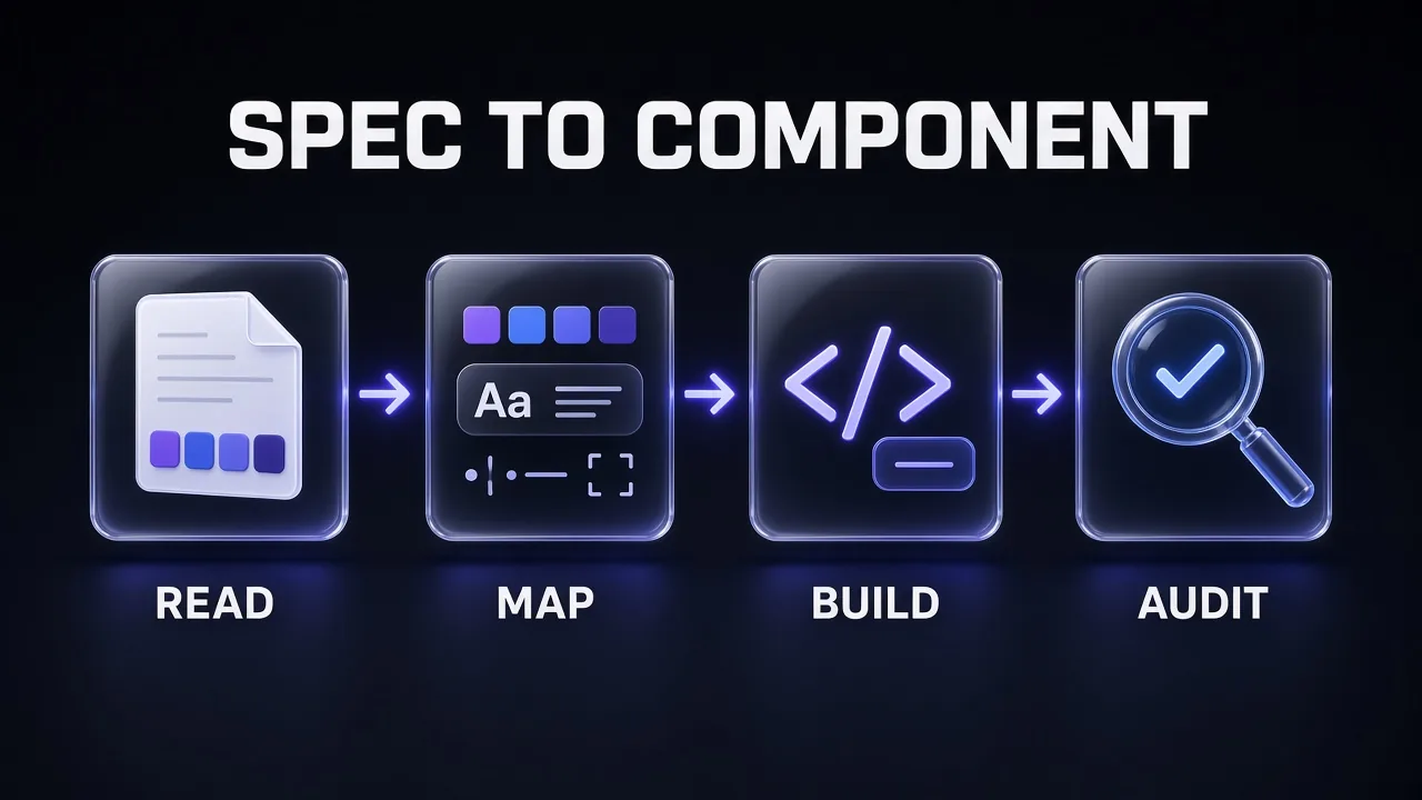
Why four stages and not one big "build my UI from this file" prompt? Because a single prompt asks the model to hold the spec, invent the CSS plumbing, write the component and judge its own work at once. Splitting the job lets you check each artefact before the next stage builds on it. It's the same idea behind context engineering: give the model the right material at each step, not everything at every step.
If you want the longer argument for why a written spec beats describing the look in chat, we made it in how design.md improves AI coding results. Honest answer on reliability: Anthropic's Claude Code docs say instruction files are treated "as context, not enforced configuration". A design file raises the odds of matching output. The audit stage is there because it doesn't guarantee it.
Prompt Anatomy: What Makes a Good Component Prompt
Every build prompt in this cheat sheet has the same four parts. Miss one and you can predict the failure.
- Context: where the design file and the digest live, what stack you're on, and which files the agent may touch. Without it, the agent improvises a stack and edits files you didn't mean to open.
- Tokens: an explicit instruction to use only mapped utilities and CSS variables, never raw hex, pixel or font values. Without it, you get
#4f46e5pasted into a className and a theme that breaks in dark mode. - States: the full list of states to implement, taken from the spec. Without it, you get a beautiful default state and nothing for hover, focus, disabled, loading or error.
- Rules: accessibility and behaviour constraints, stated as checks the agent must report on. Without it, focus rings vanish and icon buttons lose their labels.
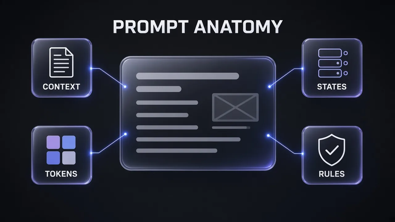
Behind those four parts sit eight meta-rules we'd apply to any design-system prompt:
- The file wins. Tell the agent that when your request and the design file disagree, it should stop and ask, not pick one.
- One component per prompt. A button and a dialog in one request means neither gets its full state list.
- Name the spec section. "Follow the Button spec table in [DESIGN_MD]" beats "make it match the design".
- Semantic tokens over palette tokens.
bg-primarysurvives a theme swap;bg-indigo-600doesn't. - Ask for gaps, not guesses. If the spec has no value for something, the agent should list it as a question rather than invent one.
- Light and dark together. Every visual change gets checked in both modes in the same step.
- Native elements first. A real
<button>beats adivwith a role. The WAI-ARIA Authoring Practices Guide is blunt about it: "No ARIA is better than Bad ARIA." - End with a self-check. Close every build prompt with a short checklist the agent must answer, so drift shows up in the reply, not in production.
Reading and Setup Prompts (1-3)
These three run once per project. They turn a long design file into a short, checkable digest and wire the file into your agent so later prompts can stay short.
1. Spec Digest
Use first: makes the agent read the whole design file and report what it found before writing any code.
Read [DESIGN_MD] in full. Do not write any code yet.

The file may store tokens as YAML (front matter or fenced yaml blocks, as in Google's DESIGN.md spec), as Markdown tables, as a JSON block, or as ready-made CSS variables. Find them wherever they are.

Write design-notes.md next to it with these sections:
1. Tokens: every colour (light and dark value), font family, type size, spacing step, radius, shadow and motion value, with its exact name.
2. Component specs: each component the file defines, with its variants, states and measurements.
3. Rules: every do, don't and accessibility requirement, quoted briefly.
4. Gaps: anything a [STACK] component library will need that the file doesn't define (for example success or warning colours, focus ring width, disabled styles).
5. Conflicts: any place where two parts of the file disagree.

Keep it under 150 lines. End with the three questions you most need me to answer before building.
2. Token-to-Code Map
Turns the digest into one stylesheet so colours, radius and fonts live in code from now on.
Using design-notes.md and [DESIGN_MD], update [CSS_FILE] for [STACK].

Follow the shadcn/ui convention:
- Semantic tokens under :root (light) and .dark (dark): background, foreground, card, popover, primary, secondary, muted, accent, destructive, border, input, ring, each surface paired with its -foreground token where one exists.
- --radius as the base radius.
- An @theme inline block that maps each variable to Tailwind (--color-primary: var(--primary), and so on), plus font families and the radius scale.

Rules:
- Copy values exactly from the design file. Do not round, convert or "improve" colours.
- If the file already ships a CSS variables block, use it as the starting point and diff it against the tables; report any mismatch instead of silently choosing.
- If a token from design-notes.md has no slot, list it under "Unmapped" rather than dropping it.

Show the final CSS, then a table: token name, light value, dark value, Tailwind utility it produces.
3. Agent Rule File
Makes every future session load the design system without you pasting it.
Create a short design rule for this repo so coding sessions follow [DESIGN_MD] by default.

If this project uses Claude Code: add a "Design system" section to CLAUDE.md that imports the file with @[DESIGN_MD] and states the rules below.
If it uses Cursor: create .cursor/rules/design-system.mdc with a description, globs for [COMPONENT_DIR] and page files, and the rules below written directly in the rule body.

Rules to include, in under 25 lines:
- Use only semantic Tailwind utilities and CSS variables from [CSS_FILE]; no raw hex, rgb, px font sizes or arbitrary colour values.
- Build new UI from existing components in [COMPONENT_DIR] before creating new ones.
- Implement every state the design file lists for a component.
- When a request conflicts with [DESIGN_MD], stop and ask.
- Check light and dark mode for every visual change.

Do not copy the whole design file into the rule. Tell me which file you changed and how to confirm it loads.
Why the split instructions? The tools load files differently. Claude Code's memory docs describe @path imports that pull a file into context, and recommend keeping each CLAUDE.md under about 200 lines. Cursor's rules docs say a file mention "tells Agent where to look" but its contents "are not inlined", and advise putting anything that must always be in context directly in the rule body. We go deeper on both formats in our AGENTS.md and CLAUDE.md guide.
Tokens and Theming Prompts (4-6)
Mapping gets the obvious tokens in. These three handle what most design files leave half-done: missing semantic colours, dark mode parity, and the type and radius scales.
4. Add Missing Semantic Tokens
Fills the gaps Prompt 1 found, in the same pattern, without inventing a new palette.
design-notes.md lists these gaps: [GAPS, e.g. success, warning, info].

For each one, add a semantic token pair to [CSS_FILE] following the existing pattern:
- Define --[name] and --[name]-foreground under :root and under .dark.
- Expose them in @theme inline as --color-[name] and --color-[name]-foreground.

Derive values only from colours already in [DESIGN_MD] or from the closest hue the file's principles describe. Show each proposed value with:
- the contrast ratio of the foreground on its surface in light and dark mode,
- whether it meets 4.5:1 for normal text.

Do not apply anything below 4.5:1. Mark these tokens as "proposed, not in spec" in design-notes.md so a designer can approve them.
5. Dark Mode Parity Check
Catches tokens that exist in light mode only, which is where most theme bugs start.
Compare the :root and .dark blocks in [CSS_FILE] against the colour table in [DESIGN_MD].

Report as a table: token, light value, dark value, in spec (yes/no), issue.

Flag:
- any token defined in one mode but not the other,
- any value that differs from the design file,
- any surface/-foreground pair below 4.5:1 in either mode,
- any border, input or ring colour below 3:1 against the surface it sits on.

Then list every component in [COMPONENT_DIR] that uses a raw colour class (bg-white, text-black, bg-gray-*, any hex) instead of a semantic token, with file and line. Don't fix anything yet.
6. Type, Radius and Spacing Scales
Wires the non-colour tokens so headings, corners and gaps match the spec everywhere.
From [DESIGN_MD], map the typography, radius and spacing tokens into [CSS_FILE] for Tailwind v4.

- Fonts: add --font-sans, --font-mono (and --font-serif or a heading font if the file defines one) inside @theme inline, and load the fonts the way [STACK] recommends.
- Type scale: if the file's sizes differ from Tailwind's defaults, define --text-* theme variables with line heights; otherwise say the defaults already match.
- Radius: keep --radius as the base and derive --radius-sm to --radius-xl from it, so one change updates the whole scale.
- Spacing: confirm whether the file's base unit matches Tailwind's default spacing base; if it doesn't, explain the change before making it.

Output the CSS and a short "how to use" list: which class gives a card radius, a heading size, a section gap.
Two Tailwind details matter here. The Tailwind v4 docs say @theme variables decide which utility classes exist, while plain :root variables don't create utilities. And when a theme variable points at another variable, the docs say to use @theme inline so the utility resolves to the right value. That's exactly the shape shadcn/ui's own default theme uses.
Core Component Prompts (7-11)
Now the build stage. Each prompt makes one component from its spec section, using only the mapped tokens. Marketplace exports include spec tables for button, badge, alert, form field and card, so the first four prompts map straight onto them. In the Nocturne theme, for example, the Button table fixes a 2.5rem height, 0.5rem by 1rem padding and a 2px focus ring with a 2px offset. If your file uses Google's format, the same specs sit in its components token group and Components section.
7. Button With Every Variant and State
The component everything else leans on; build it first and build it completely.
Build [COMPONENT_DIR]/button for [STACK] from the Button spec in [DESIGN_MD] and design-notes.md.

Implement:
- Variants exactly as the spec names them (for example primary, secondary, outline, ghost, destructive) and the sizes it lists.
- States: default, hover, focus-visible, active, disabled, and loading (spinner plus unchanged width, aria-busy="true", click blocked).
- Height, padding, radius and font weight from the spec table, via theme utilities only.
- An icon-only size that requires an aria-label prop.

Rules:
- Render a native button element; support an asChild or link variant only if [STACK] already uses that pattern.
- Focus ring uses the ring token with the width and offset the spec gives.
- No raw colours, no arbitrary values unless the spec value has no utility, and say which ones.

Finish with a checklist: each variant x state covered (yes/no), smallest rendered target size in CSS px, and any spec value you couldn't match.
8. Form Field (Label, Input, Helper, Error)
Builds the input as a full field, because a bare input is where forms lose accessibility.
Build a FormField and Input for [STACK] from the Form field spec in [DESIGN_MD].

Structure: visible label above, input, helper text below, error message below that (replacing the helper when present), following the spec's placement notes.

Implement:
- States: default, hover, focus-visible, disabled, read-only, invalid.
- Invalid state sets aria-invalid="true" and links the error text with aria-describedby; the error is shown as text plus an icon, never colour alone.
- Label tied to the input with htmlFor/id generated per instance.
- Border uses the input token; focus uses the ring token; heights and radius from the spec.

Also build Textarea and Select variants that share the same field wrapper.

Show one usage example with a required email field in each state, and confirm the border colour against the background is at least 3:1.
9. Card and Surface
Locks in the surface, border, radius and shadow combination that most screens are built from.
Build Card, CardHeader, CardTitle, CardDescription, CardContent and CardFooter for [STACK] from the Card spec in [DESIGN_MD].

- Surface: card and card-foreground tokens; border token; radius and padding from the spec; shadow from the spec's elevation scale (map it to a --shadow-* theme variable if it isn't one yet).
- CardTitle renders a heading whose level is a prop (default h3), so pages keep a correct heading order.
- CardDescription uses muted-foreground.
- An interactive variant (whole card clickable) that wraps a single real link or button, shows a visible focus ring, and doesn't nest other interactive elements inside that target.

Show the card in light and dark mode next to each other and list every token it uses.
10. Badge and Alert (Status Without Colour Alone)
Status components are where "red means error" sneaks in; this prompt forbids it.
Build Badge and Alert for [STACK] from their specs in [DESIGN_MD].

Badge: variants from the spec (for example default, secondary, outline, destructive, plus success and warning if Prompt 4 added them). Short labels only; size, radius and weight from the spec.

Alert: variants info, success, warning, error.
- Every variant shows an icon and a text title; the meaning must survive in greyscale.
- Error and warning alerts that appear after a user action render inside a live region (role="alert" for errors, role="status" for non-urgent updates) so screen readers announce them without moving focus.
- Optional dismiss button with an aria-label and a target of at least 24 by 24 CSS px.

Report the text contrast of each variant in light and dark mode.
11. Modal Dialog
The first truly interactive component, built to the WAI-ARIA dialog pattern rather than from memory.
Build a modal Dialog for [STACK] styled from [DESIGN_MD] (popover/card surface, radius, shadow, motion tokens).

Behaviour must follow the WAI-ARIA APG Dialog (Modal) pattern:
- Container has role="dialog", aria-modal="true", and aria-labelledby pointing at the visible title.
- On open, focus moves inside the dialog (first focusable element, or the title area for long content).
- Tab and Shift+Tab cycle within the dialog; content behind it is inert.
- Escape closes it; focus returns to the element that opened it.
- A visible close button with an accessible name.

If [STACK] already includes a dialog primitive (for example Radix via shadcn/ui), style that instead of writing focus management from scratch, and say so.

Animate open/close with the spec's motion durations and remove the animation under prefers-reduced-motion: reduce.
States and Accessibility Prompts (12-15)
These four turn "looks right" into "works right". Run them after each batch of components, not once at the end, because fixing a token early is cheaper than fixing 20 components later.
12. State Matrix Page
Renders every component in every state on one page so you can review the whole system at a glance.
Create a dev-only route /design-system in [STACK] that renders every component in [COMPONENT_DIR].

For each component, show a grid: rows are variants, columns are states (default, hover, focus-visible, active, disabled, loading or invalid where relevant). Force hover and focus states with a prop or data attribute so they're visible without interaction.

Add:
- a light/dark toggle at the top,
- the token name under each colour sample,
- a short list of spec values beside each component (height, radius, padding) read from design-notes.md.

Exclude the route from production builds and from the sitemap. Tell me how to open it.
13. Keyboard and ARIA Pass for an Interactive Widget
Checks one widget against its APG pattern, key by key.
Review [COMPONENT] in [COMPONENT_DIR] against the matching WAI-ARIA Authoring Practices pattern ([PATTERN: tabs, switch, menu button, disclosure, combobox or dialog]).

List the pattern's required roles, states and properties, and its keyboard interactions, then mark each as implemented, missing or wrong in our code, with the line.

Examples of what to check:
- Tabs: tablist/tab/tabpanel roles, aria-selected, aria-controls, Left/Right Arrow moving between tabs.
- Switch: role="switch" with aria-checked, Space toggles, label text that doesn't change with the state.
- Menu button: aria-haspopup and aria-expanded on the button, Enter or Space opens the menu and focuses the first item.

Fix only what's missing or wrong. Prefer native elements over added ARIA. Show the diff and a one-line manual test for each fix.
14. Contrast, Focus and Target-Size Audit
Measures the built components against the WCAG 2.2 criteria that design tokens control.
Audit every component in [COMPONENT_DIR] in light and dark mode against these WCAG 2.2 criteria and the accessibility section of [DESIGN_MD]:

- 1.4.3 Contrast (Minimum): text 4.5:1, large text 3:1.
- 1.4.11 Non-text Contrast: borders, focus rings, icons and state indicators 3:1 against adjacent colours.
- 2.4.7 Focus Visible and 2.4.11 Focus Not Obscured (Minimum): focus always visible, never fully hidden by sticky headers or overlays.
- 2.5.8 Target Size (Minimum): pointer targets at least 24 by 24 CSS px or properly spaced. If [DESIGN_MD] sets a larger target (for example 44 by 44), report against that too.
- 1.4.1 Use of Color: no state shown by colour alone.

Output a table: component, state, mode, check, measured value, pass/fail, fix. Compute ratios from the actual token values, and say "not measurable from code" when a check needs a browser.
You don't have to start from zero on contrast. Every marketplace design grades its main colour pairs against WCAG on its detail page, as on the Cobalt dashboard theme, and the exported design.md carries a measured light-mode contrast table. Compare your audit numbers with those: if the built component scores lower than the source pair, something in the code changed the colours.
15. Motion and Reduced Motion
Applies the spec's motion tokens consistently and respects the user's motion setting.
From the Motion section of [DESIGN_MD], add duration and easing tokens to [CSS_FILE] (theme variables for --ease-* and plain CSS variables for durations) and replace every hard-coded transition in [COMPONENT_DIR] with them.

Rules:
- Only animate opacity, transform and colour unless the spec says otherwise.
- Under @media (prefers-reduced-motion: reduce), remove movement and scaling (slides, zooms, parallax) and keep at most a short fade.
- No animation may delay focus moving into a dialog or menu.

List every component you changed and the before/after transition values.
Layout and Page Prompts (16-18)
Components are only half the job. These prompts compose them into screens without letting the agent sneak in one-off styles. If you're rebuilding pages for an existing product, our prompts to redesign existing web pages pair well with this section.
16. App Shell and Layout Grid
Sets the page frame (header, sidebar, content width, spacing rhythm) once, so every screen inherits it.
Build the app shell for [STACK] using [DESIGN_MD] and the components in [COMPONENT_DIR].

Include: a header, a collapsible sidebar navigation, and a main content area with a max width and section spacing taken from the spec's spacing scale.

Requirements:
- A "Skip to main content" link as the first focusable element.
- Landmarks: header, nav with an aria-label, main.
- The sidebar collapses behind a disclosure button (aria-expanded) below the md breakpoint.
- At 320 CSS px wide, nothing scrolls horizontally except data tables or other content that genuinely needs two dimensions.
- The sticky header must never fully cover a focused element when tabbing down the page.

Show the layout in light and dark mode at 320, 768 and 1280 px widths.
17. Compose a Screen From Existing Components Only
Builds a real page and proves the component library is complete enough to build it.
Build [SCREEN] for [STACK].

Rules:
- Use only components from [COMPONENT_DIR] and the app shell. Do not create new styled elements.
- If the screen needs something the library doesn't have, stop and list it as "missing component: name, why, which spec section should define it". Don't improvise it inline.
- Text hierarchy uses the type scale tokens; gaps use the spacing scale; no arbitrary values.
- Primary action uses the primary button variant once per view; destructive actions use the destructive variant and ask for confirmation through the Dialog.

After the code, list every component used and every token referenced outside a component (there should be very few).
18. Empty, Loading and Error States for a Page
Covers the three states that AI-built pages almost always skip.
For [SCREEN], add:

1. Empty state: a short heading, one sentence on what goes here, and the single next action as a primary button. Use muted surfaces and muted-foreground text from the tokens.
2. Loading state: skeleton blocks shaped like the real content, using the muted token; respect prefers-reduced-motion for any shimmer; set aria-busy on the region while loading.
3. Error state: an Alert (error variant) with a plain-language message and a retry button; announce it through the Alert's live region.

Show each state's code path and how to trigger it locally. Keep layout dimensions stable so the page doesn't jump between states.
Redesigning a site that already has a look but no design file? The Firecrawl scrape API has a branding format that pulls colours, fonts, typography, spacing and button styles from a live page. That gives Prompt 1 a starting point you can tidy into a proper design.md. We walk through the Firecrawl side in our Firecrawl and Claude tutorial.
Audit and Refactor Prompts (19-20)
The last two prompts keep the library honest over time. Run them before every release and whenever someone (human or agent) has been "just tweaking" styles.
19. Hard-Coded Value Sweep
Finds every value that bypasses the tokens and replaces it with the right one.
Search [COMPONENT_DIR] and the app's page files for values that bypass the design tokens:
- hex, rgb, hsl or oklch colours in classes, inline styles or CSS,
- Tailwind palette colours (bg-gray-100, text-indigo-600 and similar) where a semantic token exists,
- arbitrary values like p-[13px], rounded-[7px], text-[15px],
- fixed font families outside the font tokens.

For each hit, propose the matching semantic utility or token from [CSS_FILE]. If none fits, mark it "needs a token" instead of forcing a near match.

Output a table (file, line, current, replacement, confidence), then apply only the high-confidence replacements and show the diff.
20. Spec Drift Review
Compares what's built with what the design file says, and decides which one should change.
Compare [COMPONENT] in [COMPONENT_DIR] with its spec in [DESIGN_MD] and design-notes.md.

Check: variants, sizes, every listed state, colours per mode, radius, padding, height, typography, shadow, motion, and the accessibility rules.

Output a drift table: property, spec value, built value, match (yes/no).

For each mismatch, recommend one of:
- fix the code (the spec is right),
- update the spec (the code reflects a deliberate, better decision; explain why),
- ask the designer (unclear).

Don't change the design file yourself. Apply the "fix the code" items and re-run the table.
Chaining Workflow: A Component Library in One Sitting
Here's how we'd run the full set on a new project. Each step's output is the next step's input, and each ends with a check you can do in under a minute.
| Step | Prompts | Output file | Your check |
|---|---|---|---|
| 1. Read | 1 | design-notes.md | Gaps and conflicts answered |
| 2. Wire | 3 | CLAUDE.md section or Cursor rule | A new session mentions the design rules unprompted |
| 3. Map | 2, 4, 5, 6 | [CSS_FILE] | Parity table clean in both modes |
| 4. Build | 7-11 | [COMPONENT_DIR] | Each self-check list fully "yes" |
| 5. Review | 12-15 | /design-system route | Audit table has no fails |
| 6. Compose | 16-18 | Real screens | No "missing component" left open |
| 7. Maintain | 19-20 | Diffs | Drift table matches |
Three habits make the chain hold:
- Commit after each step. If Prompt 9 goes sideways, you roll back one component, not the whole theme.
- Start a new session at Build. Attach the design file,
design-notes.mdand the CSS file; leave the long reading conversation behind. Long sessions are where models start forgetting early instructions, a problem we cover in what context rot is. - Let the audit prompts block the merge. If Prompt 14 finds a contrast failure in a token, fix the token, not each component.
If you'd rather package this whole chain as a reusable agent skill instead of pasting prompts, our guide to building a UI design skill around design.md shows how. For a ready-made option, the Frontend Design skill in our skills marketplace covers the general front-end side.
Running 20 prompts across several sessions adds up on a pay-per-token plan. A flat coding subscription such as the Z.ai GLM Coding Plan, which Z.ai's docs say can be used inside agent tools including Claude Code, is one way to keep long build sessions predictable.
Common Mistakes When Turning design.md Into Components
Most of the ways an AI-built component library drifts from its spec trace back to a handful of habits. Each one has a fix that's already in the prompts above.
- Pasting the file once and hoping. A paste drifts out of context in a long session. Keep the file in the repo and wire it in with Prompt 3.
- Letting the agent pick palette colours.
text-indigo-600looks right until the theme changes or dark mode turns on. Semantic tokens only, enforced by Prompt 19. - Building the default state only. Hover, focus-visible, disabled, loading and error are where users actually struggle. Name every state in the prompt, as Prompts 7 and 8 do.
- Treating dark mode as a later task. Every token needs a dark value from day one. Prompt 5 catches the gaps.
- Adding ARIA to fix a div. A role is a promise of keyboard behaviour that the browser won't add for you. Use native elements, and follow the APG pattern for real widgets (Prompts 11 and 13).
- Guessing missing values. When the spec is silent, an agent invents a value and the next agent invents a different one. Prompts 1 and 4 turn gaps into questions and labelled proposals.
- Confusing the two design.md formats. Google's tools read tokens from YAML; a marketplace export keeps them in tables, JSON and CSS. Don't run one format's tooling on the other and assume an empty result means an empty file.
- Auditing once at the end. A contrast failure in one token shows up in 20 components. Audit after each build batch.
Already have an AI-built site that ignores its own design? Our prompts to fix ugly AI-generated websites work as a rescue pass before you run this chain.
Start With the Spec, Then Let the Prompts Do the Work
My take: the prompts matter less than the order. Read before you map, map before you build, and audit before you ship. Do that and a design.md stops being a nice document and becomes the thing your components are actually made of. Start with Prompt 1 on your own file tonight, and keep Prompt 20 for the day someone says "it doesn't look like the design any more".
Frequently Asked Questions
Need a design brief before you have a design.md? An all-in-one AI agent workspace like Genspark can research reference products and draft a first brief that you then tighten into a proper spec.
Frequently Asked Questions
9 questions answered