11+ Prompts to Redesign Existing Web Pages
15 copy-paste prompts to redesign pages you already have — reference-site matching with Firecrawl, brutal audits, hero rebuilds, conversion passes — without breaking what works.
Advertisement
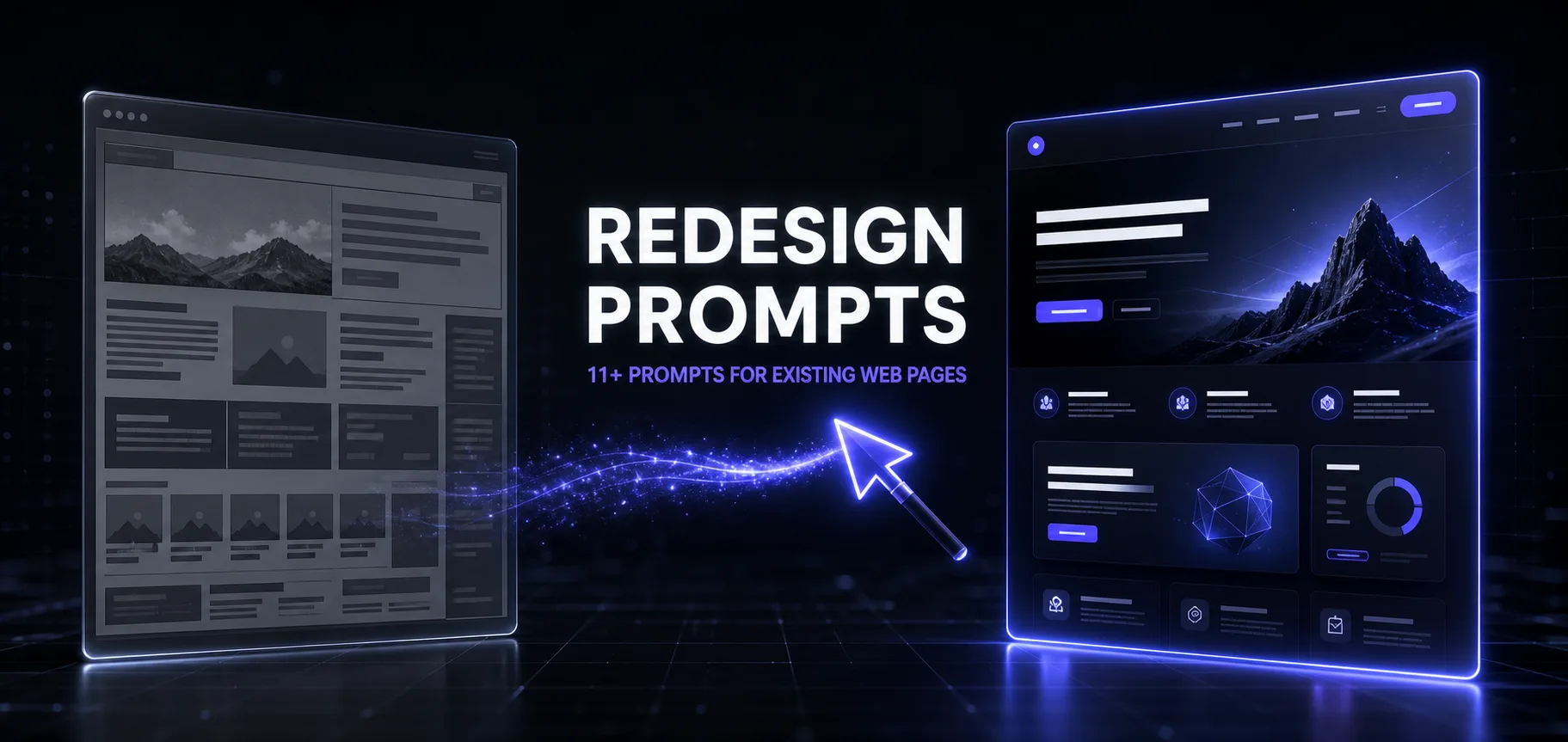
Redesigning an existing page is a different job than designing a new one — and most AI prompts get this wrong. A new page starts from zero; a redesign starts from constraints: a brand you can't break, traffic you can't lose, URLs and SEO you must preserve, and existing users whose muscle memory has value. "Make this page modern" ignores all of that, which is why one-line redesign prompts produce pretty pages that convert worse than the ugly ones they replaced.
The 15 prompts below treat redesign as what it actually is: a reference to aim at, a diagnosis of what you have, and surgical rebuilding. The first six are the heavy artillery — reference-driven redesigns that point your page at a site whose design you admire and rebuild toward it, using Firecrawl to analyze the reference at every viewport. The rest cover the workflow around them: audits, direction, conversion, accessibility, and the QA gate. They work in Claude Code, Claude Design, ChatGPT, v0, Cursor — and if your repo has a design.md, mention it in every one.
The Redesign Loop: Audit → Concepts → Rebuild → Ship

The prompts are grouped as a workflow, and the order is the method: pick a real reference or run a real audit before any pixels move (prompts 1–8), never pick a direction from one option (prompt 9), and rebuild in slices, not wholesale (prompt 14). Skipping to the pretty part is how redesigns lose the conversions the old page quietly earned.
Reference-Driven Redesign Prompts

The strongest constraint you can give an AI isn't an adjective — it's a URL. "Make it premium" produces guesses; "make it feel like this site" produces direction. These six prompts run on that principle, using Firecrawl (the scraping/screenshot tool available as an MCP server in Claude Code and most agent setups) to capture the reference site's rendered screenshots and page structure at desktop, tablet, and mobile sizes — so the model designs from what the reference actually looks like, not from its guess about the URL. No Firecrawl? Attach your own full-page screenshots at each viewport and the prompts work the same.
One line you'll see repeated across all six, because it's the line that matters: this must not be a reskin. Without it, models change the accent color, round the corners, and declare victory.
1. The Strong Reference Match
The flagship: rebuild your page toward a site you admire.
The Strong Reference Match
Redesign [EXISTING_WEBSITE_URL] using [REFERENCE_WEBSITE_URL] as the primary UI/UX reference.
Use Firecrawl to analyse both the rendered screenshots and page structure at desktop, tablet, and mobile sizes.
Keep my website's content, but substantially redesign its: page composition and section order; grid, containers, alignment, and content widths; typography hierarchy and text treatment; spacing, padding, whitespace, and visual rhythm; navigation, hero, cards, buttons, forms, and CTAs; backgrounds, borders, shadows, imagery, and decorative elements; hover states, transitions, scroll effects, and animations; responsive layout and mobile behaviour.
This must not be a basic reskin or color change. The final page should closely reflect the reference site's overall visual character, layout density, component styling, and interaction patterns while remaining original.
Deliver a complete responsive HTML page and a detailed design.md.
Note the deliverable: the page plus a design.md. That second file is what makes the redesign repeatable across your other pages instead of a one-off — it's the same leverage we covered in how design.md improves AI coding results.
2. The No-Superficial-Redesign Contract
Force the model to document the reference's system before coding.
The No-Superficial-Redesign Contract
Use Firecrawl to inspect:
Content source: [EXISTING_WEBSITE_URL]
Design reference: [REFERENCE_WEBSITE_URL]
Rebuild my page using my existing content and the reference site's design language.
Do not simply change colors, fonts, or border radius. Make significant structural and visual changes to the layout, hero, navigation, section composition, cards, buttons, spacing system, content hierarchy, responsive behaviour, and animations.
Before coding, identify the reference site's: layout system, typography scale, spacing rhythm, component patterns, visual depth, interaction style, and responsive behaviour. Then apply those principles consistently throughout the redesign.
Generate index.html, supporting CSS/JS, and design.md.
The "identify before coding" step is the quality gate here — the model that can articulate the reference's spacing rhythm applies it consistently; the one that skips straight to code applies it to the hero and forgets it by the footer.
3. The Screenshot-Led Recomposition
Content from your site, composition from theirs — with license to reorganize.
The Screenshot-Led Recomposition
Analyse [REFERENCE_WEBSITE_URL] through Firecrawl screenshots at multiple viewport sizes.
Use [EXISTING_WEBSITE_URL] only as the source of content and functionality.
Recompose the entire page so that its layout, proportions, visual hierarchy, section flow, typography, spacing, cards, buttons, navigation, backgrounds, animations, and responsive behaviour feel closely aligned with the reference.
You may reorganize, group, shorten, or reposition existing content where necessary to fit the new composition, but do not invent unsupported claims.
Avoid a surface-level redesign. Replace the existing layout system with a new one inspired by the reference.
Deliver a polished responsive HTML page and design.md.
The differentiator: explicit permission to reorganize content. Prompts 1 and 2 preserve your structure more conservatively; this one lets the reference's composition win — use it when your current section order is part of the problem.
4. The Component-by-Component Match
Systematic parity, element by element.
The Component-by-Component Match
Redesign [EXISTING_WEBSITE_URL] using [REFERENCE_WEBSITE_URL] as the visual benchmark.
Use Firecrawl to analyse the reference component by component: header and navigation, hero composition, section layouts, content grids, cards and feature blocks, buttons and CTAs, forms, typography, spacing, background treatments, animations and interactions, and mobile layout.
Create equivalent original components for my website using my existing content.
The redesign must involve major layout and aesthetic changes, not only token or color changes. Match the reference's design quality, proportions, density, hierarchy, and interaction style as closely as possible without copying its branding or assets.
Create the working HTML/CSS/JS page and design.md.
The component checklist turns "make it look like theirs" into twelve verifiable sub-tasks — and gives you a natural review structure: walk the checklist against the output and you know exactly which components still lag the benchmark.
5. The Multi-Reference Blend
Best-of-three, composed into something original.
The Multi-Reference Blend
Redesign [EXISTING_WEBSITE_URL] using these references: [REFERENCE_URL_1], [REFERENCE_URL_2], [REFERENCE_URL_3].
Use Firecrawl screenshots and page analysis to identify the strongest layout, typography, spacing, component, animation, and interaction patterns from each reference.
Keep my existing content, but rebuild the full page structure and visual system. Make substantial changes to section composition, grids, content hierarchy, navigation, hero, cards, buttons, backgrounds, whitespace, and responsive behaviour.
Do not produce a simple theme or palette change. Create a cohesive, premium, and original interface that feels comparable to the references.
Deliver index.html, required assets, and design.md.
Three references solve single-reference risk in both directions: the output can't drift into cloning any one site, and weaknesses in one reference get outvoted by the other two. Pick references that share a register (all premium-minimal, all dense-editorial) or the blend fights itself.
6. The One-Shot Claude Code Redesign
The full pipeline — analysis, documentation, build, self-review — in one prompt.
The One-Shot Claude Code Redesign
Use Firecrawl to deeply analyse:
Content website: [EXISTING_WEBSITE_URL]
Design reference: [REFERENCE_WEBSITE_URL]
Capture and study screenshots at desktop, tablet, and mobile sizes. Analyse both the visible design and underlying page structure.
Preserve my content, but completely replace the current design approach with one inspired by the reference, including: layout architecture and section flow, container sizes and grid proportions, typography scale and hierarchy, spacing and whitespace rhythm, navigation, hero, cards, buttons, and CTAs, borders, shadows, backgrounds, and visual depth, hover effects, transitions, scroll animations, and micro-interactions, and responsive transformations.
This is not a color-swap task. Make major and clearly visible structural, aesthetic, and interaction changes.
Do not start implementation until the reference design system has been documented. After implementation, compare the result against the reference and perform another refinement pass if it still resembles the original layout.
Deliver: a complete production-quality responsive HTML page, supporting CSS and JavaScript, and a design.md containing extracted design tokens, layout rules, component specifications, animation behaviour, breakpoints, and implementation decisions.
Use the reference closely for design direction, but do not copy its text, logos, images, branding, or proprietary assets.
This is the one we run in Claude Code when we want the whole job in a single agentic session: document-first discipline, a built-in self-comparison pass, and the ethical boundary stated outright — direction yes, assets never. If you only save one prompt from this article, save this one.
Diagnosis Prompts
Reference-driven redesigns answer "what should it become." These two answer "what is it now" — run them when you don't have a reference, or before choosing one.
7. The Brutal Page Audit
Before touching anything: find out what's actually wrong — and what isn't.
The Brutal Page Audit
Audit this page like a design director who bills $500/hour and doesn't flatter clients: [PASTE URL, HTML, OR ATTACH FULL-PAGE SCREENSHOT].
Page goal: [WHAT IT EXISTS TO DO — e.g. convert visitors to trial signups]. Audience: [WHO].
Score it 1-10 on: visual hierarchy, message clarity in the first 5 seconds, scannability, trust signals, CTA prominence, and consistency. For each score below 8: the specific problem, where exactly it appears, and the severity for the page goal.
End with two lists: "must fix" (hurting the goal today) and "leave alone" (working, don't touch in the redesign). The second list matters as much as the first.
The "leave alone" list is the guardrail most redesigns never build. Feed it into whichever reference prompt you run next — everything on that list is protected, which is how you avoid redesigning away the reasons the page currently works.
8. The Design-Language Extraction
Reverse-engineer what you have before deciding what to keep.
The Design-Language Extraction
Extract the current design language from this page: [PASTE THE CSS/HTML OR ATTACH SCREENSHOTS].
Document what actually exists: the color palette with hex values and each color's apparent role, the type scale (sizes, weights, line heights), spacing patterns, corner radii, shadows, and the recurring component styles (buttons, cards, forms, nav).
Then judge it: which of these tokens are worth carrying into a redesign (they carry brand equity or work well) and which are accidents of history. Output as a design.md-style brief I can hand to the redesign step — real values only, no inventing what isn't there.
This output becomes the redesign's constitution — and when you run the reference prompts above, it's how the new design keeps your brand colors while adopting their composition. Our guide on writing better design.md files covers what a keeper-quality version looks like.
Direction and Rebuild Prompts
9. The Three-Concept Divergence
Three genuinely different directions — not one idea in three fonts.
The Three-Concept Divergence
Propose 3 redesign concepts for this page: [ATTACH AUDIT FROM PROMPT 7 + DESIGN LANGUAGE FROM PROMPT 8].
The three must genuinely diverge: (A) the conservative evolution — same structure, refined execution; (B) the conversion-first rebuild — structure reordered around the page goal, even if it looks less "designed"; (C) the bold reposition — the direction we'd pick if we weren't afraid.
For each: the one-line art direction, what changes structurally, what it keeps from the "leave alone" list, the main risk, and which metric it should move. Do NOT blend them into one safe middle option — I'll choose, then we execute the winner.
Forcing labeled divergence (conservative / conversion / bold) prevents the failure mode where all three "options" are the same design with different accent colors. Choose with your metric, not your mood — and if concept C needs a visual target, that's your cue to go find a reference URL and run prompt 1.
10. The Above-the-Fold Rebuild
The 5-second test, passed by design.
The Above-the-Fold Rebuild
Rebuild only the above-the-fold section of this page: [ATTACH CURRENT HERO HTML/CSS OR SCREENSHOT].
The 5-second contract it must pass: a first-time visitor can answer "what is this, who is it for, what do I do next" without scrolling.
Deliver: rewritten headline + subhead (outcome-first, max 12 words for the headline, no buzzwords), one primary CTA with the label naming the outcome, visual hierarchy spec (what the eye hits 1st, 2nd, 3rd and why), and the production-ready code using our existing design tokens: [PASTE FROM PROMPT 8].
Constraint: nothing below the fold changes yet. Give 2 headline variants for testing.
Heroes earn their own prompt because they carry disproportionate weight — in most audits we run, the fold is where half the "must fix" list lives. Fix it first, measure, then continue.
11. The Conversion-Pass Redesign
Redesign the persuasion, not just the pixels.
The Conversion-Pass Redesign
Redesign this page for conversion without changing the brand look: [ATTACH PAGE + DESIGN TOKENS].
Conversion goal: [THE ACTION]. Current rate if known: [X%].
Work the persuasion layer: CTA hierarchy (one primary action per screen — demote or delete competing CTAs), friction audit (every field, click, and decision between arrival and goal — cut or defer each one you can), proof placement (move testimonials/logos/numbers to the moment of hesitation they answer, not a graveyard section), and objection coverage (the top 3 hesitations and where the page answers each).
Output: the revised page structure as an annotated section list — for every change, the persuasion reason. No decoration-only changes in this pass.
12. The Modernize-Without-Rebrand
Ten years newer, recognizably the same brand.
The Modernize-Without-Rebrand
Modernize this page's execution while keeping its brand identity intact: [ATTACH PAGE + THE KEEPER TOKENS FROM PROMPT 8].
Locked: logo, brand colors, typefaces [ADJUST TO YOUR CASE]. Open: everything else.
Apply current-era craft: a real spacing scale (nothing eyeballed), stronger type hierarchy with fewer sizes, generous whitespace, consistent radii and elevation, purposeful hover/focus states, and modern layout (CSS grid, fluid type, container queries where they earn it).
Banned: trend cosplay — no gradient meshes, glassmorphism, or animation garnish unless it serves comprehension. The test: a returning user says "they cleaned it up," not "they changed it."
13. The Accessibility Redesign
WCAG as a design brief, not a compliance chore.
The Accessibility Redesign
Redesign this page to meet WCAG 2.2 AA while improving — not compromising — its visual quality: [ATTACH PAGE].
Fix systematically: color contrast (audit every text/background pair against 4.5:1, adjust our palette minimally to pass — show the before/after hex values), focus states that are visible and on-brand, semantic structure (one h1, logical heading order, landmarks, real buttons vs links), form labels and error messaging, motion that respects prefers-reduced-motion, and touch/click target sizes.
Output: the issues table (element, WCAG criterion, fix), the adjusted token values, and the corrected code. Where accessibility forces a visual change, propose the version that looks intentional rather than remedial.
Shipping Prompts
14. The Section-by-Section Incremental Redesign
Ship the redesign in slices — never as a big-bang reveal.
The Incremental Redesign Plan
Turn this approved redesign direction into an incremental shipping plan: [ATTACH THE CHOSEN CONCEPT OR REFERENCE-PROMPT OUTPUT + CURRENT PAGE].
Slice the page into independently shippable sections (hero, social proof, features, pricing, footer...). For each slice: the specific changes, effort estimate (S/M/L), expected impact on [THE PAGE METRIC], dependencies on other slices, and what to measure for a week after it ships.
Order the slices by impact-to-effort. Then implement slice 1 only — production-ready code, visually coherent with the not-yet-redesigned sections around it (this constraint is real: no orphaned new-style islands). We ship one slice at a time and let the metrics vote.
This is the prompt that separates redesigns that survive from redesigns that get rolled back. Every slice is an experiment; the metric decides if the next slice ships. It pairs especially well with the reference prompts — their full-page output becomes the target, and this prompt sequences the journey there.
15. The Redesign QA Gate
The adversarial review before anything ships.
The Redesign QA Gate
Review this redesign against the original as a skeptic who liked the old page: [ATTACH BEFORE + AFTER].
Original audit and "leave alone" list: [PASTE FROM PROMPT 7]
If a reference site was used: [REFERENCE_URL] — judge whether the result matches the reference's quality without copying its branding or assets.
Check: did anything on the leave-alone list get changed anyway? Did any content, link, or SEO-relevant element (headings, meta, structured data, internal links) silently disappear? Does the new version pass the 5-second test better than the old one — or just look better? Any regressions in mobile, accessibility, or load weight?
Verdict per section: improved / lateral / regressed, with evidence. "Prettier but worse at the goal" is a rejection, and you should say so plainly.
Run this in a fresh conversation — a model reviewing its own redesign inherits its own taste. Same fresh-context rule as every review prompt in our Sonnet 5 cheat sheet.
Chaining Them: Two Pipelines
The reference pipeline — when you know what you want the page to feel like:
- Extract your design language (#8) so your brand tokens survive the transformation.
- Run the One-Shot Claude Code Redesign (#6) — or #1 for a single reference, #5 for a blend.
- Sequence the rollout with the Incremental Plan (#14).
- Gate every slice with the QA Gate (#15), fresh context.
The audit pipeline — when you know something's wrong but not what right looks like:
- Brutal Audit (#7) + Design-Language Extraction (#8) — one conversation, both outputs saved.
- Three-Concept Divergence (#9); the specialist prompts (#10–13) execute the slices the audit flagged.
- Incremental Plan (#14), then the QA Gate (#15) per slice.
The Meta-Rules Behind All 15
- A reference URL beats a paragraph of adjectives. Pointing at a real site is the strongest design constraint you can give a model — that's why the reference prompts lead this list.
- Ban the reskin by name. "This must not be a basic reskin or color change" appears in every reference prompt because without it, that's exactly what you get.
- Direction, never assets. Match a reference's quality, proportions, and interaction patterns — never its text, logos, images, or branding. The line is stated inside the prompts so the model enforces it too.
- Protect what works. The audit's "leave alone" list rides along in every prompt. Redesigns die by collateral damage, not by bad new ideas.
- Demand design.md as a deliverable. Every reference prompt outputs one — it's what turns a one-page redesign into a system for your whole site.
- Ship in slices, review in fresh context. The metric decides whether the redesign continues, and the QA gate never runs in the conversation that did the design.
The Verdict
AI is genuinely great at redesign work in 2026 — better than at blank-page design, honestly, because redesign is constraint-satisfaction and models thrive on explicit constraints. The reference-driven prompts are the purest form of that: the constraint is a real site, analyzed at three viewports, with the reskin escape hatch welded shut. Supply the reference, the protected list, and the tokens, and the model does the rest. Run the One-Shot (#6) on your worst-performing important page this week — the before/after will make the case better than this article can.
Going deeper on the design side: 25+ Claude Design prompts for net-new design work, turning your design system into a Skill, and the developer sets — Fable 5 for web developers and the Next.js collection — for when the redesign becomes a build.
Keep Building
Browse the full prompt library, more guides, and the AI skills collection on PromptsRush.
Frequently Asked Questions
9 questions answered