The PromptsRush journal
Tutorials20 Prompts to Improve an Ugly AI-Generated Website
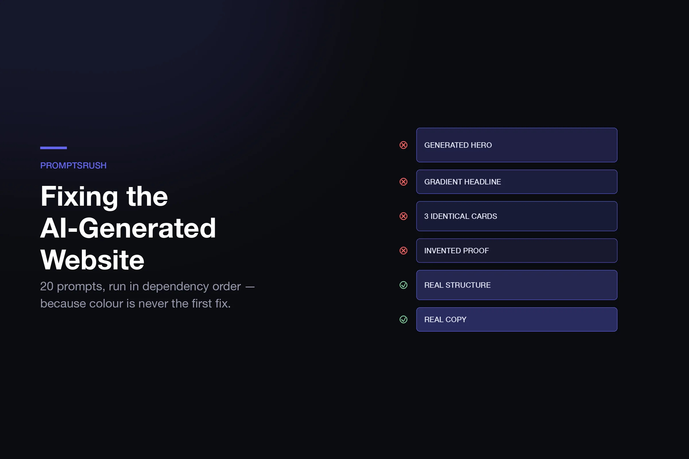
AI-generated ugly is a specific, finite, recognisable ugly — the same violet gradient, the same three cards, the same invented testimonials. Name the tells, then fix them in dependency order with 20 targeted prompts.
Advertisement
An AI-generated website is not ugly in a general way. It is ugly in a specific, finite, recognisable way — the same violet gradient, the same three feature cards, the same centred column, the same "Transform your workflow with AI-powered insights" headline. Once you can name the tells, fixing them stops being a taste problem and becomes a checklist.
That is the useful thing about AI slop: it is predictable. A model asked for a landing page returns the statistical centre of every landing page it has seen, so every model returns roughly the same page. Your site does not look bad because the model failed. It looks bad because it succeeded at producing the most probable page, and the most probable page is by definition the one that looks like everything else — the same reason every vibe-coded site arrives looking identical no matter which tool built it.
Below are 20 prompts organised by which tell they fix, in the order you should run them. The order matters more than the prompts do, and the section after next explains why.
First: Identify Which Tells You Actually Have
Open your page next to this table. Every row you recognise is a real defect with a known cause. You probably have eight to twelve of them.
| The tell | Why the model does it | Damage |
|---|---|---|
| Violet-to-indigo gradient hero | Overwhelmingly the most common hero in training data | High — instant recognition |
| Gradient text on the headline | Same, plus it reads as "modern" in older tutorials | High |
| Everything centred in one max-width column | Safest layout; never breaks | High — kills all composition |
| Three identical feature cards with icons | The canonical "features section" shape | High |
| Same shadow and same radius on every element | One utility class copied everywhere | Medium — flattens hierarchy |
| Inter at default weights | Framework default; never questioned | Medium |
| Uniform section padding top to bottom | No reason to vary it without instruction | Medium — no rhythm |
| Round-number stat band (99.9%, 10x, 24/7) | Statistically the most common stats shown | High — reads as fabricated |
| Testimonials from invented people | Asked for testimonials, got plausible ones | Severe — credibility |
| "Trusted by 10,000+ teams" with no logos | Social proof pattern without the proof | Severe |
| Emoji as section icons or bullets | Cheap visual variety | Medium |
| Gradient orbs blurred in the corners | Decoration that costs the model nothing | Low |
| The same CTA label six times | No instruction to vary intent | Medium |
| Dark mode as a straight inversion | Cheapest way to satisfy "add dark mode" | Medium |
| No empty, loading, or error states | Only the happy path was requested | High for apps |
| Generic hero copy with no specific claim | Nothing in the prompt said what you do | Severe |
Two rows on that list are not design problems at all. Invented testimonials and unsupported "trusted by" claims are fabricated evidence, and they are the first thing to remove — before any styling work — because no amount of visual polish makes a fake customer quote acceptable to ship. Delete them now, whatever else you do with this article.
Fix in Dependency Order, Not Symptom Order
The instinct is to fix what annoys you most, which is usually the colour. That is the wrong first move, because colour decisions depend on layout decisions, and layout changes invalidate colour work.
The order that avoids rework:
- Evidence — delete anything fabricated. Non-negotiable, takes two minutes.
- Copy — because layout should serve real content, and generic copy makes every layout look generic regardless of how it is styled.
- Structure — composition, grid, section rhythm. The biggest single visual change available.
- Type — the scale and pairing that the structure now needs.
- Colour and depth — now that you know what is emphasised and what is not.
- Detail — motion, states, edges, focus rings.
- Verification — does it still read as AI-generated to a stranger?
Run it in this order and each pass builds on the last. Run it backwards and you will restyle the same button four times.
When Repairing Is the Wrong Call
Before you start: repair is not always cheaper than rebuild, and the deciding factor is what the thing actually is.
If it is a product — an app with state, auth, real data — repair is almost always right, because the codebase carries value the design does not. If it is a marketing page, a launch page or a funnel, the calculus flips. A page with no state and no logic is not a codebase you gain anything by owning, and the builder options for that job have improved enough that the trade is no longer obvious. Twenty prompts against a codebase whose design system was never coherent to begin with is a lot of effort to arrive at "acceptable," and you end up owning a codebase you did not want in order to serve a page that has no business logic in it at all.
The honest question is whether you wanted a repository or wanted a page. If the answer is a page — and for most launch pages, lead magnets and campaign destinations it is — rebuilding on something where the design system is already coherent takes an afternoon and ends with a page that never had the tells in the first place.
Onepage is the practical version of that escape hatch: drag-and-drop pages that hold their layout when you edit them, 650+ templates that were designed by people rather than averaged by a model, multi-step forms and quizzes for capture, and a free tier for three pages so you can test the rebuild-versus-repair question before paying anything. Paid plans run $19.90/month for 7 pages up to $179.90/month for unlimited. The reason it solves the specific problem in this article is structural: you cannot generate the violet-gradient default if you are starting from a designed template and editing content into it.
If you do want to keep the codebase, everything below applies. Read on.
Tier 1 — Evidence and Copy (Prompts 1–4)
1. The fabrication sweep
Scan this page and list every claim presented as fact that I have not
verified: testimonials, customer names, logos, statistics, ratings,
user counts, awards, certifications, "trusted by" claims.

For each: quote it, and mark it KEEP (I can substantiate it),
REPLACE (real version exists, needs my input), or DELETE.

Do not suggest replacement copy yet. Just the inventory.
2. The specificity rewrite
Here is my hero copy: [PASTE].

It could describe any product in any industry. Rewrite it so it could
only describe this one: [WHAT IT ACTUALLY DOES, WHO FOR, WHAT IT
REPLACES, WHAT IT COSTS].

Rules: no "transform", "unlock", "empower", "seamless", "revolutionise",
"supercharge", "elevate". Name the specific thing that happens.
Give me 5 options ranging from plain to bold.
3. The proof-instead-of-adjective pass
For every adjective and superlative on this page, either replace it with
the concrete fact that justifies it, or delete it.

"Blazing fast" becomes a number. "Loved by teams" becomes a named
customer or gets cut. "Enterprise-grade" becomes the specific
certification or gets cut.

Show me a table: current phrase | what would justify it | my suggestion.
4. CTA intent differentiation
This page has [N] calls to action, most labelled the same thing.

Map each one to where the reader actually is when they reach it —
just arrived, mid-evaluation, convinced, or hesitating — and write
a label that matches that state.

The button after a pricing table should not say the same thing as
the one in the hero. Explain each choice in one line.
Tier 2 — Structure (Prompts 5–9)
Structure is the single biggest visual change available to you, and it is the tier people skip because it feels like more work than restyling. If your page needs wholesale recomposition rather than the targeted fixes below, the reference-driven approach in prompts for redesigning existing pages is the heavier tool for that job.
5. Break the centred column
Every section on this page is centred content in a max-width container.

Propose 3 restructured compositions that use asymmetry on purpose:
off-centre focal points, a broken grid, full-bleed elements set against
constrained text, or a sidebar that carries real content.

For each, tell me what it costs in readability and at which breakpoint
it stops working. Then implement the one I pick — do not implement all 3.
6. Kill the three-card reflex
My features section is [N] identical cards in a grid.

The features are not equally important. Rank them by what actually
makes someone buy, then redesign the section so the layout expresses
that ranking — different sizes, different treatments, or a completely
different pattern than a card grid.

Anything that ranks below 4th: argue for cutting it.
7. Vertical rhythm audit
List the vertical padding of every section top to bottom.

They are almost certainly all the same, which is why the page reads as
a flat list. Propose a rhythm where spacing communicates grouping —
related sections tighter, major shifts wider — and give me the exact
values on a consistent scale.
8. Section transition design
Right now every section is a stacked box with the same background.

Design the transitions between them: where does the background change,
where does a full-bleed element break the grid, where does the content
width shift. I want a reader to feel they are moving through a document
with structure, not scrolling a list of blocks.

Give me a section-by-section plan before any code.
9. Responsive intent, not reflow
Audit this page at 375px, 768px and 1440px.

Tell me where the mobile version is just the desktop version stacked
vertically. For each of those, redesign for what someone on a phone is
actually doing — and change the section ORDER where the priority
differs, do not only change the widths.
Tier 3 — Typography (Prompts 10–13)
10. Escape the default font
This page uses [FONT] at default weights, which is the framework default
rather than a decision.

Project: [DESCRIPTION]. Audience: [AUDIENCE]. Tone: [3 ADJECTIVES].

Propose 4 pairings from Google Fonts. For each: heading face, body face,
why they work together technically (x-height, contrast, width), and the
mood produced. Exclude Inter, Roboto and Open Sans.
11. Build a real type scale
Extract every distinct font-size, weight and line-height currently used
on this page and show me the list.

It is probably arbitrary. Replace it with a scale built on a [1.25 /
1.333] ratio from a 16px base: 7 steps in rem, each with its use case,
line-height and letter-spacing. Larger sizes get tighter tracking.

Then map every existing element onto the new scale.
12. Hierarchy stress test
Assign every piece of text on this page a level in the hierarchy.

Show me where two adjacent elements are competing for the same level —
that competition is why the page feels noisy.

Fix by changing size, weight, colour or spacing, in that order of
preference. Size is the blunt instrument; try the other three first.
13. Kill the gradient headline
My headline uses gradient text: [PASTE].

Give me 5 alternatives that make it visually distinct without a gradient:
weight contrast, a colour accent on one word, scale jump, a rule or mark,
or restrained letter-spacing.

Implement the one that suits [TONE]. Do not propose any gradient.
Tier 4 — Colour and Depth (Prompts 14–17)
Colour is the tell everyone notices and the one you should fix fourth. If judging hex values in a terminal is not how you want to make these calls, Claude Design's prompt workflow gives you something to look at while you decide.
14. Repalette from a real constraint
Replace this palette entirely, starting from ONE fixed colour: [HEX or
"pick one that suits [INDUSTRY/MOOD] and justify it"].

Give me 2 neutrals, 1 accent, and a 9-step tint/shade ramp for each.
Every text-on-background pair must state its contrast ratio and pass
WCAG AA. Show me the combinations you rejected and why.

Banned: violet-to-indigo, and any gradient as a background fill.
15. Depth without the default shadow
Every card here has the same shadow, so nothing reads as elevated.

Define an elevation system with 3 levels, and state which UI role sits
at each. Then get depth from things other than shadow where you can:
borders, background steps, overlap, scale.

Apply it, and tell me which elements you demoted to flat.
16. Colour as information
Right now colour on this page is decoration.

Assign every colour a job: primary action, destructive, success,
warning, informational, disabled, and brand accent. Then find every
place a colour is used for a reason other than its assigned job and
fix it.

Nothing should be coloured just because it looked plain.
17. Dark mode as a design
My dark mode is an inversion of the light palette, which is why it
looks cheap.

Design it properly: pure black backgrounds and pure white text are both
wrong. Elevated surfaces get lighter, not darker. Saturated brand colours
usually need desaturating to survive on dark.

Give me the full token set with contrast ratios, and name every token
whose role changes between the two modes.
Tier 5 — Detail and Verification (Prompts 18–20)
18. State completeness
For every interactive element on this page define all states: default,
hover, focus-visible, active, disabled, loading, error.

Show me which ones are currently missing — focus-visible almost
certainly is, which is an accessibility failure and not a polish item.

Then define empty and error states for every region that displays data.
19. The generic test
List every element on this page that would appear on a generic
AI-generated landing page for any product in any industry.

For each one: either justify why it earns its place on THIS page
specifically, or replace it with something that could only belong here.

Be aggressive. I would rather cut a section than keep a generic one.
20. The stranger audit
You are a designer seeing this page for the first time, asked one
question: "does this look AI-generated?"

Answer honestly, then list the specific evidence that led you there,
ranked by how strongly each one gives it away.

For the top 5, give me the exact fix. Do not compliment anything.
Running the Whole Thing as One Pass
If you would rather do this in a coding agent than prompt by prompt, the sequencing above becomes a single brief. Give the agent the tier order as an explicit constraint, and make it stop for approval between tiers — the failure mode of one-shotting a redesign is that it rewrites your structure and your copy simultaneously and you cannot tell which change caused which effect.
The other thing worth doing once rather than repeatedly: write the constraints down. Every prompt above encodes rules — no gradient text, no violet-to-indigo, elevation has three levels, colour has assigned jobs — and re-typing them into every session is how they get lost by the third file. A design.md the agent reads automatically turns them from something you repeat into something the tool already knows, and writing one that actually changes output is a short exercise with a large payoff.
Pro tip: Take a screenshot before you start and keep it. Three tiers in, you will lose your sense of how bad it was, and the comparison is the only honest measure of whether the work is paying off.
Five Ways This Goes Wrong
- Regenerating instead of fixing. Asking for the whole page again returns the statistical centre again — a different arrangement of the same tells. The gains come from targeted, critical passes, not from another roll of the dice.
- Fixing colour first. It is the most visible tell and the most tempting starting point, and every layout change afterwards invalidates the work.
- Keeping the fake proof "for now". Placeholder testimonials have a way of surviving to production. Delete them in the first pass, before you are attached to how the section looks with them in.
- Accepting praise as review. Unprompted, models compliment. If you did not explicitly ask for criticism and forbid compliments, you did not get a review — you got agreement.
- Polishing a page that should be rebuilt. Prompt fifteen on a marketing page you never wanted to own as code is a signal, not a milestone.
The Verdict
AI-generated ugly is the easiest ugly to fix, because it is not a failure of taste — it is a small set of documented defaults, each with a known cause and a specific counter-prompt. Work in dependency order, delete the fabricated evidence before anything else, and finish with the stranger audit so a real critic tells you whether it worked.
And when you are twenty prompts deep into a page with no business logic in it, stop. Not every page needs to be a codebase.
Keep Reading
Packaging your fixed design system into a reusable skill stops the next project starting from the same defaults, and Claude Design vs Figma covers where AI design tooling still stops short. Browse all prompts on PromptsRush.
Frequently Asked Questions
10 questions answered