The PromptsRush journal
Tutorialsdesign.md Marketplace Guide: Ship Consistent UI With AI Coders
How to take a design system from the Promptsrush design.md marketplace to a matching first screen: pick, preview in light and dark, copy the tokens and design.md into your repo, and wire it into Claude Code or Cursor, with three copy-ready prompts.
Advertisement
Short version: an AI coder ships consistent UI when it reads the same design file every session, not when you describe the look again in chat. Pick a design system, check it in light and dark mode, copy its tokens into your CSS and its design.md into your repo, then point your agent at that file before it touches a component. The Promptsrush design marketplace gives you the first three steps in a few clicks. The fourth is a habit.
Most AI-built interfaces drift for a boring reason: nobody told the model which blue, which radius or which font, so it guesses fresh on every screen. We've covered why a design file fixes that in how design.md improves AI coding results. This guide is the practical follow-up: how to get a ready-made design.md from our marketplace and wire it into Claude Code, Cursor or a chat-based builder so every screen comes out matching.
Sources: the live marketplace and its designs database, Google's DESIGN.md announcement, spec and CLI, and the Claude Code and Cursor docs, all checked on 30 October 2026. Opinions are labelled.
What You'll Get From This Guide
- What design.md is, where Google's open spec fits and how coding agents read project files.
- A tour of the marketplace: 38 approved designs, what each page shows and what the exported file contains.
- A four-step workflow (pick, preview, copy, ship) with exact setups for Claude Code and Cursor.
- Three copy-ready prompts and the pitfalls that quietly undo the whole thing.
What a design.md File Is and How It Steers an AI Coder
A design.md is a plain Markdown file that describes a visual system to an AI agent. It pairs exact values (colours, fonts, spacing, radius, shadows, component specs) with short prose explaining when and why to use them. The values stop the model guessing. The prose stops it applying them in the wrong places.
The idea got a formal spec this year. On 21 April 2026, Google open-sourced the draft DESIGN.md format from its Stitch design tool so it could be used across tools. The spec on GitHub puts machine-readable tokens in YAML and design rationale in Markdown sections, and states the rule plainly: "The tokens are the normative values. The prose provides context for how to apply them." It's still versioned alpha, and Google says to expect changes.
It's the visual counterpart to the instruction files agents already read, such as CLAUDE.md in Claude Code and AGENTS.md or project rules in Cursor (we break those down in our guide to AGENTS.md and CLAUDE.md). The instruction file says how to build. The design file says what the result should look like.
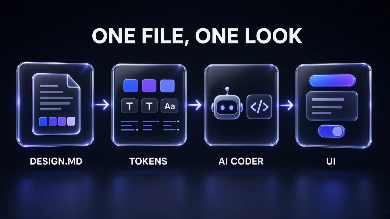
Here's how one file steers the output. The design.md holds the brief and the tokens. The tokens become CSS variables in your project, so the code itself carries the palette. The agent reads the file (through an import, a rule or a paste) before it writes markup, and reaches for bg-primary and rounded-lg instead of inventing hex codes. Every screen it builds draws on the same small set of values, which is what makes them look like one product.
One caveat: Anthropic's docs say Claude treats CLAUDE.md files "as context, not enforced configuration". A design file makes matching output far more likely, not guaranteed, which is why the workflow below ends with a review.
What's Inside the Promptsrush Design Marketplace
The Promptsrush design marketplace is a catalogue of complete design systems built for AI coding. Each design is token-backed: its colours, type, radius, shadows, motion and component specs live as structured tokens, and the site renders the preview, the CSS exports and the downloadable design.md straight from them. Nothing is a screenshot.
Here's what the catalogue held when we checked it on 30 October 2026:
- 38 approved designs, all with both light and dark modes.
- All 38 under the MIT licence, all exporting for shadcn/ui, Tailwind and plain CSS variables.
The designs fall into five groups:
| Group | Designs | Built for | Examples |
|---|---|---|---|
| SaaS & Dashboard | 7 | Products, dashboards and tools | Nocturne, Cobalt, Graphite |
| Marketing & Landing | 8 | High-impact landing pages | Colorblock, Horizon, Aurora |
| Editorial & Content | 8 | Reading-first blogs and docs | Broadsheet, Quill, Manuscript |
| Minimal & Mono | 7 | Quiet, type-led interfaces | Monolith, Carbon, Bone |
| Bold & Experimental | 8 | Loud, scroll-stopping brands | Neon Grid, Bauhaus, Synthwave |
On the listing page you browse by look rather than by group: a search box takes theme names, styles or fonts, and style chips filter by Minimal, SaaS, Editorial, Brutalist, Glassmorphic, Retro, Playful, Corporate, Dark and Monochrome, 12 results to a page.
Each detail page, such as the Nocturne dark SaaS theme, has four parts you'll use:
- A live preview of a sample product page with a Light and Dark toggle.
- Foundations: click-to-copy swatches, WCAG contrast grades, the type scale, radius, shadows and rendered components.
- Guidelines: do's and don'ts, spacing, motion, iconography, accessibility and component specs.
- Exports: Download and Copy design.md buttons, plus CSS Variables, Tailwind v4, tokens.json and design.md tabs.
Anatomy of a Marketplace design.md
The exported file is built from the design's tokens by the site's own generator, so every design's file has the same shape. Generated from that code, the files for all 38 designs run from 438 to 504 lines, roughly 12,000 to 20,000 characters. In order, each one contains:
- Front matter: name, description, style and mood tags, frameworks, modes, fonts, licence and version.
- The design brief, written by hand, with Principles and When to use sections.
- "How to use this with your AI agent": a ready instruction to paste alongside the file.
- Design principles as Do and Don't lists.
- Foundations: light and dark values per CSS variable, type scale, spacing, radius, elevation, borders, motion and iconography.
- Component specs for button, badge, alert, form field and card.
- Accessibility rules with a measured light-mode contrast table.
- Code blocks: tokens as JSON, CSS variables for
globals.cssand a Tailwind theme.
For Nocturne, the measured contrast table reads 18.72:1 for body text, 4.76:1 for muted text and 6.29:1 for text on the primary button. The same figures appear on the detail page, so the agent gets real numbers rather than a vague promise of accessibility.
Pro tip: This is a design.md in spirit, not in Google's exact schema: the tokens sit in JSON, not Google's YAML groups. Version 0.4.0 of Google's@google/design.mdCLI finds no tokens in the Nocturne export (its Tailwind export comes back as an empty@themeblock), so use the marketplace's own CSS Variables or Tailwind v4 tab for code.
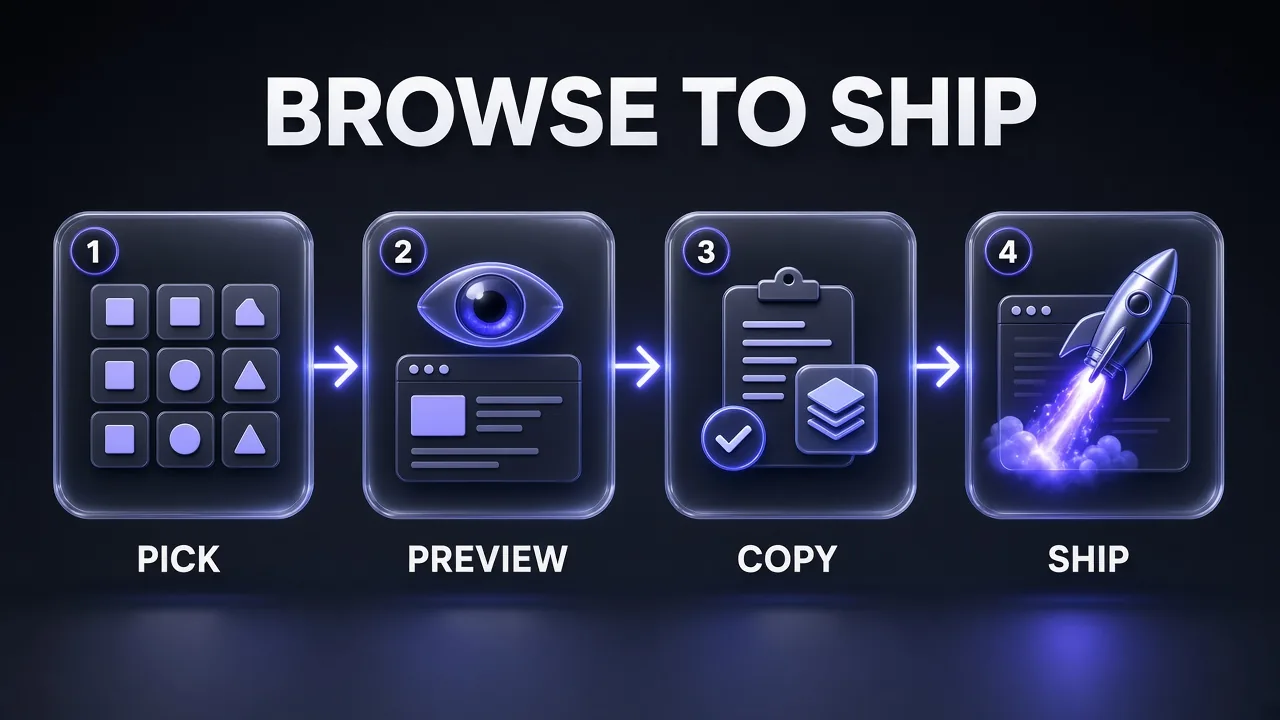
The Workflow at a Glance: Pick, Preview, Copy, Ship
Here's the whole path from the catalogue to a matching screen. Each step has one job and one check before you move on.
- Pick: shortlist two or three designs whose "When to use" section matches your product, then choose one.
- Preview: check the choice in light and dark mode, read the contrast grades and look at the rendered components.
- Copy: paste the CSS variables into your project, save the design.md in your repo and connect it to your agent.
- Ship: build the first screen with a prompt that names the file, then review the output against it before you build more.
Step 1: Pick a Design That Fits the Product
Start from the product, not the palette. A theme that looks great on a landing page can be tiring in a dashboard someone uses all day. Every brief has a "When to use" section, and the best ones also say when to pick something else. That's your fastest filter.
A practical way to shortlist:
- Dashboards and tools: start with the SaaS group. Cobalt is a cobalt-blue theme with a dashboard-ready scale for data apps, and Graphite is a dark steel admin theme for dense operator screens.
- Docs, blogs and knowledge bases: look at the Editorial group. Quill pairs Source Serif 4 with an indigo accent tuned for documentation, while Broadsheet goes full newspaper with Playfair Display headlines and hairline rules.
- Landing pages: the Marketing group, such as Colorblock, a soft neo-brutalist theme with pastel blocks, navy ink and hard offset shadows.
- Developer and AI products: the Minimal group, such as Monolith, a pure-monochrome, dark-first system set in Geist and JetBrains Mono.
If you already know a constraint, such as a font, search for it. If you're torn between two or three, paste each brief (the opening paragraph plus Principles and When to use) into this prompt:
Pick the Right Design System for My Product
You are a product designer helping me choose a design system for an app I am building with an AI coding agent.

My product:
- What it is: [ONE-SENTENCE PRODUCT DESCRIPTION]
- Main screens: [E.G. DASHBOARD, SETTINGS, PRICING PAGE]
- Users and context: [WHO USES IT, FOR HOW LONG, LIGHT OR DARK PREFERENCE]
- Brand words: [THREE ADJECTIVES]

Below are the briefs of three candidate design systems, each with its Principles and When to use sections.

Candidate 1:
[PASTE BRIEF]

Candidate 2:
[PASTE BRIEF]

Candidate 3:
[PASTE BRIEF]

For each candidate:
1. Score the fit from 1 to 5 against my main screens and users, with one sentence of reasoning.
2. Name the single biggest risk, for example too loud for long sessions or too quiet for a landing page.
3. Quote the line from its When to use section that supports it or rules it out.

Then recommend one and tell me what to check in its light and dark previews before I commit. Do not invent colours or fonts that are not in the briefs.
Step 2: Preview It Like a Real Screen
The detail page exists so you can find problems before your agent builds twenty screens with them. Open your pick and work through it top to bottom:
- Flip the preview between Light and Dark. All 38 designs ship both, several are dark-first, and the mode you didn't plan for is the one that surprises you.
- Read the contrast grades. The colour section grades body text, muted text, the primary button, card text and the accent against WCAG. Muted text is usually the tightest pair. On Nocturne's light mode it's 4.76:1, just above the 4.5:1 AA line.
- Look at the rendered components. Buttons in six variants, badges, an input, a card and a callout show how the radius, borders and shadows feel together, which a palette alone can't tell you.
- Skim the guidelines. The do's and don'ts are the rules your agent will be held to. If you already know you'll break one (say, "Don't add a second accent colour" when your brand has two), pick a different design now.
Changing a token after the agent has built a dozen components is easy. Changing the whole design language isn't.
Step 3: Copy the Tokens and the design.md Into Your Repo
The look needs two homes: the CSS your code uses and the file your agent reads. Skip either and the agent reads about values your code doesn't have.
1. Paste the CSS variables. In the design's export panel, open the Tailwind v4 tab (or CSS Variables if you don't use Tailwind) and copy it into your global stylesheet, usually globals.css in a shadcn/ui project. You get :root values for light mode, a .dark block and, in the Tailwind tab, an @theme inline block mapping each variable to Tailwind colour names. Values in code are values the agent reads instead of remembering, an idea we unpack in our context engineering explainer.
2. Save the design.md. Click Download design.md (or Copy design.md) and save it as DESIGN.md in your project root, next to your AGENTS.md or CLAUDE.md, and commit it so everyone's agent sees the same file.
3. Connect it to your agent. This is where most setups fail: a file sitting in the repo isn't automatically in the model's context.
Claude Code
Claude Code expands @path imports in CLAUDE.md into context, so @DESIGN.md would load the full 440 to 500 lines into every session, even when you're fixing a database query. Anthropic's memory docs recommend keeping each CLAUDE.md under 200 lines and note that imports don't reduce context cost.
Our preference is a path-scoped rule. Rules in .claude/rules/ with a paths field load only when Claude reads or edits a matching file:
.claude/rules/ui.md

---
paths:
  - "src/components/**/*.tsx"
  - "src/app/**/*.tsx"
---

# UI rules
- Before creating or restyling any component, read DESIGN.md in the project root.
- Use the theme's CSS variables through Tailwind classes (bg-primary,
  text-muted-foreground, border-border). Never hard-code hex values,
  font names, pixel radii or shadows.
- If DESIGN.md and globals.css disagree, globals.css wins. Flag the mismatch.
Run /context in a session to confirm which memory files loaded.
Cursor
Cursor's project rules live in .cursor/rules/ as .mdc files (a plain .md file there is ignored). One detail from Cursor's rules docs matters here: a file you mention in a rule, like @DESIGN.md, "tells Agent where to look". It isn't pasted into the prompt. So put the rules that must always hold in the rule body, and let the agent open DESIGN.md for the details:
.cursor/rules/design-system.mdc

---
description: Design system rules for all UI work
globs: src/components/**/*.tsx, src/app/**/*.tsx
alwaysApply: false
---

- Read @DESIGN.md before creating or restyling a component.
- Use only the theme's CSS variables via Tailwind classes. No hard-coded
  hex values, font names, radii or shadows.
- One primary-coloured action per view; secondary actions use outline or ghost.
- Every interactive element keeps a visible focus ring.
If your repo uses AGENTS.md instead, one line ("All UI follows DESIGN.md; read it before any UI change") does the same job.
Chat-based builders
For tools without project files, do what the marketplace page suggests: paste the whole design.md into Claude, Cursor or v0 with the instruction from its "How to use this with your AI agent" section, and paste it again in every new chat.
Pro tip: Using both tools on one repo? Anthropic's docs say Claude Code's/initreads Cursor rules in.cursor/rules/when it drafts a CLAUDE.md. Move any UI detail it copies into the path-scoped rule so CLAUDE.md stays short.
Step 4: Ship the First Screen and Review It Against the File
Don't start with the whole app. Build one screen with lots of component types (a settings or billing page is a good test) and review it before anything else, because mistakes on screen one get copied into screens two to twenty. Name the file in the prompt even when a rule already points to it:
Build the First Screen From DESIGN.md
Read DESIGN.md in the project root before writing any code. It is the design system for this project, and its tokens are already defined in [PATH TO GLOBALS.CSS].

Build [SCREEN NAME, E.G. THE BILLING SETTINGS PAGE] with these sections: [LIST THE SECTIONS].

Rules:
1. Use only the theme's CSS variables through Tailwind classes (bg-background, text-foreground, bg-primary, text-muted-foreground, border-border). No hard-coded hex values, font names, pixel radii or custom shadows.
2. Follow the Components section for buttons, badges, inputs, alerts and cards: height, padding, radius and font weight.
3. Use the primary colour for one main action per view. Secondary actions use the outline or ghost style.
4. Follow the Accessibility section: visible focus ring, the touch target size it specifies, labels above inputs, and never colour as the only signal.
5. The screen must work in light and dark mode with no separate styles.

When you finish, list every place where you were unsure which token to use instead of guessing silently.
Then review it in a fresh session, so the reviewer isn't grading its own work:
Review a Screen Against DESIGN.md
You are a design reviewer. Compare the code for [SCREEN OR COMPONENT PATH] against DESIGN.md in the project root.

Check each area and report every issue with the file, the line and the DESIGN.md rule it breaks:
1. Colours: any hex, rgb or named colour that is not a theme variable.
2. Typography: fonts or sizes outside the type scale, and headings not using the heading font.
3. Shape and depth: radius or shadow values not listed in the Radius and Elevation sections.
4. Components: buttons, inputs, badges or cards that differ from the Components specs.
5. Principles: anything that breaks a Don't rule, such as a second accent colour.
6. Accessibility: missing focus styles, touch targets below the specified size, colour used as the only signal.

Do not change any code yet. Give me a numbered list of fixes, most visible first, then wait for my approval.
Once the first screen passes, the rest is mostly repetition. For layouts with more personality, pair the file with the Frontend Design skill. Retrofitting an existing app? Start with our prompts to fix an ugly AI-generated website.
No Design Fits? Start From a Reference and Submit Your Own
If none of the 38 matches your brand, the marketplace accepts submissions. The Submit a Design System page lets you paste tokens as JSON or import existing shadcn CSS variables, preview the result live, add a Markdown design brief, tag style, mood and frameworks, and publish a downloadable design.md. You need to be signed in, and submissions are reviewed before they appear in the public catalogue.
If you're starting from a site whose look you admire, Firecrawl can give you a structured starting point. Its scrape endpoint has a branding format that returns a page's colour scheme, brand colours, fonts, typography sizes and weights, spacing, border radius and button and input styles as JSON. Treat that as raw material, then make the system your own: don't reproduce another company's logo, name or trade dress. Our guide to Firecrawl with Claude covers the API setup.
Tool Stack for Consistent AI-Built UI
| Job | Tool | Why it's in the stack |
|---|---|---|
| Design system | Promptsrush design marketplace | 38 token-backed designs, light and dark, MIT, with design.md, CSS and Tailwind exports |
| Styling layer | shadcn/ui + Tailwind CSS | The exported variables map 1:1 to shadcn and Tailwind colour names |
| Agent instructions | CLAUDE.md, .claude/rules, .cursor/rules, AGENTS.md | Tell the agent when to read DESIGN.md and which rules always apply |
| Coding agent | Claude Code or Cursor | Both read project instruction files and can scope rules to file paths |
| Model plan | Z.ai GLM Coding Plan | One subscription that Z.ai says works inside agent tools including Claude Code |
| Framework docs | Tailwind CSS v4 Docs skill | Gives the agent current Tailwind v4 docs, so the theme block is used correctly |
| Reference extraction | Firecrawl branding format | Pulls colours, fonts and spacing from a reference page as JSON |
Common Pitfalls That Bring the Drift Back
- Loading the whole file into every session. A 450-line import in CLAUDE.md costs context on every task, UI or not, the effect we explain in what context rot is. Scope it with a path rule.
- Two sources of truth. If you tweak
--primaryin globals.css but not in DESIGN.md, the agent reads one value and the code has another. Anthropic's docs warn that when instructions conflict, Claude may pick one arbitrarily. Change both together, or re-export the file. - Mixing two designs. Pulling the palette from one theme and the components from another produces exactly the mismatch you were trying to avoid. Pick one system and adapt its tokens.
- Skipping the dark-mode check. If users can switch modes, both need the same review.
- Treating the file as enforcement. A design file is context. For rules that must never break, such as no raw hex values in components, add a lint rule or code review check as well.
- Feeding the marketplace file to Google's tools. Google's CLI expects its own YAML token schema. The marketplace file carries its tokens as JSON, CSS and Tailwind blocks, so use those exports directly.
Verdict: Pick Once, Then Make the Agent Read It Every Time
My take: the design file isn't the hard part any more. The marketplace hands you one with tokens, component specs and measured contrast. What decides consistency is the wiring: CSS variables in your code, DESIGN.md in the repo, a rule that scopes it to UI files, and a review of the first screen before you build the rest.
If you do one thing today, open the Quill documentation theme or any design that fits your product, check both modes, and run the Step 4 build prompt on a single page. One screen tells you whether the agent is reading the file.
Frequently Asked Questions
8 questions answered