Loading model...
Best Nano Banana 2 prompts
124 prompts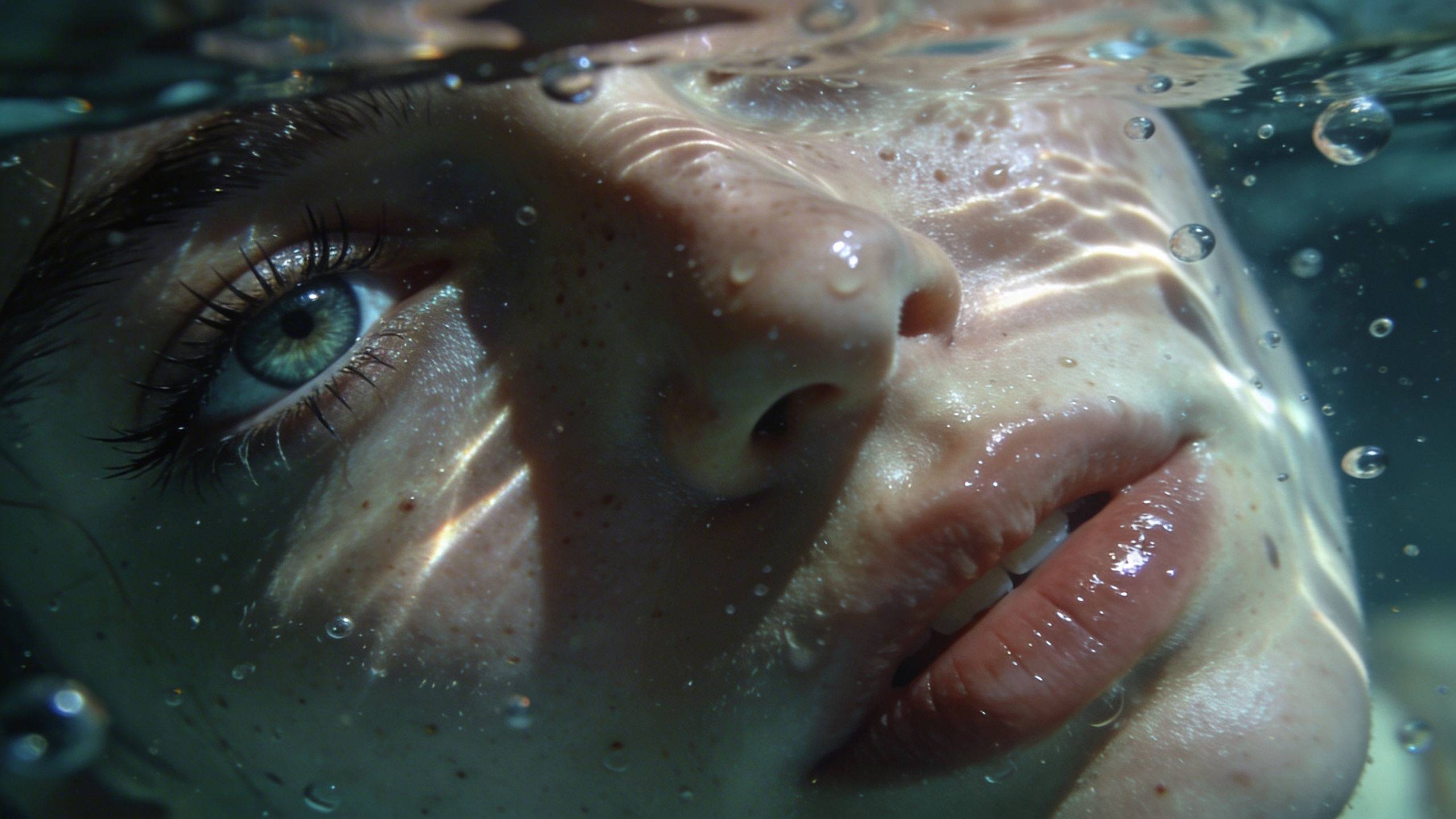
Image
Portrait & Character
Submerged Focus – Cinematic Underwater Half Portrait
This template creates a hyper-realistic underwater macro portrait showing only the left half of the subject’s face. The composition emphasizes intimacy, texture, and dreamlike atmosphere while maintaining strict identity accuracy.The visual focus is one sharply defined eye positioned at the far left of the frame, with underwater light caustics dancing across natural skin textures. The mood blends realism and surreal elegance, making it ideal for editorial portraits, artistic branding, cinematic posters, or conceptual social visuals.
229 Views
Image
Portrait & Character
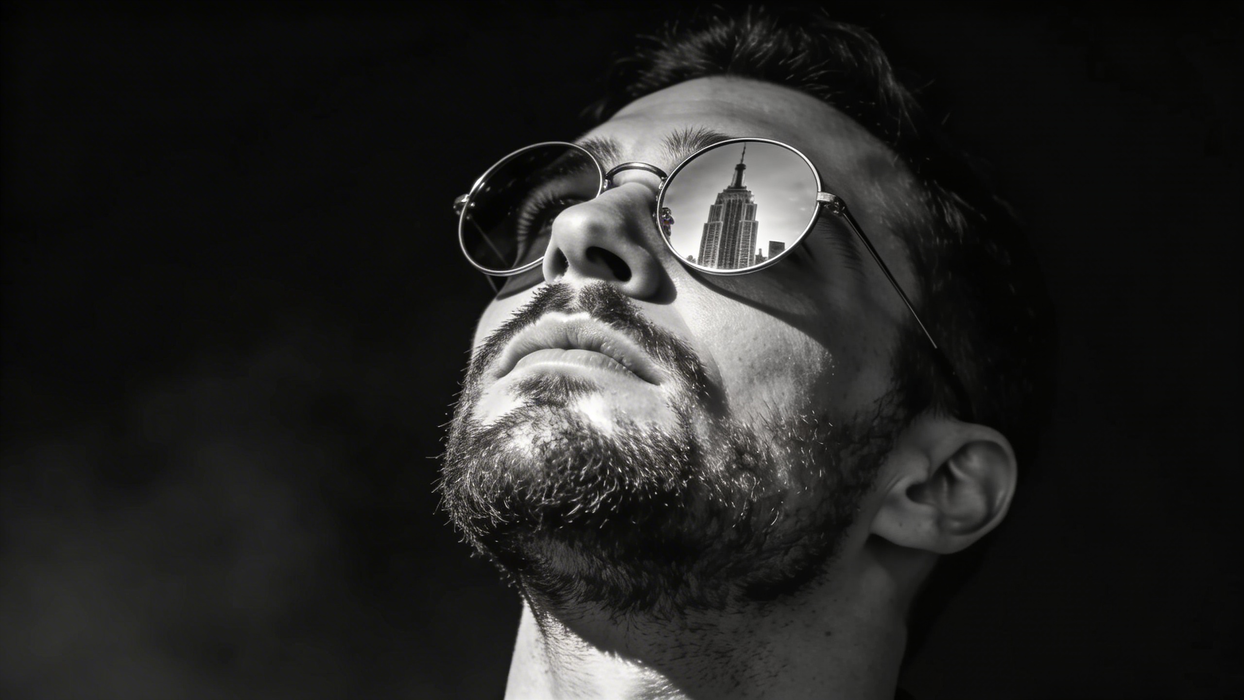
Noir Ascension – Cinematic Black & White Power Portrait
This template creates a dramatic, ultra-realistic black-and-white cinematic portrait with strong side lighting and deep contrast. The subject remains completely unchanged in facial structure and identity while the environment and lighting elevate the mood into a powerful noir-style visual.The reflective sunglasses act as a storytelling element, showing a towering city skyline — symbolizing ambition and dominance.Perfect for editorial branding, social media hero visuals, album covers, or cinematic character posters.
244 Views
Image
Featured
Education
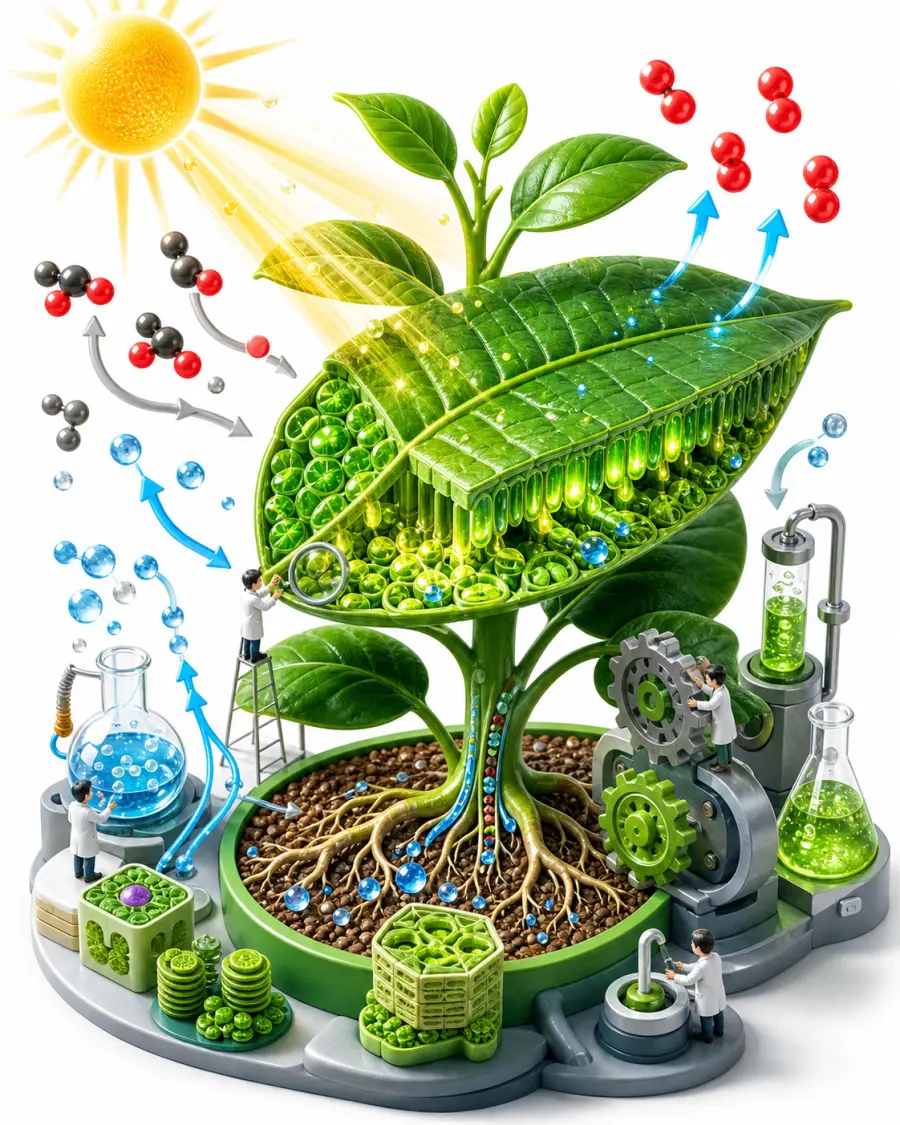
Engaging Isometric Educational Concept
This image prompt produces engaging, visually stunning 3D isometric illustrations for educational materials, explainer content, and e-learning. Isometric art is widely recognized for making complex or abstract concepts easier to digest by presenting them as interconnected miniatures. The prompt composes miniature characters interacting with scaled-up topic elements (books, gears, molecules, beakers or instruments), with small arrows and icons that make the idea readable at a glance, all under bright, even studio lighting on a clean white background at 8k resolution. What you can customize Educational Topic — the concept being illustrated; the default is photosynthesis with a cutaway leaf, glowing plant cells, and molecule flows Color Palette — the color scheme, such as vibrant emerald green and warm sun-yellow Illustration Style — five options: Playful 3D Cartoon, Clean Infographic, Detailed Diorama, Low-Poly, or Claymation Best for Header graphics for online course modules, textbook illustrations, PowerPoint or Keynote slide decks, and infographics explaining scientific, historical, or mathematical concepts. Instructional designers, teachers, Udemy and Skillshare instructors, textbook publishers, and EdTech startups can get custom illustrations without hiring a 3D artist. Tips for the best results Be specific with the topic. Instead of "science", specify "the human circulatory system" or "how a combustion engine works"; the Nano Banana Pro model handles specific details much better. Use color psychology: blue and teal palettes suit intense focus subjects like math and science, while vibrant oranges and yellows suit creative or energetic topics. The white background is deliberate, making it easy to run background removal or blend the image into white pages and slides. Avoid cluttered requests. "World history from Rome to WW2" in one prompt produces messy results; keep each generation narrowly focused. Avoid literal text overlays or specific diagram labels, as AI still struggles with accurate typography on complex shapes.
Image
Architecture & Interior
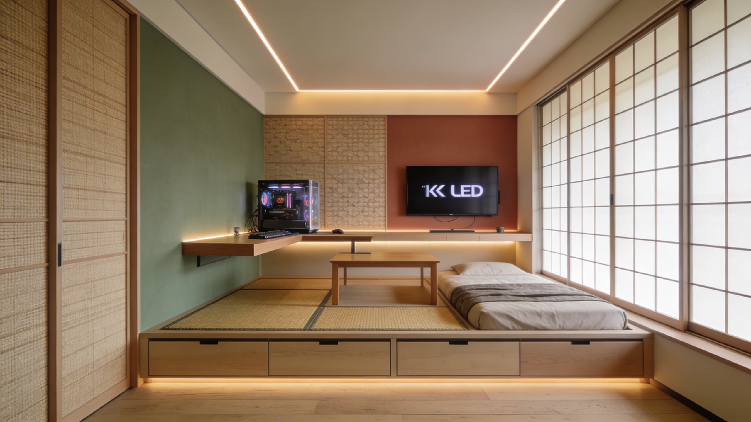
Luxurious Modern Japandi Interior
This prompt crafts stunning interior design renderings in the popular 'Japandi' aesthetic, a hybrid of Japanese minimalism and Scandinavian functionality. The style is defined by natural materials, warm neutral palettes and intentional simplicity, and the prompt locks those in: pale woods, muted earthy tones and a wide-angle lens that shows the full room layout. Output is photorealistic, interior-design-magazine-quality photography at 8k resolution. What you can customize Room Type — the space being rendered; the default is a spacious open-concept living room with a vaulted ceiling, but a detail shot like a close-up of a Japandi coffee table setup works too. Key Interior Features — the furniture and objects that anchor the scene, such as a low-profile curved bouclé sofa, a raw-edge wooden coffee table and a large indoor olive tree. Lighting — the light source and mood; the default is soft morning sunlight casting long shadows across a polished concrete floor. Best for Real estate staging concepts, interior design pitch decks, architectural mood boards and hero imagery for furniture or home decor e-commerce sites. Interior designers, real estate agents showing the potential of empty properties, architects and lifestyle brands needing high-end residential backgrounds for product composites all get value from it. Tips for the best results Focus on natural materials — request elements like "light oak wood", "linen upholstery", "wabi-sabi ceramics" or "paper lanterns" to ground the image in reality; Japandi thrives on texture. Let the light in: specifying "soft golden hour sunlight streaming through floor-to-ceiling windows" drastically improves the mood and premium feel. If you want a detail shot rather than the full layout, adjust the Room Type rather than fighting the wide-angle default. Avoid bold, chaotic colors or loud patterns like neon or busy florals, which break the serene minimalist aesthetic. Do not overcrowd the space with furniture; the power of this style is in the negative space and breathing room between objects.
Image
Productivity
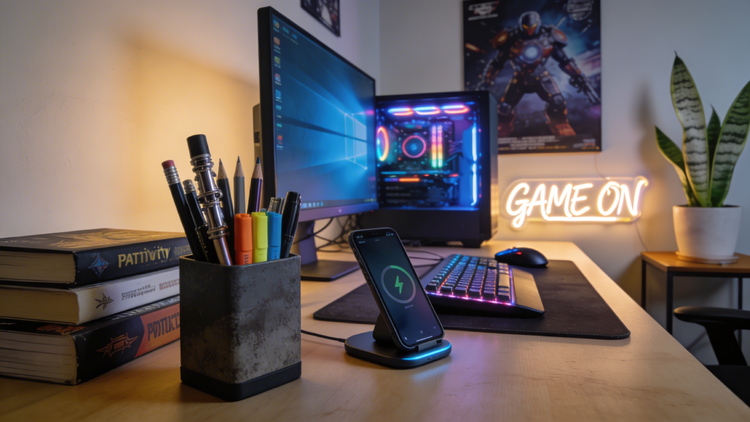
Deep Work Aesthetic Desk Setup
Generate cozy, highly curated desk and workspace setups that perfectly encapsulate the modern 'aesthetic productivity' and 'deep work' movements. The prompt renders lifestyle photography of a desk meticulously arranged for focus, with soft cinematic lighting and extreme attention to detail. The workspaces evoke a sense of focused calm and digital minimalism — the Instagram-worthy setup that productivity culture is built on. What you can customize Desk Items — what sits on the surface; the default is an open glowing tablet with a stylus, a minimalist mechanical keyboard and a steaming cup of matcha latte. Environment Vibe — three atmospheres: a cozy Rainy Afternoon by a large window, a Bright Minimalist Morning with harsh shadows, or a Late Night Hacker scene lit by monitor glow and a warm desk lamp. Best for Visual assets for productivity blogs, header images for task management apps, social posts for study-gram or workspace-setup accounts and background images for focus timer applications. Productivity software startups, lifestyle influencers, tech reviewers and writers get aspirational workspace imagery without cleaning and staging a physical desk full of expensive gadgets. Tips for the best results Curate the clutter: a productive desk is neither empty nor messy, so specifying two or three key items — an open laptop, a cup of coffee, a mechanical keyboard — yields the most realistic compositions. Pick the vibe that matches your content's tone; Rainy Afternoon yields cool, moody lighting while a sunny morning gives bright, energetic contrast. Add plant life — "a small potted succulent" or "trailing pothos plant" — to humanize a tech-heavy desk. Avoid requesting specific text on screens or in notebooks; the model will likely produce garbled text that ruins the photorealism. Avoid broad descriptions like "a desk with stuff on it"; the more specific the tools of the trade, the better the output.
Image
Architecture & Interior
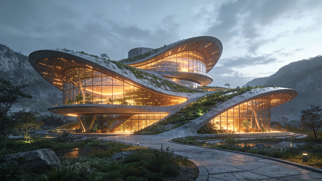
Sustainable Futuristic Architectural Render
Generate awe-inspiring, photorealistic exterior architectural visualizations focusing on sustainable, solarpunk, and eco-futurist design principles. The prompt merges massive modern structures with lush, integrated greenery and organic shapes, rendered at epic scale in an Unreal Engine 5 style architectural visualization. Warm glowing interior lights are built into every render, playing against cool exterior tones and foliage so the building looks inviting and inhabited. What you can customize Building Purpose — what the structure is; the default is a massive public botanical library and research center. Architectural Elements — the features that define the building, such as sweeping biomimetic curves, cascading vertical gardens and a transparent geodesic dome. Surrounding Environment — the context and time of day, from a lushly planted urban park at twilight to a dense metropolis or a coastal cliffside. Camera Angle / Perspective — three views: a dramatic Low Angle looking up, a sweeping Bird's Eye Aerial, or an Eye-Level Street View from a nearby walkway. Best for Urban planning concept proposals, architectural firm portfolios, science fiction world-building concept art and high-impact headers for sustainability and green-tech articles. Architects, urban planners, concept artists, real estate developers and environmental tech companies can use it to show investors or the public a compelling vision of a green future. Tips for the best results Specify eco-elements heavily in the Architectural Elements field — "cascading vertical gardens", "integrated solar panel glass", "living roofs" or "biomimetic curves" — to land the solarpunk look. Treat the surrounding environment as critical: a high-tech eco-building in a dense futuristic metropolis at dusk carries a very different emotional impact than one on a serene coastal cliffside. Use dusk or twilight settings to let the warm interior glow contrast against the exterior. Avoid gritty or dystopian keywords like "cyberpunk", "decay" or "grimy"; the goal is a utopian, clean, optimistic vision. Do not mix clashing historical styles, such as a futuristic gothic cathedral with solar panels, which can confuse the model and produce structural incoherence.
Image
Food & Culinary
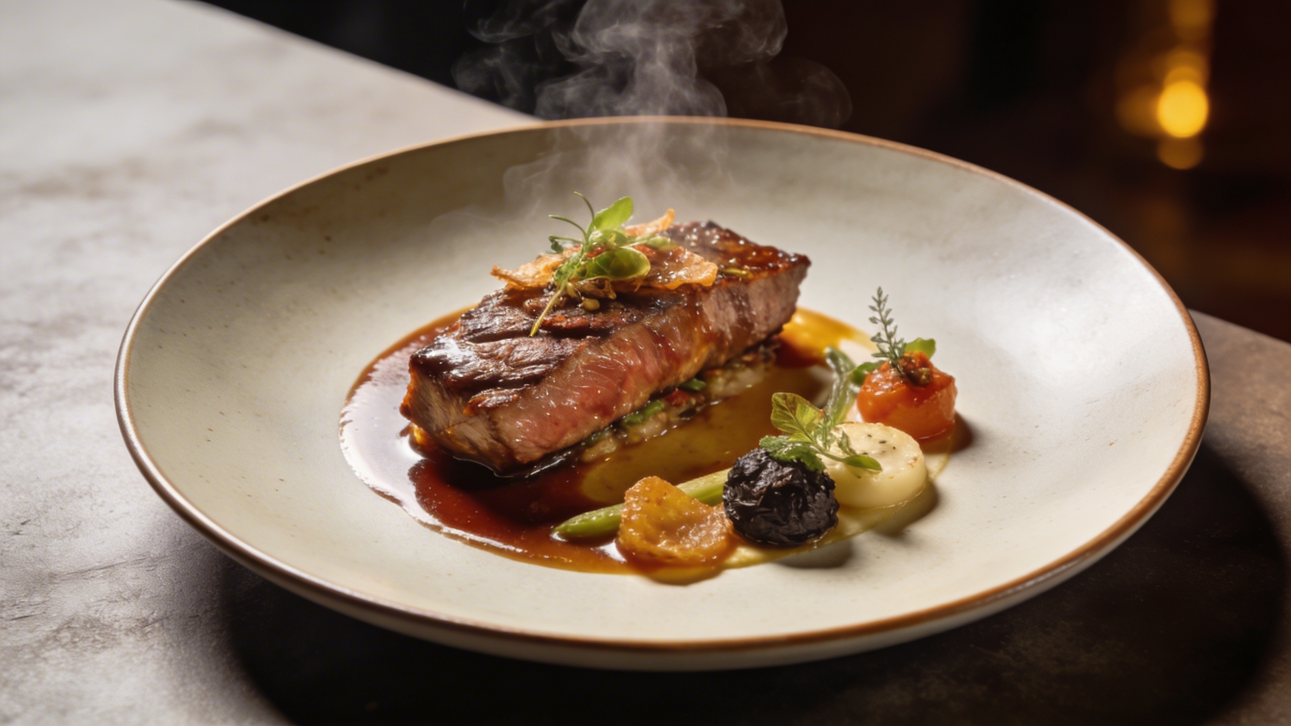
Michelin-Star Plated Gourmet Dish
This prompt is a gourmet food photography generator, simulating the styling, lighting, and cameras top culinary magazines use for Michelin-star dishes. It renders your dish in a Michelin-star dining presentation, shot from a flattering 45-degree angle with shallow depth of field, steam gently rising, and rich appetizing textures. The quality tail asks for an 8k, photorealistic culinary magazine aesthetic, so results read as premium commercial food photography rather than casual snapshots. What you can customize Dish Description — the food itself; the default is pan-seared diver scallops on pea purée with micro-basil and foam, and textural language here drives the result Plating Style — the plate or surface the dish sits on, such as a dark textured slate plate Lighting Style — three options: Dramatic Backlighting, Soft Window Light, or Moody Restaurant Table Best for Designing high-end restaurant menus, premium food blogs, and social media marketing for hospitality groups. It also lets executive chefs and menu designers prototype new plating concepts before anyone enters the kitchen. Tips for the best results Focus on texture in the dish description: "crispy seared skin", "velvety smooth purée", "glossy reduction drizzle". The engine excels at highlighting these details to trigger appetite. Use contrast in plating. Light-colored food belongs on dark slate or dark ceramic; dark food belongs on pristine white porcelain. Pick lighting deliberately: dramatic directional backlighting highlights steam and texture, while soft diffused window light gives a fresher, organic vibe. Avoid "messy" or "casual" food styles if you want to keep the premium feel; the AI interprets "messy" by adding unappetizing splatters. Keep non-food items out of the primary focus point, as they dilute the appetite appeal of the focal dish.
Image
Marketing
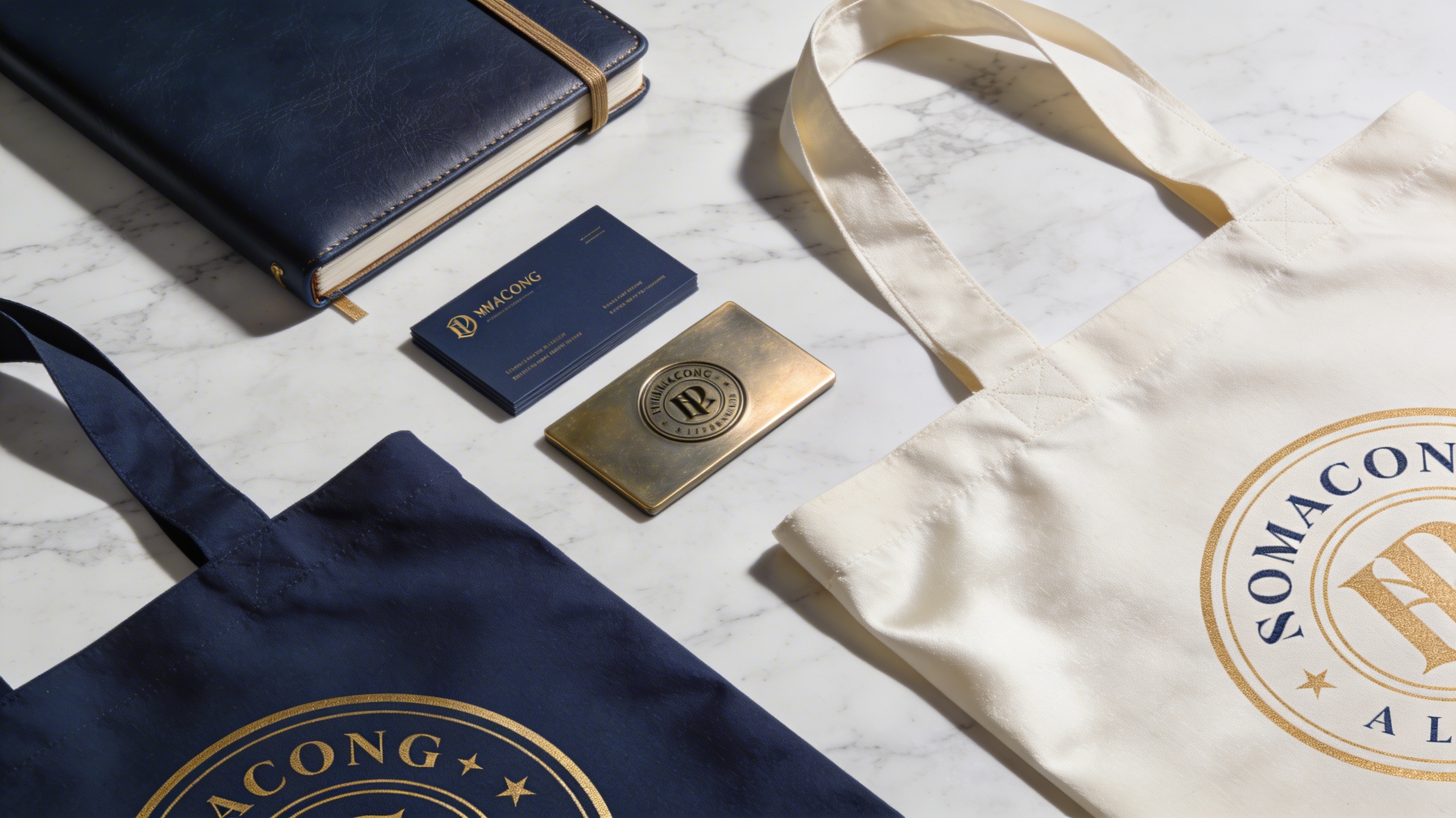
Professional Brand Identity Mockup Kit
This prompt is a brand identity mockup generator, creating photorealistic business cards, letterheads, packaging, and devices on a clean surface. It stages a premium flat-lay photography mockup with your chosen items arranged neatly on a surface material, the palette tinted by your brand colors, and corporate staging with sharp focus at 8k resolution. The result has the high-ticket, agency-level feel that elevates a pitch without 3D rendering software. What you can customize Mockup Items — the objects in the kit; the default is two stacks of matte business cards, a ceramic coffee cup, and an open textured notebook Surface Material — the desk or backdrop, such as a smooth terrazzo stone desk Brand Colors — the dominant palette, such as deep forest green and cream white Lighting & Shadows — three options: Soft Natural Light, Harsh Studio Lighting, or Moody Ambient Lighting Best for Client presentations, portfolio showcases, and brand guideline documents. Graphic designers, brand strategists, creative directors, and founders can visualize a brand's physical presence before sending anything to print and present it to investors, stakeholders, or customers. Tips for the best results Lighting is key. Choose soft natural light for organic brands (soft shadows from a nearby window) and harsh studio lighting for tech. Be specific about materials in the item and surface fields: matte paper, gold foil, organic textured cardboard, or sleek frosted glass all improve realism. Keep the objects cohesive so they make sense together for the industry you are representing. Avoid mixing too many unrelated or oversized items that break the flat-lay perspective. Do not describe complex, highly detailed logos; the engine excels at scene and mood rather than perfect typography.
Image
Marketing
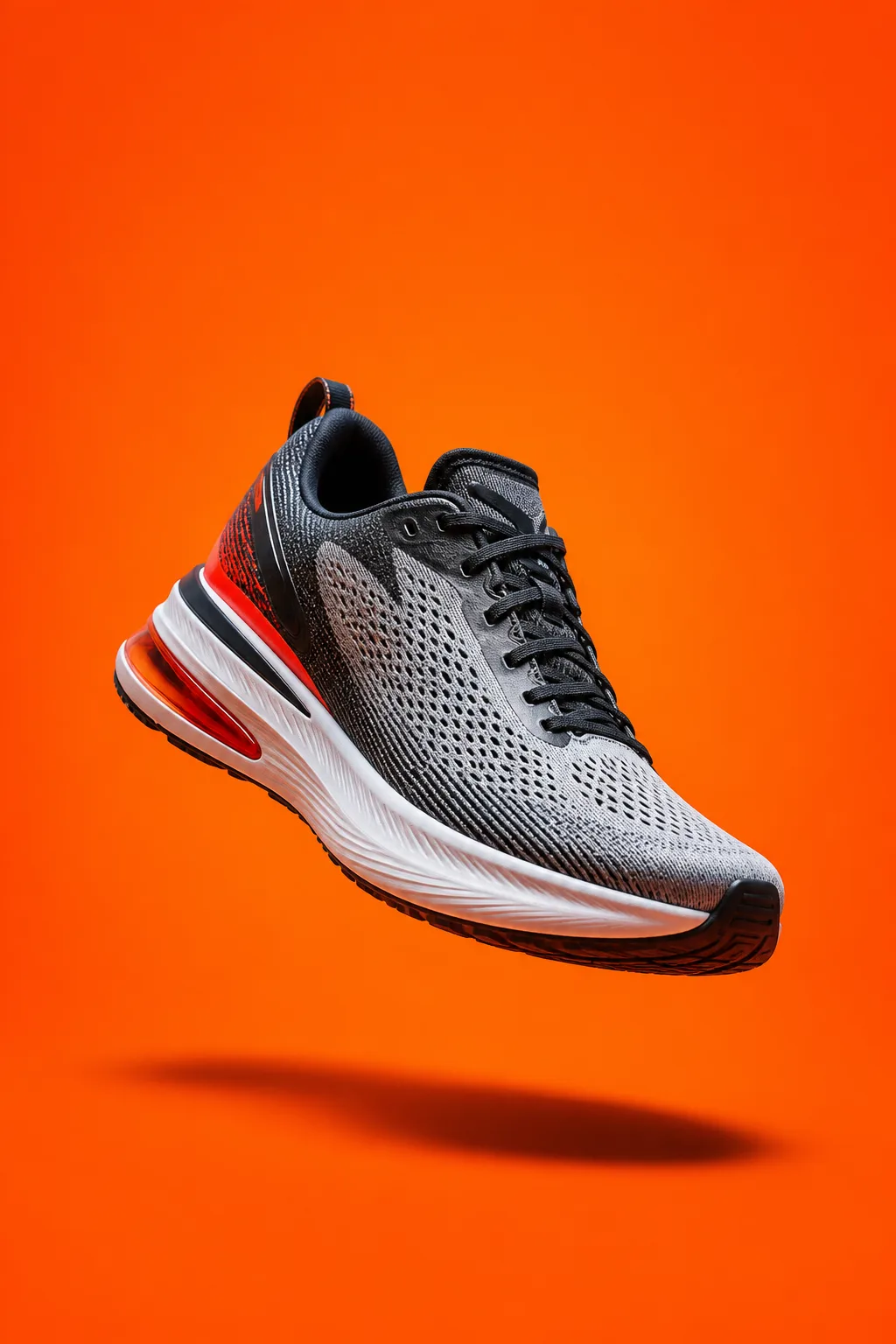
High-Converting Facebook Ad Creative
This versatile prompt generates optimized, visually arresting ad creatives tailored for digital marketing channels like Facebook, Instagram, and TikTok. The subject is centered and hero-lit against your background, with high contrast, crisp shadows, and saturated color designed to pop in a busy feed. The prompt reserves clean negative space for your headline and leaves that area empty of text, logos, and watermarks, delivering a bold, photorealistic 8k asset ready for copy. What you can customize Product / Main Subject — the hero object; the default is a high-performance running shoe hovering mid-air with a dynamic tilt Background Setting — the backdrop, such as a smooth, vibrant neon-orange studio backdrop Lighting Style — the light character, such as hard directional flash lighting Ad Style — five options: Bold Studio Product, Lifestyle In-Use, Splash / Dynamic, Flat-Lay Top-Down, or Luxury Minimal Negative Space Position — four options: Top Third, Left Side, Right Side, or Bottom Third Best for Performance marketing campaigns, social media advertising, and promotional announcements. Digital marketers, media buyers, e-commerce brand owners, and ad agencies can generate A/B testing variations by tweaking the subject or background to find winning combinations without photoshoots or stock images. Tips for the best results Keep it simple: define the focal product or service clearly so it stands out immediately. Use bold, contrasting colors in the lighting and background to stop the scroll. Plan for text overlays. Set the negative space position so there is room for headlines and calls to action. Avoid cluttered environments that distract from the main subject. Do not write contradictory prompts (a "minimalist neon maximalist" scene, for example); they can confuse the Nano Banana Pro engine and produce muddy visuals.

Image
Productivity
Minimalist Workflow Diagram Visualization
A highly effective and visually stunning tool for generating conceptual visualizations of workflows, data networks, or abstract organizational structures. It turns traditional charts into abstract 3D art: a clean, organized, forward-moving flow built from your visual metaphor, passing through sleek geometric nodes and gates that convey structure and progression. A minimalist palette of glowing elements against a dark background, soft depth of field, and a premium 8k render with no text or watermark complete the corporate tech aesthetic. What you can customize Workflow Concept / Idea — the process being represented, such as data being filtered and optimized into a streamlined process Visual Metaphor — the imagery carrying the flow; the default is glowing fiber-optic threads weaving from scattered strands into a single organized channel Primary Glowing Color — the highlighted hue, such as electric cyan and clean white Render Style — five options: Isometric 3D, Front Flow Diagram, Glass & Neon, Blueprint Wireframe, or Particle Network Best for Slide decks, corporate presentations, landing page hero images, whitepapers, and technical blog headers that need to explain systems, processes, or software architecture. Product managers, technical writers, business consultants, developers, and marketing teams can convey connectivity and workflow without sterile diagramming tools. Tips for the best results Abstract the concept. Glowing nodes connecting, interlocking geometric shapes, crystalline data streams, or cascading dominoes create far more impact than literal flowchart shapes. Inject your company's primary and secondary brand colors into the glowing color field for brand consistency. Keep the background dark, matte, or extremely clean so the visualization pops. Do not ask for literal text labels, arrows, or precise flowchart boxes; AI struggles with text layout and strict schematic logic. Add your own overlays in post-production. Avoid overly complex node structures that look chaotic; aim for clean, intentional lines of movement.
Image
Fashion & Beauty
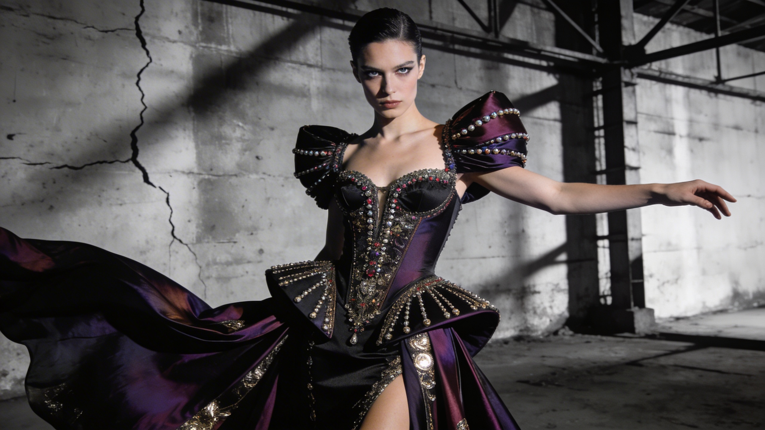
High Fashion Editorial
Generate striking, Vogue-level fashion editorial photography. The prompt renders a high fashion magazine editorial shot with a striking pose, dramatic directional lighting and haute couture detail, finished as an incredibly detailed 8k photograph. It is ideal for visualizing haute couture outfits, distinctive model looks and dramatic photography sets before anyone books a studio. What you can customize Model Look / Traits — the face, hair and presence of the model. The default is striking angular features with slicked-back silver hair; try freckles and a buzz cut, or long braids and bold brows. Outfit Style — the garment concept, which carries the editorial. The default is an avant-garde dress made entirely of reflective shattered glass; structured tailoring, feathers or liquid latex all read well. Backdrop — the set behind the model, from the default stark minimalist red studio background to a brutalist stairwell or a wind-swept dune. Best for Fashion lookbook concepts, designer mood boards, magazine cover mockups, styling portfolios and campaign pitches where you need a couture image fast. Tips for the best results Spend the most words on the outfit; material, silhouette and texture are what make the shot feel couture. Pick a backdrop color that contrasts the garment so the directional lighting carves out the shape. Keep the model description to two or three defining traits rather than a full biography. Avoid naming real designers or models; describe the look instead.
Image
Anime & Manga
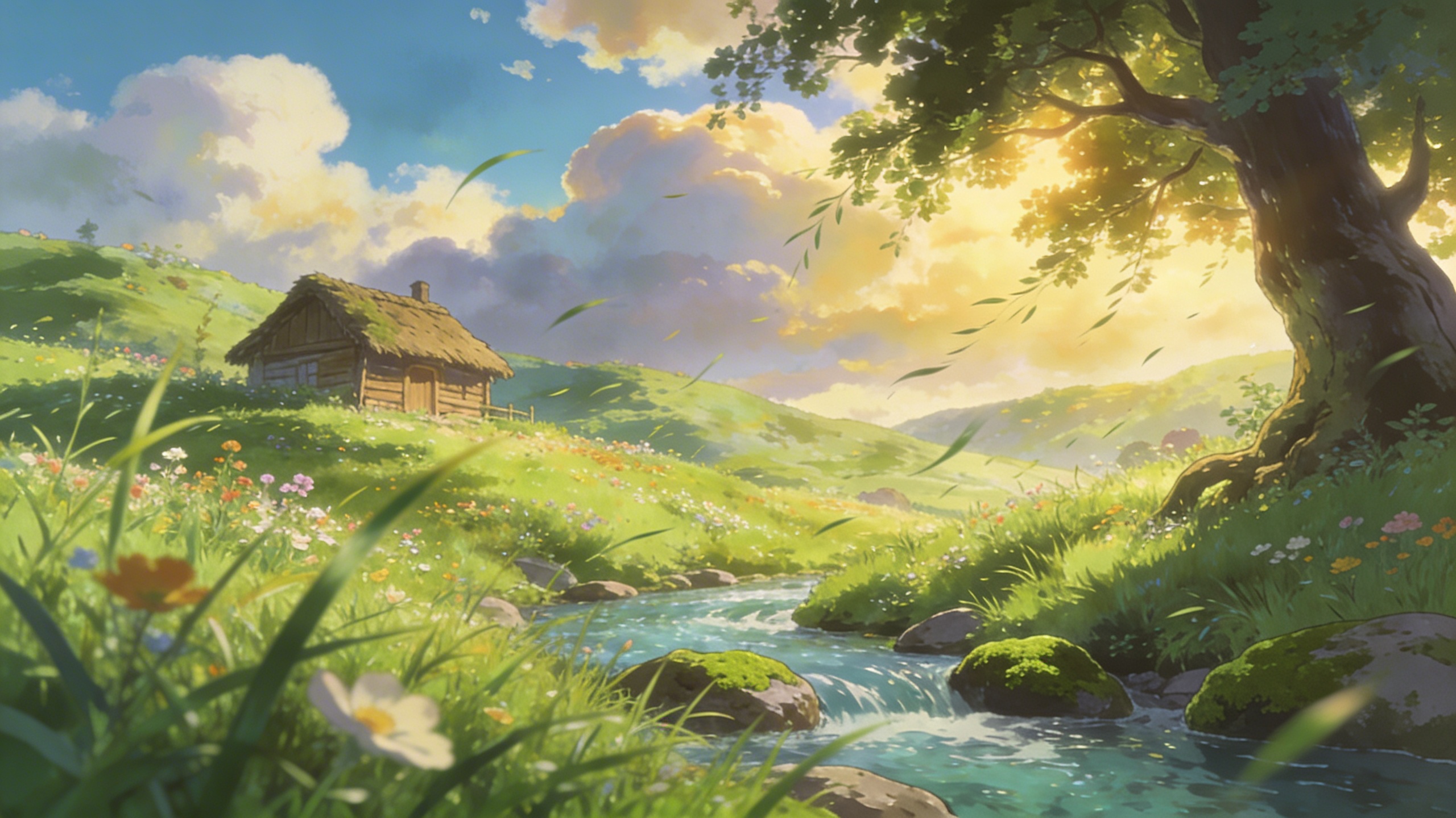
Ghibli-Style Anime Landscape
Tap into the nostalgic, painterly beauty of classic anime films. The prompt produces an anime-style landscape inspired by Studio Ghibli: lush green grass, painterly clouds, vibrant colours and wind blowing through the scene. It is framed as peaceful background art with highly detailed cel-shading, so the result feels like a still from a film rather than a character illustration. What you can customize Landscape Features — the subject of the scene. The default is a forgotten overgrown train station covered in vines with wildflowers everywhere; rural roads, seaside towns or hilltop shrines suit the style well. Sky Condition — the sky above it, from the default vibrant blue with towering cumulus clouds to sunset, drizzle or a starry night. Best for Stunning animated-style landscapes with lush greens, fluffy clouds and peaceful atmospheres. Use it for wallpapers, visual novel backgrounds, storyboard establishing shots, prints and nostalgic social content. Tips for the best results Lead the Landscape Features with something man-made and slightly abandoned, such as a station, a bridge or a farmhouse; the contrast with nature is what gives the style its nostalgia. Big cumulus clouds are the signature look. Keep the Sky Condition generous rather than flat or overcast if you want the classic feel. Mention grass, flowers or trees in the features so the wind-blown motion has something visible to move. Avoid characters and text; the prompt is tuned for background art and figures tend to render inconsistently.