The PromptsRush journal
Tutorials22 Prompts to Improve Landing Page Conversion Rates
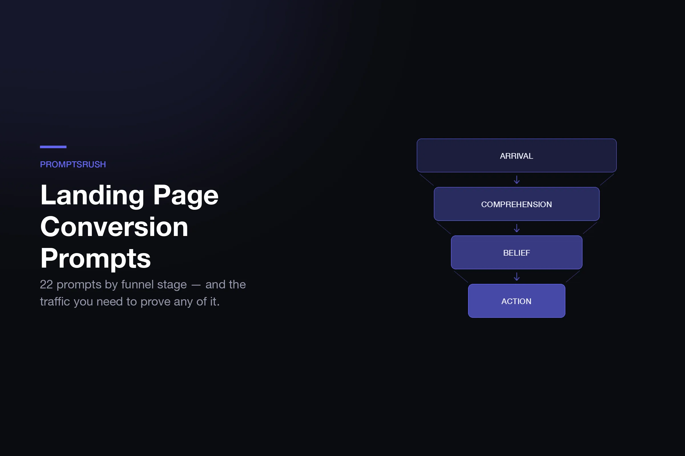
Conversion and beauty are different objective functions. 22 prompts grouped by the funnel stage they fix — arrival, comprehension, belief, action — plus the traffic you actually need before any of it is measurable.
Advertisement
Conversion rate and visual quality are different objective functions, and they trade against each other more often than anyone selling either will admit. The highest-converting page you have ever seen was probably not the most beautiful, and a page that wins a design award routinely underperforms an ugly one with a clearer promise.
That distinction is why "make my landing page better" is a useless prompt. Better at what? The prompts below optimise for one thing — a stranger arriving, understanding, believing, and acting — and they will occasionally tell you to make the page uglier. They assume a page already exists; if you are starting from nothing, building one with prompts first is the prior step.
One honest caveat before any of it: a prompt cannot tell you what converts on your page. It can generate a hypothesis, spot a friction point, or write a variant. Only your traffic decides which one wins. Anyone claiming an AI rewrite lifted conversions without a test measured a coincidence.
What You Actually Need Before Optimising
The uncomfortable arithmetic: detecting a real improvement requires more traffic than most pages get, and the lower your baseline, the more you need.
| Current conversion rate | Improvement you want to detect | Visitors needed per variant | Total for an A/B test |
|---|---|---|---|
| 2% | +20% (to 2.4%) | ~19,600 | ~39,200 |
| 2% | +50% (to 3%) | ~3,100 | ~6,300 |
| 5% | +20% (to 6%) | ~7,600 | ~15,200 |
| 5% | +50% (to 7.5%) | ~1,200 | ~2,400 |
| 10% | +20% (to 12%) | ~3,600 | ~7,200 |
| 10% | +50% (to 15%) | ~600 | ~1,200 |
Approximate sample sizes at 80% power and 95% confidence, two-sided. The pattern to take away: if you get under a few thousand visitors a month, you cannot reliably detect a 20% lift, and you should stop trying. Make large, confident changes instead of small ones, judge them over longer windows, and accept that you are reasoning rather than measuring. That is a legitimate way to work — pretending a 3-day test on 400 visitors proved something is not.
Pro tip: Before optimising anything, check whether your conversion problem is actually a traffic-quality problem. A page converting at 0.4% on cold paid traffic and 9% on referrals does not have a page problem.
Find Where You Are Losing People First
Every landing page loses visitors at one of four stages, and the fix is completely different at each. Optimising the wrong stage is the most common way CRO effort produces nothing.
- Arrival — they leave in under 5 seconds. The page did not match what they clicked. This is a message-match problem, not a design problem.
- Comprehension — they stay 20 seconds and leave. They could not work out what this is. A clarity problem.
- Belief — they read most of it and leave. They understood and were not convinced. An evidence and objection problem.
- Action — they reach the form or checkout and stop. A friction, risk or pricing problem.
Scroll depth and time-on-page tell you which one you have. Fix that stage. The prompts below are grouped the same way so you can skip straight to yours.
The Constraint Nobody Names
Here is the practical reason most landing pages never improve: testing requires variants, and variants require the ability to build a page without asking anyone.
If a second version of your page means a ticket, a sprint, or waiting on a developer who has real work to do, you will not run the test. You will have the idea, estimate the cost of getting it built, and quietly drop it. That is not a discipline failure — it is a tooling constraint, and it caps your conversion rate at whatever the first version happened to achieve. Teams that improve conversion consistently are almost always teams where making a page variant costs an hour, not a sprint. Whatever you use to get there matters less than the cost per variant — we compared the AI landing page builders on exactly that basis.
Onepage removes that specific bottleneck: drag-and-drop pages that keep their layout when you edit them, 650+ templates so a variant starts from a designed baseline, multi-step forms and quizzes for progressive capture, an integrated CRM with lead notifications and autoresponders, and URL and UTM parameter capture so you can actually attribute which source converted. Plans run from free for 3 pages, $19.90/month for 7, $39.90/month for 50, up to $179.90/month unlimited, with AI credits on every tier. The relevant feature for this article is page count — being able to give each campaign, each segment and each test its own destination is the thing that makes everything below testable rather than theoretical.
Stage 1 — Arrival and Message Match (Prompts 1–4)
1. The message-match audit
Here is the ad/email/post that brings people here: [PASTE].
Here is the landing page they arrive on: [PASTE].

Score the match on: exact promise, vocabulary, visual continuity,
and specificity. Where the page uses different words for the same
idea, list both.

The click was made on a promise. Show me every place the page fails
to immediately confirm that promise was kept.
2. The five-second test
You are seeing this page for the first time and you get 5 seconds
before it disappears: [PASTE ABOVE-THE-FOLD CONTENT OR SCREENSHOT].

Answer only from what you saw: What is this? Who is it for?
What does it want me to do? What would it cost me?

Then tell me which of those four questions the page failed to answer
and what single change would fix the worst one.
3. Segment-specific rewrite
This page currently addresses everyone: [PASTE].

I have [N] distinct traffic sources: [LIST WITH INTENT LEVEL].

Write a variant of the headline, subhead and first CTA for each,
matched to what that segment already knows and already believes.
Cold traffic and existing-list traffic should not read the same page.

Flag any segment where the differences are large enough to justify
a separate page rather than a variant.
4. The bounce-cause hypothesis
Page: [PASTE]. Traffic source: [SOURCE]. Bounce rate: [X]%.
Average time on page: [Y] seconds.

Given that people leave after [Y] seconds specifically, generate 5
ranked hypotheses for why — ordered by how well each explains that
exact timing, not by how easy it is to fix.

A 4-second bounce and a 40-second bounce have different causes.
Say which one this is.
Stage 2 — Comprehension (Prompts 5–9)
5. The plain-language pass
Rewrite every sentence on this page so a smart person outside my
industry understands it on first read: [PASTE].

Remove: jargon, internal product names used before they are defined,
abstractions like "solutions" and "platform", and any sentence that
would survive being deleted.

Show me a before/after table and mark which changes lose precision,
so I can decide if the trade is worth it.
6. The specificity ladder
Take my main value proposition: [PASTE].

Give me 5 versions on a ladder from vague to painfully specific.
The most specific one should name the exact outcome, the exact
timeframe, and the exact person it happens to.

Then tell me which rung I can actually substantiate today —
I will not ship a claim I cannot back.
7. Information order audit
List the sections of this page in their current order.

Reorder them to match the order a skeptical buyer forms questions:
what is it, is it for me, does it work, what does it cost, what
happens if it goes wrong, how do I start.

Show me the current order against the ideal order side by side, and
name the single worst-placed section.
8. Kill the curse of knowledge
Read this page as someone who has never heard of this product or
this category: [PASTE].

List every place the page assumes knowledge I do not have —
a term used before defining it, a benefit that only makes sense
if you know the alternative, a comparison to something unnamed.

For each, write the one clause that would fix it without adding
a paragraph.
9. The visual hierarchy check
Where conversion and design overlap: emphasis is a conversion decision, not a taste one. The design-system prompts cover the same ground from the aesthetic side if the whole page needs rebuilding.
Rank every element above the fold by visual weight — size, contrast,
position, colour, whitespace around it.

Now rank them by importance to the conversion decision.

Where those two rankings disagree, the page is emphasising the wrong
thing. Show both rankings as a table and fix the three biggest gaps.
Stage 3 — Belief and Objections (Prompts 10–14)
10. The objection inventory
Product: [DESCRIPTION]. Price: [PRICE]. Audience: [AUDIENCE].

List the 12 reasons someone who understands the offer and can afford
it still does not buy. Rank by how often each one is the real reason,
not the stated one.

For each: where on the page it should be handled, and whether it is
handled today. Be blunt about the ones I am avoiding.
11. Proof-to-claim mapping
Extract every claim this page makes: [PASTE].

For each, state what type of evidence would satisfy a skeptic —
a number, a named customer, a demo, a guarantee, a third-party
citation — and whether the page currently provides it.

Show me claims with no supporting evidence. Those are where I lose
people who were otherwise convinced.
12. Rewrite weak social proof
Here is my current social proof: [PASTE].

Generic testimonials are worth less than none, because they signal
that the real ones do not exist. For each, tell me what specific
detail would make it credible — a role, a number, a before/after,
a named objection it overcame.

Then write the interview questions I should ask real customers to
get quotes like that. Do not write fake testimonials.
13. Risk reversal design
My offer: [DESCRIPTION]. Price: [PRICE]. Current guarantee: [OR NONE].

Design 4 risk-reversal options ranked by how much fear each removes
against how much it costs me if abused — guarantee, trial, pilot,
milestone pricing, or something specific to this category.

For each, write the exact on-page wording, and say what would have
to be true operationally for me to honour it.
14. The competitor comparison a buyer wants
Buyers on this page are also considering: [ALTERNATIVES,
including "do nothing" and "build it internally"].

Write the honest comparison — including where the alternatives are
genuinely better. Then tell me where on the page it belongs.

A comparison that has us winning every row is read as marketing
and ignored. Give me one we would actually stand behind.
Stage 4 — Action and Friction (Prompts 15–19)
15. The friction audit
Walk through every step from landing on this page to completing the
conversion: [DESCRIBE OR PASTE THE FLOW].

Count every click, field, decision, page load and moment of doubt.

For each, classify it as necessary, deferrable (can be asked after
conversion), or removable. Show the total count before and after
your cuts.
16. Justify every form field
My form asks for: [LIST FIELDS].

For each field: who uses this data, when, and what breaks if it is
missing. Fields that fail that test come out.

Then tell me which remaining fields could be enriched automatically
from an email address instead of typed, and which could be asked on
the thank-you page rather than before conversion.
17. CTA copy that matches intent
My CTA currently says "[CURRENT]" and appears [N] times.

Write 8 alternatives that state what happens next from the visitor's
point of view rather than mine. "Get started" describes my funnel;
"See my results" describes their experience.

Then map each CTA position on the page to the intent level of someone
who reaches it, and assign the right one to each.
18. Pricing presentation
If pricing sits inside a longer multi-step flow rather than on one page, the funnel builder comparison covers where that flow should live.
Here is my pricing section: [PASTE].

Diagnose it for: anchoring, the number of options, whether the
recommended plan is obvious, whether each tier's name tells someone
if it is for them, and whether the cheapest option is a trap that
makes people bounce rather than upgrade.

Propose a restructured version and explain each change in one line.
19. Mobile conversion pass
Audit this page for conversion on a phone specifically, not just
layout: [PASTE].

Check: is the primary CTA reachable without scrolling back up, do
form fields trigger the right keyboard, is the tap target big enough,
does the sticky header eat the fold, how much do the hero images cost
on a slow connection.

Rank the findings by conversion impact, not by ease of fixing.
Stage 5 — Testing and Reading Results (Prompts 20–22)
20. Hypothesis, not guess
I want to test: [PROPOSED CHANGE].

Rewrite it as a falsifiable hypothesis in this form: because
[evidence I have], we believe [change] will cause [metric] to move
[direction] for [segment], and we will know it worked if [result].

Then tell me honestly whether this change is large enough to detect
at my traffic level of [VISITORS/MONTH] at a [X]% baseline.
21. Sequencing the roadmap
Here are the [N] changes I am considering: [LIST].

Rank them by expected impact against effort, but weight heavily
toward changes big enough to measure at my traffic volume.

Then group them: which can ship together as one bundle because they
address the same stage, and which must be isolated because I need to
know individually whether they worked.
22. The results sanity check
Test result: variant A [X] conversions from [N] visitors,
variant B [Y] from [M]. Ran for [DAYS] days.

Tell me whether this is significant, what the confidence interval on
the difference actually is, and every reason the result might be
wrong: too short, ran over a weekend, a traffic-source change, peeking,
or too many variants tested at once.

Argue against the result before you accept it.
Reading Results Without Fooling Yourself
Four failure modes account for most false wins, and every one of them feels like success at the time.
Peeking. Checking a running test daily and stopping when it looks significant inflates your false-positive rate dramatically — you are effectively running a new test every time you look. Fix the sample size before you start and do not stop early because the numbers look good.
Too-short windows. Buying behaviour varies by day of week. A test that runs Tuesday to Thursday measures Tuesday-to-Thursday buyers. Run full weeks, always.
Segment mixing. A variant can lose overall while winning decisively on your best segment. If a test fails, check whether it failed everywhere before you discard the idea.
Attributing to the wrong change. Ship four changes at once and a lift tells you the bundle worked, not which part. That is fine when you need the win and cannot afford four tests — just do not record it as knowledge about which change mattered.
Where conversion work meets copy specifically, the same evidence discipline applies to outbound: our cold email prompt templates deal with the same problem of a claim that has to earn belief in a few seconds, just in a different container.
Six Mistakes That Cost Real Money
- Testing button colours at 800 visitors a month. The effect you are looking for is smaller than your noise. At low traffic, make big changes and reason about them honestly instead.
- Optimising a page when the problem is the traffic. If paid converts at 0.3% and organic at 8%, no headline rewrite fixes that. Segment before you optimise.
- Letting AI write testimonials. It will if you ask, and shipping fabricated endorsements is a legal and reputational problem that no conversion lift justifies.
- Removing friction that was doing a job. Some fields qualify. Cutting them raises conversion and lowers lead quality, and if you only measure the first number it looks like a win for a whole quarter.
- Copying a competitor's page. You are copying the output of their constraints, their audience and their brand equity — and you cannot see whether it converts.
- Believing the lift. Almost every improvement regresses toward the mean when re-measured. Treat a first result as promising, not settled.
The Verdict
Conversion optimisation with AI works when you use it for the part it is good at: generating hypotheses, inventorying objections, spotting friction you have stopped seeing, and writing variants faster than you could alone. It fails when treated as an oracle that knows what converts, because it does not and cannot — your traffic holds that information and nothing else does.
Diagnose which of the four stages you are losing people at, run the prompts for that stage only, make changes large enough to detect at your actual traffic, and argue against your own results before you believe them. If your page is also ugly, fix that separately — our prompts for repairing an AI-generated page handle the visual side, and conflating the two is how people spend a month on a redesign that moves nothing.
Keep Reading
The 20-tool lead generation stack covers what feeds traffic into the page you just optimised, and eCommerce SEO prompts handle the demand-capture side. Browse all guides on PromptsRush.
Frequently Asked Questions
10 questions answered