The PromptsRush journal
Tutorials44+ Best 80s & 90s ChatGPT Image Prompts (2026)
The viral ChatGPT time travel trend, done properly: 14 identity-locked prompts that turn your own photo into a genuine 1985 or 1995 photograph, plus 50 text-to-image prompts built from real film stocks, flash and tape — not mood words.

Advertisement
"Make it 80s" is the reason your retro images look like everyone else's retro images. The model hears a mood word, reaches for the most photographed version of that mood — a purple grid, a sunset, some chrome — and hands you a 2015 album cover rather than anything that existed in 1985.
The fix is not a longer mood description. It is naming the physical constraint that produced the look. Every retro aesthetic worth copying is the fingerprint of specific hardware: a film stock with a particular dye response, a flash mounted two inches from the lens, a tape format that could only resolve 240 lines, a graphics card that could show four colours. Name the constraint and the model renders the consequence. Name the vibe and you get the average of a million Pinterest boards.
If you want the effect on a photo you already have rather than a scene generated from scratch, start with our 80s Time Travel Photo Prompt — a fillable template that takes your own reference photo, locks the face, skin tone and apparent age so the person stays recognisable, and rebuilds only the era around them: teased hair, neon wardrobe, direct flash and a red-orange date stamp. The identity lock is what separates it from a costume filter, and its {{decade}}, {{style_vibe}}, {{scene_setting}} and {{photo_finish}} variables mean the same template covers the 90s too.
This article covers both halves of the format. Fourteen time travel prompts that transform a photo of you, starting from the identity-lock clause that makes the trend work at all — and fifty text-to-image prompts that build a period scene from nothing, organised by medium and each made from real equipment. Every section is illustrated with unedited output.
First, the distinction almost every retro prompt collection gets wrong.
The 80s and the 90s Look Nothing Alike
Treating them as one "retro" bucket is the single biggest reason output lands in a generic nowhere-decade. They were different film stocks, different lighting conventions, different printing, different colour philosophies.
| 1980s | 1990s | |
|---|---|---|
| Dominant film | Kodachrome 64, Kodacolor VR — warm, saturated, red-forward | Fujicolor Superia, Kodak Gold — cooler, green-forward, softer |
| Colour philosophy | More is more. Saturation as aspiration | Muted, desaturated, deliberately unglamorous |
| Light | Hard direct flash, coloured gels, rim light, hazy backlight | Available light, overcast, fluorescent, on-camera flash without glamour |
| Graphics | Airbrush, chrome, grids, Memphis geometry, gradients | Grunge textures, photocopied type, collage, early digital dither |
| Typography | Wide, angular, outlined, drop-shadowed | Distressed, layered, overlapping, deliberately broken |
| Skin and styling | Glossy, heavy makeup, structured shoulders, volume | Matte, minimal makeup, flannel, slip dresses, straight hair |
| The signature artifact | Halation around highlights, dense blacks | Chroma bleed, tape noise, scanner banding |
| Mood | Optimistic, aspirational, expensive-looking | Ironic, casual, anti-aspirational |
If your prompt does not pick a side, the model averages them and you get neither.
The Revival Trap
An honest warning that will save you a lot of confused output: several things marketed as "80s" or "90s" aesthetics are 2010s internet revivals, not period looks.
Synthwave and outrun — the purple wireframe grid running to a banded sunset, chrome italic lettering, palm silhouettes — is a retro-futurist style that became popular around 2010–2015. It is a loving pastiche of 1983 sci-fi paperback covers and arcade cabinet art, but a photograph taken in 1983 looks nothing like it. Vaporwave is the same story with 90s materials: Greek busts, Windows 95 chrome, Japanese text, dolphins. It is a 2011-onward internet aesthetic assembled from 90s parts.
Neither is a problem — they are both genuinely good-looking styles and several prompts below produce them deliberately. The problem is asking for one and expecting the other. If you want a picture that could plausibly have been taken in 1987, do not use the word synthwave. If you want the album-cover look, say synthwave explicitly and stop mentioning film stocks.
Pro tip: Decide before you prompt whether you want period or revival. Period means naming cameras, film and light. Revival means naming the art movement. Mixing the two vocabularies in one prompt is what produces the muddy, nowhere-decade result.
Six Rules That Make Any Retro Prompt Work
These matter more than the prompts. Internalise them and you can write your own for any era.
1. Name the capture medium, never the mood
"Vintage" is a feeling. "Kodachrome 64, direct on-camera flash, 1985" is a set of physical facts with a known visual outcome: saturated reds, dense blacks, a hard shadow outline behind the subject, fine grain. The model has seen millions of images with those properties and can reproduce them. It cannot reproduce a feeling.
2. Name the light — it is the biggest single tell
More retro images are given away by lighting than by colour. Eighties commercial photography used hard, direct, often coloured light. Nineties editorial used available light and unflattering fluorescents. Modern AI defaults to soft, even, flattering, wraparound light that did not exist in either decade outside a studio. If you change one word in your prompt, change the lighting word. The same discipline drives modern work too — the fashion photography prompts are built almost entirely out of lighting vocabulary, just aimed at a look that is current rather than period.
3. Ask for the failure, not just the format
Formats are defined by how they break. VHS means chroma bleed and tracking error. Disposable cameras mean vignetting and a harsh flash hotspot. Photocopies mean toner speckle and blown-out midtones. Asking for "VHS style" gets you a clean image with a scanline overlay. Asking for "chroma bleed on red, head-switching noise across the bottom 8 pixels, tracking distortion" gets you VHS.
4. Date it to the year, not the decade
1981 and 1989 are different planets. So are 1991 and 1998. A year forces the model to commit to specific clothing, hairstyles, technology and print conventions rather than averaging ten years of them into a costume.
5. Specify the output path
A photo that was printed in a newspaper, scanned from a magazine, developed at a one-hour lab, or projected as a slide all look different after capture. The reproduction chain is half the aesthetic. "Scanned from a 1994 magazine with visible halftone rosette and slight registration misalignment" is a completely different image from the same photo as a clean digital file.
6. Explicitly ban the modern tells
Modern defaults leak in constantly: shallow depth of field with creamy bokeh, HDR shadow recovery, digital micro-contrast, perfectly white straight teeth, contemporary eyebrow shapes, modern glasses. Name them and forbid them. Negative instruction is more reliable than positive instruction here, because you are removing a default rather than competing with one.
How to Use These
Everything in square brackets is yours to replace. Paste a whole block — the line breaks are meaningful, and models read structured prompts more reliably than one long run-on sentence.
These were written for ChatGPT's image generation, which OpenAI updated on 8 September 2026 to ChatGPT Images 2.5. That release matters for retro work specifically: OpenAI cites more natural lighting and richer textures, better preservation of subjects in reference photos, and more reliable multi-turn editing — all three of which are exactly what period photography prompts stress. There is also a new Sketch feature that lets you draw a rough reference for composition, and in the API two models, Flare for speed and Sunburst for more precision at longer generation times. The prompts work on any capable image model, including Midjourney and the Gemini-family models, but the phrasing is tuned for a model that follows long natural-language instruction rather than keyword soup.
Thinking-style deeper reasoning modes sit on paid tiers rather than the free one, so if your output keeps ignoring half a long prompt, the plan is worth checking before the prompt is — our breakdown of ChatGPT's plans and limits covers what each tier actually gets.
Aspect ratios on this generation of models run between 1:3 and 3:1, so period-correct framing is available: ask for 3:2 for 35mm, 1:1 for Polaroid or medium format, and 4:3 for anything that came off a television or early computer monitor.
The Time Travel Trend: Prompts That Use Your Own Photo
The prompts in the rest of this article generate a scene from nothing. The ones in this section do something different and far more shareable: you upload a photo of yourself, and the model rebuilds the era around you while keeping your face intact. That is the trend currently filling everyone's feed, and it is the reason most people are searching for 80s and 90s prompts at all.
It works because of one clause. Everything else is decoration.
The identity lock. The prompt has to state, explicitly, that your face, bone structure, skin tone and apparent age are fixed and only the era changes. Without that sentence the model treats your photo as loose inspiration and returns a stranger in a denim jacket. With it, the result reads as a photo someone actually took of you in 1985 and left in a shoebox.
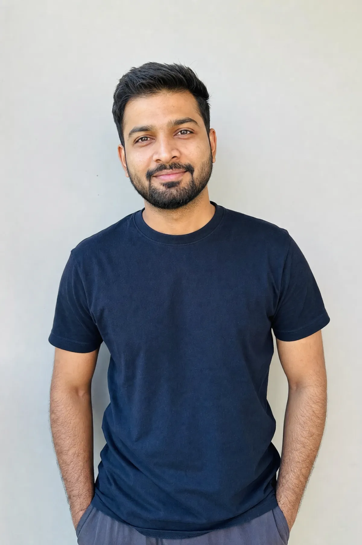
The source photo used for every transformation in this section — flat daylight, neutral clothing, face unobstructed. Nothing about it is retro; that is the point.
Get the source photo right first
The transformation is only ever as good as what you feed it. Five rules that account for almost every bad result:
- One person, facing the camera. Group photos confuse the identity lock and you will get an averaged face. Crop to yourself.
- Even, soft light. A photo already carrying heavy shadow, a colour cast or a strong filter fights the period lighting you are asking for. Flat daylight is the best input.
- Unobstructed face. Sunglasses, a mask, a hand on the chin or hair across the face all remove the information the model needs to keep you recognisable.
- Reasonable resolution. A screenshot of a screenshot has already lost the detail that makes you look like you.
- Neutral current styling. Modern clothing in the source is fine and expected — the prompt replaces it. A costume in the source confuses it.
The thing nobody warns you about
Image models have a well-documented tendency to "improve" faces they are asked to regenerate: slimming jawlines, smoothing skin texture, straightening noses, enlarging eyes and — most seriously — lightening skin tone. If you are not white, this shows up often enough that you should assume it will happen and instruct against it.
Every prompt below carries an explicit clause banning it. Keep that clause. It is the difference between a photo of you in 1985 and a photo of a different, blander person who shares your haircut. If a result comes back looking subtly wrong in a way you cannot name, compare the nose and jaw against your source — that is almost always where it drifted.
T1. The baseline 1985 transformation
Using my uploaded photo, show me what I would have looked like around 1985.

Preserve my identity exactly: facial features, bone structure, skin tone,
eye colour, apparent age and recognisable appearance. Do not slim my face,
smooth my skin texture, lighten my complexion, reshape my nose or make me
more conventionally attractive. Only the era around me changes.

Reimagine my hair, clothing and accessories with bold, unmistakably
mid-1980s styling: expressive silhouettes, statement accessories, layered
details, and the distinctive colours and textures of the period.

Make it feel like a genuine 1985 photograph: consumer colour negative film,
analog grain, slightly faded colour, direct on-camera flash, subtle softness.

Add a period-accurate red-orange date stamp in the lower right corner.

No modern objects, no modern text, no logos, no phones.
T2. 1986 India, street portrait
Using my uploaded photo, show me in India in 1986. Keep my face, bone
structure, skin tone and apparent age exactly as they are — no slimming,
no smoothing, no lightening, no reshaping.

Styling: acid-wash denim jacket with the sleeves rolled, a striped polo
underneath, high-waisted pleated trousers with a leather belt, white canvas
sneakers, oversized clear-framed glasses, a square digital watch.

Setting: leaning against a pillar at a busy railway station concourse,
an Ambassador car and a crowd blurred behind me, hand-painted signage.

Photograph: Kodak consumer negative film, warm faded colour, visible grain,
bright available daylight from the side, slight softness.

Add a small red-orange date stamp in the lower corner. No modern objects.
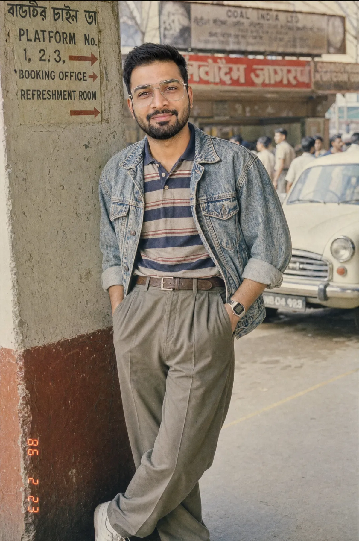
Prompt T2 applied to the photo above, unedited. Same face, same beard, same age — only the era moved. The acid wash, the pleated trousers and the digital watch are all named garments, not a “retro” instruction.
T3. 1991 mall studio portrait
Using my uploaded photo, place me in a mall portrait studio in 1991.
Preserve my identity precisely — face, skin tone, apparent age, distinguishing
features. Do not beautify, slim or lighten me.

Styling: volumised period hair, statement earrings, a sequinned or
structured outfit with strong shoulders.

Lighting: the standard studio formula — a large soft key slightly above,
a bright hair light from behind creating a halo, weak fill, and a
blue-to-black gradient backdrop. A soft-focus diffusion filter over
the whole frame and a warm glow on the skin.

Square-ish framing, glossy print finish, slightly vignetted edges.
No modern objects or text.
T4. 1994 grunge portrait
Using my uploaded photo, show me in 1994. Keep my exact face, bone
structure, skin tone and age — no smoothing, slimming or lightening.

Styling: flannel shirt over a plain tee, thrifted layers, straight unstyled
hair, minimal grooming, matte skin with visible texture and pores.

Setting: leaning against a graffitied brick wall in an alley, overcast day.

Photograph: Fujicolor Superia 400 — cool, green-forward, low contrast,
grainy in the midtones. Available light only, no flash, slightly
underexposed. Shot on a 28mm lens close enough to mildly distort.

Deliberately unglamorous and documentary, not aspirational.
No modern objects, no modern text.
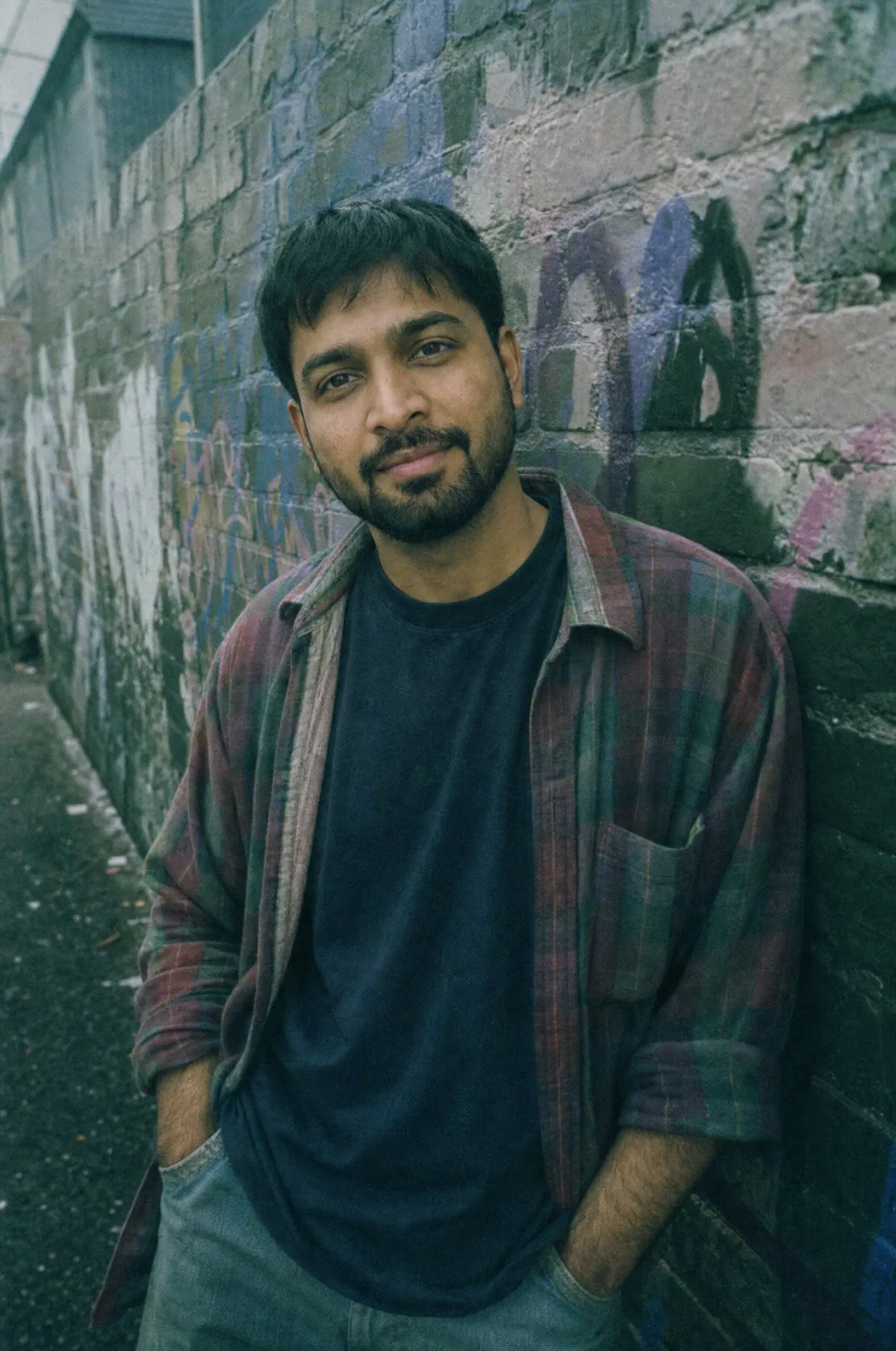
Prompt T4 on the same source photo. Put this beside the 1986 image and you can see the decade gap the table at the top of this article describes — warm and saturated versus cool, green and flat, with the same person in both.
T5. 1986 Miami, sunlit
Using my uploaded photo, show me in Miami in 1986. Preserve my face,
skin tone and apparent age exactly — no beautification of any kind.

Styling: acid-wash denim jacket, a bright graphic tee, high-waisted jeans,
aviator sunglasses pushed up on the head rather than covering my eyes,
gold jewellery, big hair.

Setting: leaning against the hood of a red classic convertible on a palm-lined
street, record shop and neon signage behind, strong late-afternoon sun.

Photograph: Kodachrome 64 — deep saturated reds, warm skin, dense blacks,
fine grain, heavy lens flare and halation blooming around the highlights.

No modern objects, no modern logos, no phones.
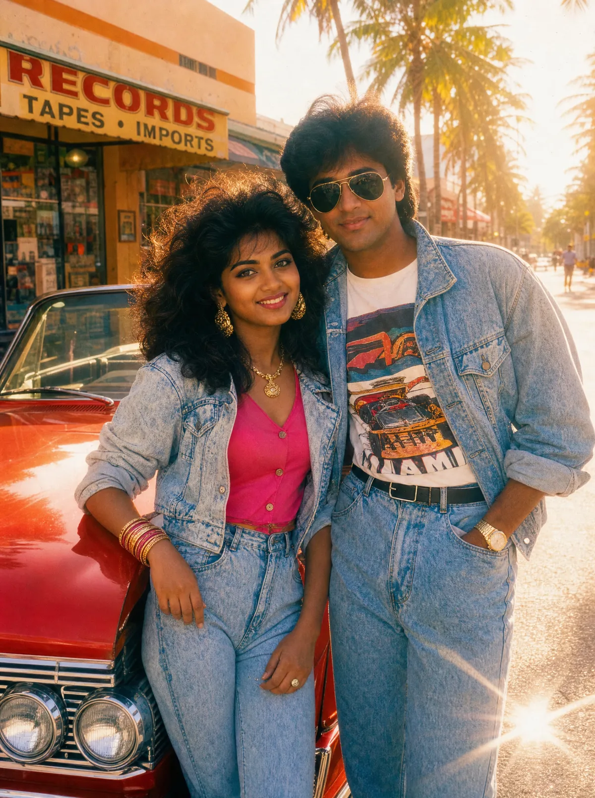
Prompt T5. Kodachrome is doing the work here — the saturated reds, the dense blacks and the halation blooming off every highlight are the film, not a filter.
T6. 1993 college hostel
Using my uploaded photo, show me as a college student in 1993. Keep my
identity locked: same face, same skin tone, same apparent age. Do not
slim, smooth, lighten or otherwise improve my features.

Styling: oversized denim jacket, plain white vest underneath, high-waisted
jeans with a wide belt, a scrunchie or a period haircut, large gold hoop
earrings, a black plastic digital watch.

Setting: sitting on the floor of a hostel room, hard afternoon sunlight
falling through a window and throwing a sharp shadow pattern on the wall,
film posters taped up behind me.

Photograph: expired consumer film, warm faded colour, heavy grain, soft focus.
No modern objects or text.
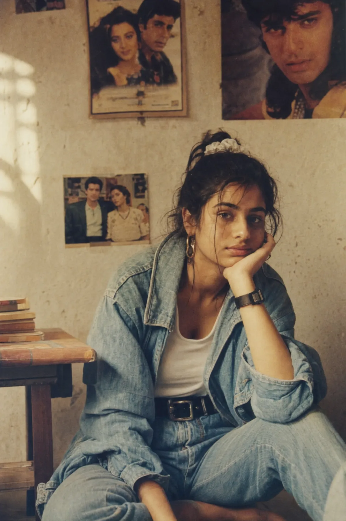
Prompt T6. The hard shadow pattern thrown across the wall is the detail that makes this read as a real afternoon rather than a studio setup.
T7. The found photograph
Using my uploaded photo, produce a photograph of me taken in December 1986
that has survived thirty years in a family album.

Identity locked exactly — face, bone structure, skin tone, apparent age.
No slimming, smoothing or lightening.

Styling and setting: [DESCRIBE, or: period-appropriate for 1986].

The photograph as an object: colour shifted toward warm orange, contrast
collapsed, whites gone cream, a soft crease through one corner, minor
surface scratches, slight edge fading.

Along the left edge print the film stock lettering in orange as it appears
on a negative border, and put a small red-orange date stamp reading
DEC 24 1986 in the lower left.

No modern objects, no modern text.
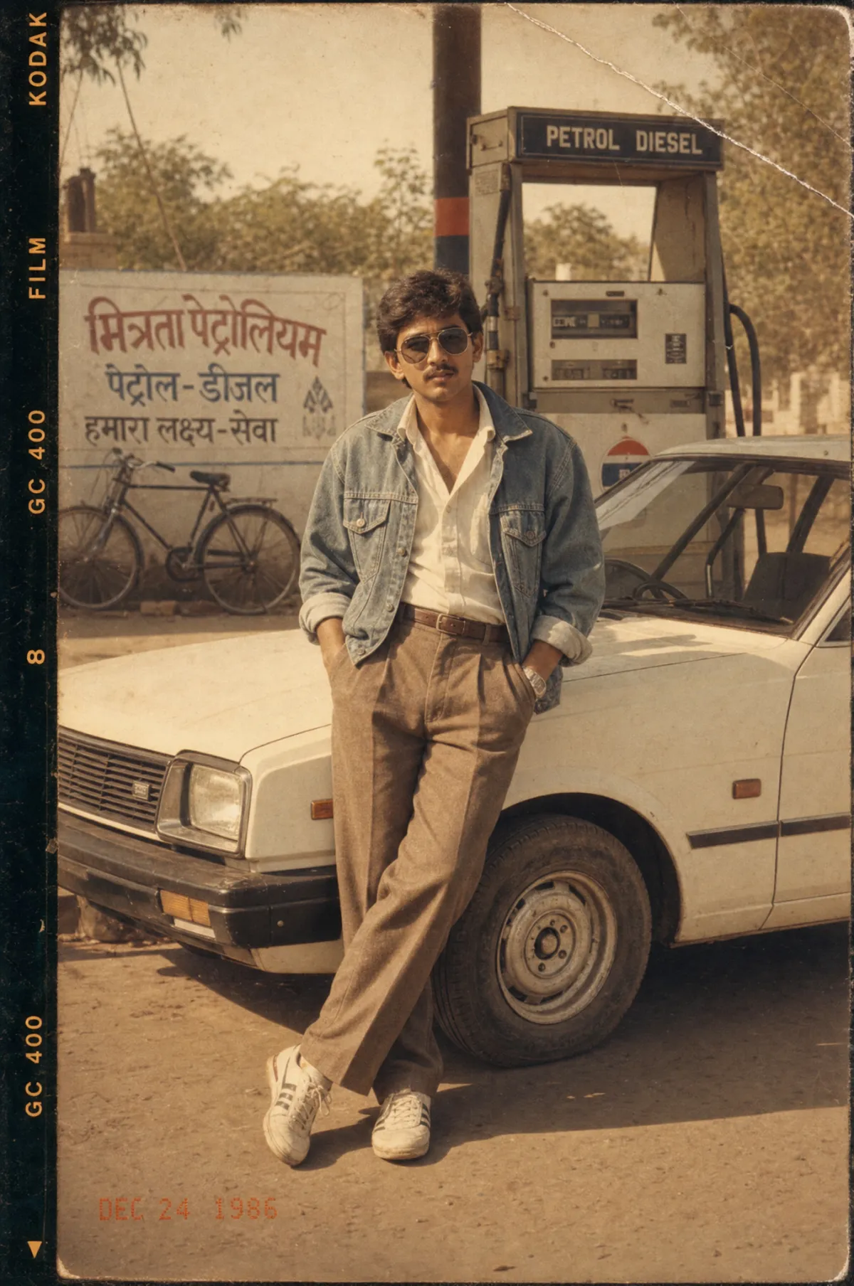
Prompt T7. This one asks for the photograph as a surviving object rather than a fresh print — hence the edge lettering, the crease through the corner and the collapsed contrast.
T8. 1989 wedding guest
Using my uploaded photo, show me as a guest at a wedding in 1989.
Preserve my face, skin tone and apparent age exactly — no beautification.

Styling: formal period dress with strong shoulders and rich fabric,
period-appropriate hair with volume, statement jewellery.

Setting: a decorated function hall, warm tungsten lighting mixed with
a harsh direct flash from the camera.

Photograph: consumer negative film pushed for a dim room — warm orange
cast, heavy grain, hard flash hotspot on the faces, background falling
off to near black. Slightly crooked handheld framing.

No modern objects. No modern text.
T9. 1988 office portrait
Using my uploaded photo, show me at work in 1988. Keep my identity exactly
as it is — face, skin tone, age, distinguishing features. No smoothing,
no slimming, no lightening.

Styling: a boxy suit with wide shoulders, a wide tie or a structured blouse,
oversized metal-framed glasses, a chunky wristwatch.

Setting: seated at a desk with a beige CRT terminal, a rotary or push-button
telephone, stacked paper files, a wood-veneer desk, venetian blinds behind.

Photograph: medium format, conservative three-point lighting, a slight
soft-focus filter, flat contrast, a faint cyan cast in the neutrals —
printed in a company annual report.

No modern objects, no flat screens, no modern text.
T10. 1995 yearbook senior portrait
Using my uploaded photo, make my 1995 high school senior portrait.
Identity locked precisely: same face, same bone structure, same skin tone,
same apparent age. Do not idealise or retouch my features.

Styling: period haircut, a patterned shirt or a simple sweater,
oversized glasses, minimal makeup.

Setting and lighting: the laser background — thin coloured light beams
radiating from a point against black, in cyan and magenta. Hard direct
studio flash, flat and unflattering, sharp in a clinical way.
Shoulders angled thirty degrees, chin slightly down.

Slightly soft print with a warm cast. No modern objects or text.
T11. Two people, same era
Using the two uploaded photos, show both of us together in [1987].
Preserve BOTH identities exactly and separately — each person keeps their
own face, bone structure, skin tone and apparent age. Do not blend our
features, do not slim or lighten either of us, and do not make us look
related if we are not.

Styling: matching period looks — [DESCRIBE], with the silhouettes,
accessories and colours of the year.

Setting: [PLACE].

Photograph: consumer colour negative film, warm faded colour, direct
on-camera flash, grain, slight softness. Small red-orange date stamp
in the corner.

No modern objects or text.
T12. 1983 band photo
Using my uploaded photo, make me the subject of a 1983 band promo shot.
Keep my face, skin tone and apparent age exactly — no beautification.

Styling: dramatic period stage clothing, layered and textured, statement
accessories, big hair.

Lighting: hard key through a magenta gel from camera left, a cyan rim light
from behind right separating me from a seamless paper backdrop, smoke in
the air catching the backlight, no fill, hard-edged shadows.

Photograph: shot on 16mm-style film with grain, high contrast, crushed
blacks and clipped highlights.

Stylised and deliberately theatrical. No modern objects or text.
T13. 1992 holiday snapshot
Using my uploaded photo, show me on holiday in 1992. Preserve my identity
exactly — face, skin tone, apparent age, distinguishing features. No slimming,
smoothing or lightening.

Styling: casual period holiday clothing, a bucket hat or sunglasses,
a camera on a strap around my neck.

Setting: standing squinting into direct midday sun in front of a landmark,
taken by a stranger holding a compact camera at chest height.

Photograph: slightly tilted horizon, me too small in the frame, too much sky,
warm faded consumer film, thin whites, cyan shift in the shadows.
A 4x6 glossy print with a thin white border and an orange date stamp.

No modern objects or text.
T14. Pick the decade yourself
Using my uploaded photo, show me in {{decade}}.

Preserve my identity exactly: facial features, bone structure, skin tone,
eye colour, apparent age and recognisable appearance. Do not slim, smooth,
lighten, reshape or beautify me in any way. Only the era changes.

Styling: {{style_vibe}}
Setting: {{scene_setting}}
Photograph: {{photo_finish}}

Add a period-accurate date stamp in the lower corner.
No modern objects, no modern text, no logos.
T14 is the reusable frame — the same four variables our 80s Time Travel Photo Prompt template exposes, so you can fill them in and re-run without rewriting the identity lock each time.
When it goes wrong
| What you get | What caused it | The fix |
|---|---|---|
| A stranger who vaguely resembles you | No identity lock, or a low-quality source | Add the lock clause verbatim; re-upload a sharper, front-facing photo |
| A smoother, slimmer, lighter version of you | The model's default "improvement" behaviour | Keep the explicit ban on slimming, smoothing and lightening — it only works if you say it |
| Modern clothing that looks vaguely retro | You asked for a mood, not garments | Name specific pieces: acid wash, pleated trousers, shoulder pads |
| A clean, sharp, modern-looking photo | No capture medium specified | Name the film, the light and the grain — the era is in the photograph, not just the outfit |
| Correct era, wrong feeling | The lighting is modern and flattering | Specify direct flash or hard sun; soft wraparound light did not exist in a 1985 snapshot |
| Anachronistic details creeping in | No ban list | End every prompt with "no modern objects, no modern text, no logos, no phones" |
One last mechanical note: when a result is close but one thing is wrong, edit it rather than re-running the prompt. Asking for "the same photo but with the jacket open" preserves the face you already got right; re-running resamples everything and gives you a different person.
80s Film Photography (1–6)
1. The Kodachrome standard
A [SUBJECT] photographed on Kodachrome 64 slide film in [1984].

Deep saturated reds, warm skin tones, dense blacks with no shadow
detail recovery, fine tight grain, high micro-contrast. Bright
daylight because the film is only ISO 64.

Shot on a Nikon FM2 with a 50mm f/1.8 at f/8, so the background is
in focus, not blurred.

No modern bokeh, no HDR, no shadow lifting.
2. Hard flash snapshot
A candid snapshot of [SUBJECT] at [A KITCHEN PARTY], [1986].

Direct on-camera flash two inches from the lens: harsh hotspot on
foreheads and noses, a hard black shadow outline on the wall behind
the subject, foreground blown out, background falling off to near
black within a few feet.

Kodacolor VR 200, warm yellow cast, visible grain, slight red-eye.
Slightly crooked handheld framing.
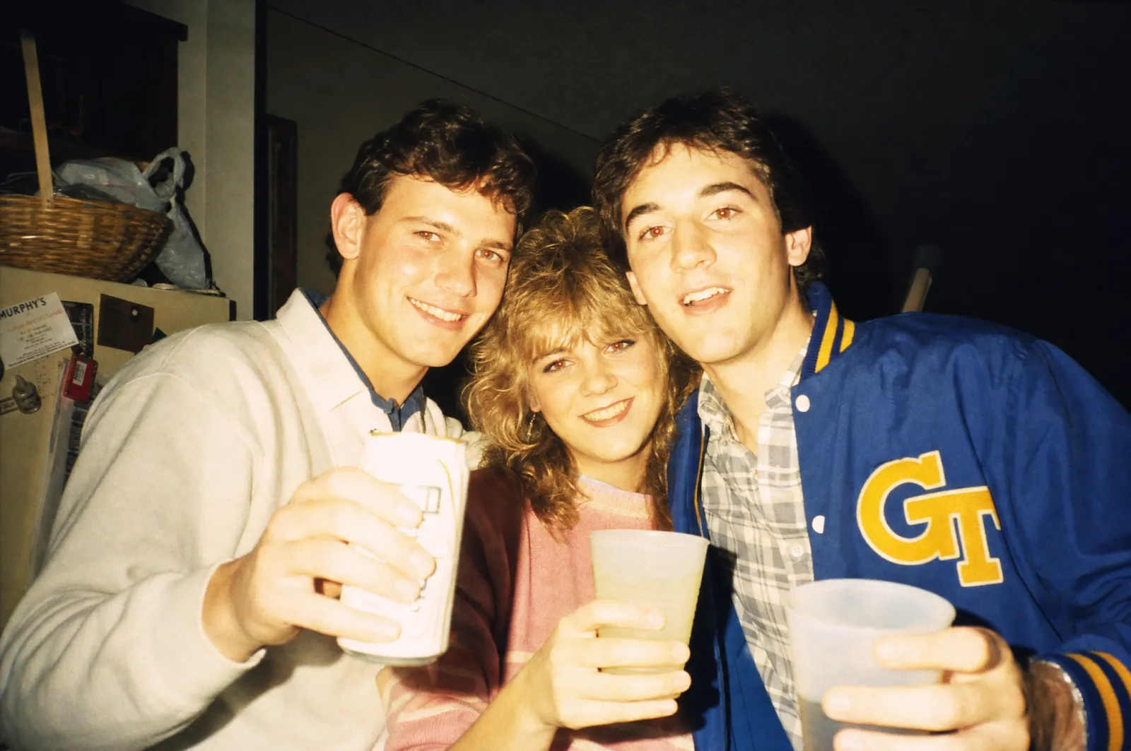
Prompt 2, unedited. The giveaways are all physical: the flash hotspot on the foreheads, the hard shadow line on the wall, and the background dropping to black within a couple of feet of the subjects.
3. Magazine editorial, gelled light
An editorial portrait of [SUBJECT] for a [1987] magazine.

Hard key light through a magenta gel from camera left, a cyan rim
light from behind right separating the subject from a seamless
paper backdrop. Visible light falloff, no fill, hard-edged shadows.

Glossy skin, structured shoulders, high-volume hair.
Medium format, 6x7, shot at f/11 with everything sharp.
4. The end of golden hour
[SUBJECT] photographed outdoors in the last twenty minutes of light,
[1985], on Kodachrome.

Strong low warm sun raking across the frame, heavy lens flare and
halation blooming around every highlight, hazy atmospheric backlight,
long hard shadows.

Slight warm colour shift in the shadows toward orange rather than
neutral or blue.
5. Sports and action, motor drive
A [SPORT] moment, [1988], shot by a wire-service photographer.

300mm f/2.8 telephoto, motor-drive frame with slight motion blur in
the extremities, panning blur in the crowd behind, harsh midday sun.

Ektachrome pushed one stop: cooler than Kodachrome, grain visibly
coarser, contrast increased, highlights near clipping.
Frame is slightly off-centre because it was shot at 5 frames a second.
6. Family holiday documentation
A family photograph at [LOCATION], summer [1983].

Everybody arranged in a line squinting into direct sun, taken by a
stranger holding a compact 35mm camera at chest height.
Slightly tilted horizon, subjects too small in the frame, too much
sky, a stray thumb blur in one corner.

Warm faded consumer negative film, thin whites, cyan shift in the
shadows from ageing dye.
90s Film Photography (7–12)
7. The Superia look
[SUBJECT] photographed on Fujicolor Superia 400 in [1996].

Cooler than Kodak: greens pushed, skin slightly cool, lower contrast,
noticeable grain in the midtones. Overcast available light, flat and
even, no dramatic shadows.

Casual unstyled clothing, matte skin, minimal makeup.
The mood is documentary and unglamorous, not aspirational.
8. Disposable camera party
A photograph taken on a single-use disposable camera at [AN EVENT],
[1997].

Fixed-focus plastic lens: soft at the edges, sharp only in the middle,
strong corner vignetting. Harsh built-in flash with a hotspot and a
rapid falloff to black. Subjects caught mid-blink and mid-sentence.

Lab-printed with a slight magenta cast and a white border with the
date stamped in small orange dot-matrix numerals.
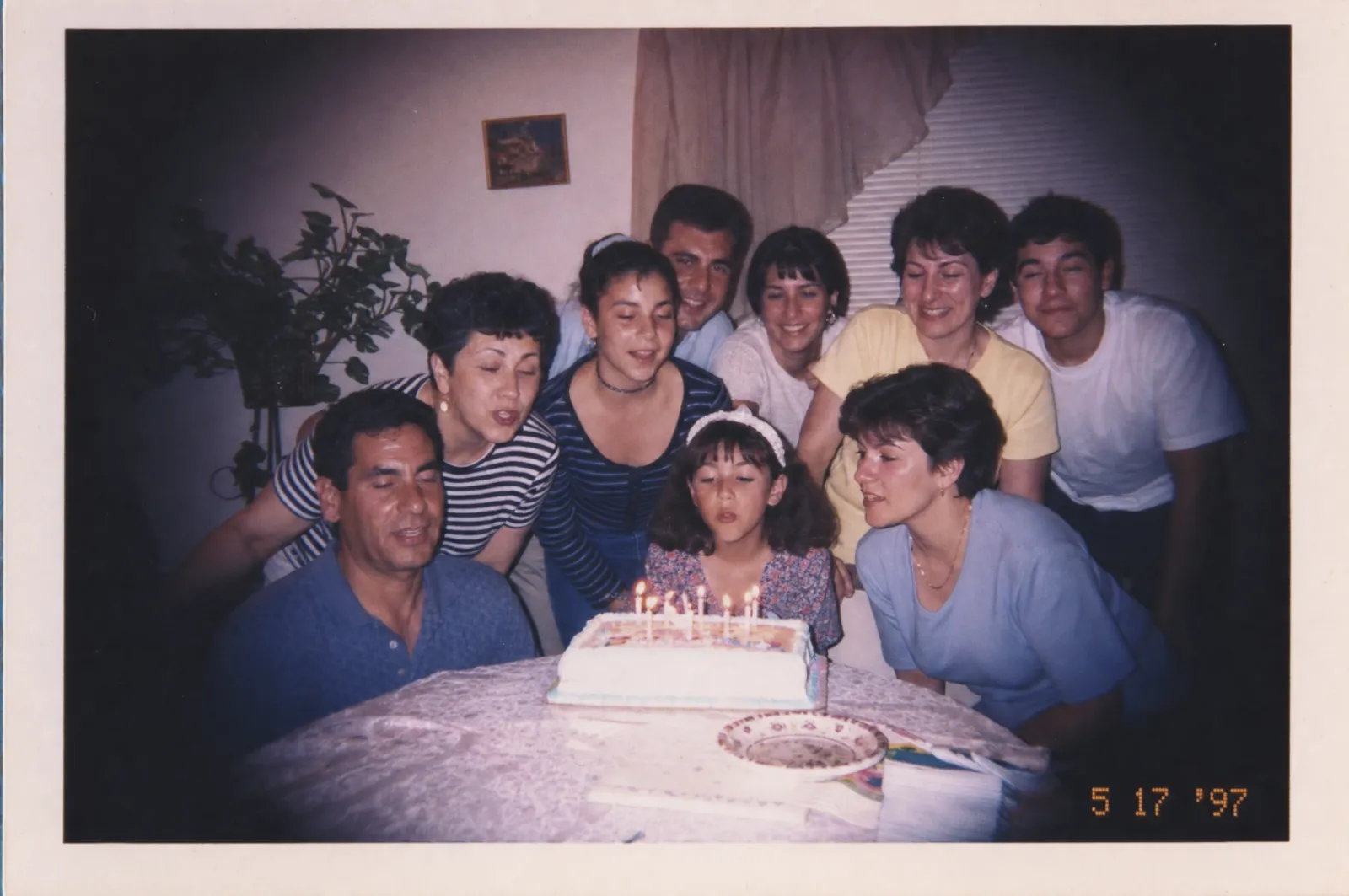
Prompt 8, unedited. Note what the model did with “lab-printed”: it rendered the print as an object — white border, machine colour cast, and the orange dot-matrix date in the corner.
9. Grunge editorial portrait
A portrait of [SUBJECT] for an alternative music magazine, [1994].

Available light from a dirty window, deep shadows, no fill, slightly
underexposed. Desaturated and cool with a green cast.

Flannel, thrifted layers, straight unstyled hair, matte skin with
visible texture and pores.

Shot on a 28mm lens close enough to mildly distort. Looks like it was
taken in eleven minutes in a rehearsal room, because it was.
10. One-hour lab print
A [SCENE] photographed in [1992] and printed the same day at a
one-hour photo lab.

4x6 glossy print with a thin white border, slightly over-magenta
machine colour correction, crushed shadows, blown highlights in the
sky, mild loss of sharpness from automated printing.

Photograph the print itself at a slight angle on a kitchen table,
with a faint reflection across the glossy surface.
11. Skate and street documentary
A [SKATEBOARDING] photograph, [1995], shot for a skate magazine.

Fisheye lens from ground level very close to the subject, strong
barrel distortion, the whole frame bending. Off-camera flash freezing
the action against a darkened afternoon sky.

Coarse grain from pushed film, dusty concrete, scuffed griptape.
Composition slightly wrong in the way real action photography is.
12. End-of-decade Portra
[SUBJECT] photographed on Kodak Portra 400NC in [1999].

Low saturation, exceptionally soft skin rendering, a gentle warm
neutral palette, wide latitude in the highlights. Soft window light,
large source, minimal contrast.

This is the most modern-looking film on this list, so keep everything
else period-correct: the styling, the hair, the room.
Still no digital sharpening, no HDR.
Instant Film and Polaroid (13–16)
13. SX-70 softness
A Polaroid SX-70 instant photograph of [SUBJECT], [1981].

Square image area with the wide white border at the bottom. Soft
dreamy focus, low contrast, slightly milky blacks, a warm colour
shift with cyan creeping into the shadows.

Visible unevenness in the development across the frame.
The chemistry looks like it was developing in cold air.
14. Polaroid 600 with flash
A Polaroid 600 instant photo taken indoors at [A PLACE], [1989].

Built-in flash: hard, frontal, hot in the centre, falling off to
darkness at the frame edges within a couple of feet.
Higher contrast and cooler than SX-70, with a slight blue-green cast.

White border with a handwritten caption in blue ballpoint at the
bottom: [CAPTION].
Slight fingerprint on the emulsion in one corner.
15. Peel-apart test shot
A peel-apart instant film test shot for a [1986] commercial shoot.

Irregular chemical edges where the developer spread unevenly, a
slightly uneven border, warm brownish blacks.

The subject is a lighting test rather than a finished photograph:
a stand-in holding a grey card, studio clutter visible at the frame
edge, tape on the floor.
16. Instant film, mistreated
An instant photograph of [SUBJECT] that has been kept in a wallet
since [1990].

Surface cracking across the emulsion, a soft crease running through
one corner, colour heavily shifted toward orange, contrast collapsed,
the whites now cream.

Photographed flat against a plain surface in even light, so the
damage is the subject.
VHS, Television and Broadcast (17–22)
17. Third-generation VHS
A still frame from a VHS tape that has been copied three times,
recorded off television in [1991].

240 lines of horizontal resolution, so everything is soft.
Chroma bleed: red and orange smearing several pixels to the right of
their edges. Horizontal tracking distortion bands drifting through
the frame. Head-switching noise as a torn band across the bottom
8 pixels.

4:3 aspect ratio. Colours slightly desaturated and shifted green.
Do not add a scanline overlay to a sharp image — the softness is the
point.
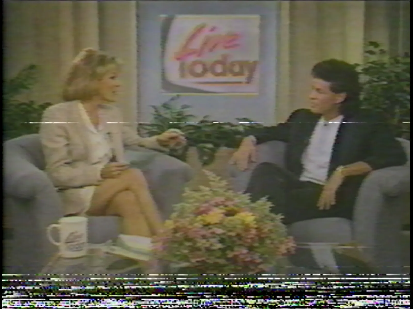
Prompt 17, unedited — and the best argument in this article for rule 3. The image is genuinely low-resolution rather than sharp-with-an-overlay, and the torn head-switching band along the bottom is the detail that sells it.
18. Local news broadcast
A frame from a local television news broadcast, [1993].

Interlaced video look, slightly soft, overlit by a hard frontal
camera light that flattens the subject against the set.
Saturated primary-coloured set graphics behind the anchor.

A lower-third chyron in a bold condensed sans-serif with a hard drop
shadow, reading [TEXT], over a solid colour bar.
4:3 frame, slight barrel distortion from a CRT monitor.
19. Home camcorder footage
A frame from VHS-C home camcorder footage of [AN EVENT], [1994].

Auto-exposure hunting so the image is momentarily too bright, harsh
onboard camera light, heavy noise in the shadows, smeared motion.

A timestamp burned into the lower right corner in blocky orange
seven-segment digits reading [DATE].
Handheld, slightly tilted, mid-zoom.
20. Late-night infomercial
A frame from a direct-response television commercial, [1992].

Overlit studio with a hard key and no subtlety, a plain gradient
backdrop, a product on a rotating pedestal.

Large chunky text overlay in a yellow outlined typeface reading
[OFFER], a starburst graphic in the corner, and a phone number in a
red band across the bottom.
Video, not film: sharp motion, flat contrast, slightly noisy.
21. Music video, film-to-tape
A frame from a music video, [1988], shot on 16mm film and transferred
to video for broadcast.

Grain from the film combined with video softness from the transfer.
Heavy coloured gel lighting, smoke in the air catching backlight,
a wind machine.

High-contrast transfer with crushed blacks and clipped highlights.
4:3 with the composition centred for television safe areas.
22. Pause on a rental tape
A paused frame on a worn VHS rental tape, [1990].

Frozen-frame noise: a horizontal jitter band, doubled edges from the
interlaced fields separating, heavy chroma noise.
Visible tape wear as intermittent horizontal dropout lines.

Shot of the CRT television screen itself in a dark room: curved glass,
visible phosphor triads, moiré interference, a bright reflection of
the room in the corner of the screen.
Neon, Synthwave and Retro-Futurism (23–27)
Reminder from earlier: these are revival aesthetics. Do not mix film-stock language into them.
23. The outrun grid
A synthwave illustration: an infinite wireframe grid in magenta
receding to a horizon under a huge sun banded with horizontal
cutout stripes in orange and pink.

Chrome-finished italic lettering reading [TEXT] with a hard bevel
and a cyan-to-magenta gradient.
Palm tree silhouettes, a low haze layer, scattered star field above.

Flat vector rendering, not photographic. Deep black sky.
24. Miami pastel deco
A [SCENE] in the Miami pastel palette, [1985]: flamingo pink, mint
green, cream, pale turquoise.

Art deco geometry, glass block, curved corners, neon tube signage in
pink and turquoise reflecting on wet pavement.

Shot at dusk on daylight-balanced film so the sky goes deep blue
while the neon reads correctly.
Hard-edged shadows, no atmospheric softening.
25. Airbrush illustration
A commercial airbrush illustration of [SUBJECT] in the style of
[1983] magazine advertising.

Smooth continuous gradients with no visible brush texture, hard
graphic black outlines, flat stylised skin in two or three tones,
strong geometric composition.

Cool palette with one hot accent colour. Highly stylised, high
contrast, minimal detail in the face.
Illustration, not photography.
26. Memphis geometry
A composition in the Memphis Group style, Milan, [1984].

Squiggles, terrazzo-speckle patterns, black-and-white stripes,
irregular geometric shapes in primary red, yellow and blue against
pastel pink and mint.
Asymmetric, deliberately unbalanced, laminate surfaces.

Flat even studio light. Product photography of [OBJECT] staged
inside the composition.
27. Chrome and starfield
A [1986] title-card graphic: the word [TEXT] in a heavy extended
sans-serif rendered in polished chrome, with an environment
reflection showing a horizon line across the metal.

Hard specular highlights, a magenta-to-cyan gradient in the
reflection, a thin outer glow.
Background is deep black with a fine star field and one lens flare.

Early computer-graphics rendering, slightly plastic, not modern
raytracing.
Video Games and Computer Graphics (28–33)
28. CGA four-colour
A [SCENE] rendered as a CGA computer graphic, 320x200 pixels,
limited to exactly four colours: black, cyan, magenta and white.

Hard dithering to fake additional shades, chunky visible pixels,
no anti-aliasing whatsoever.
The colour combination should look slightly wrong and unpleasant,
because that palette was.

Display it as if on a CRT monitor: slight glow, visible scanlines,
curved glass edges.
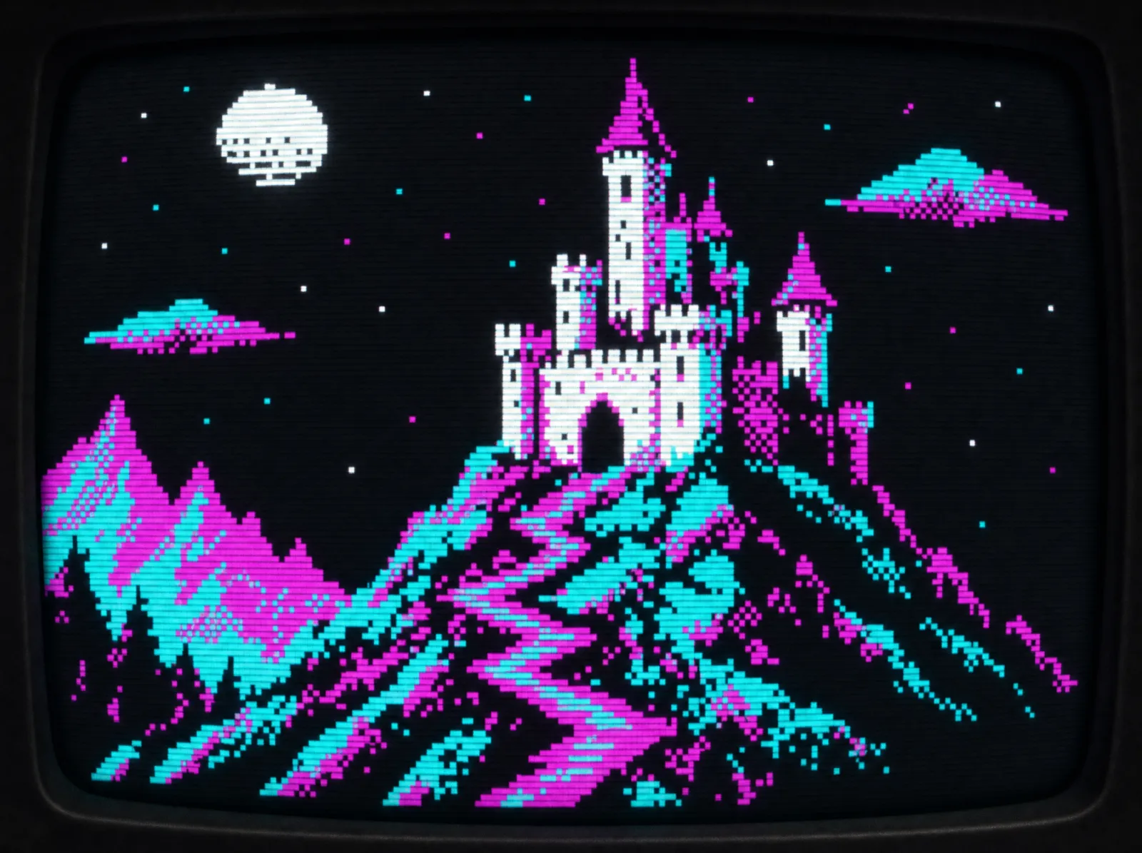
Prompt 28, unedited. The palette is exactly the four CGA colours, with dithering standing in for the shades it could not display — and it looks as slightly unpleasant as it did in 1985.
29. VGA Mode 13h
A [SCENE] as a 320x200 VGA game screen from [1993], 256-colour
palette with heavy dithering in the gradients.

Hand-pixelled art: dark outlines, limited shading with three tones
per object, visible dither patterns in the sky.
Pixels are non-square and slightly taller than wide, as they were on
a 4:3 monitor at that resolution.

Include a status bar along the bottom with chunky pixel icons.
30. Game Boy four greens
A [SCENE] as a Game Boy screen, [1991]: 160x144 pixels, exactly four
shades of olive green, no other colours.

Heavy black outlines, minimal internal detail, dithered patterns
standing in for midtones, sprite-based composition.

Shown on the actual handheld's reflective LCD: low contrast, visible
ghosting trails behind moving elements, a slight green backlight
absence.
31. Arcade cabinet art
Side-panel artwork for an arcade cabinet, [1984], advertising a game
about [SUBJECT].

Airbrushed illustration, dramatically more detailed and exciting
than the actual game could render.
Bold outlined logo lettering with a chrome bevel and a starburst.
Heavy blacks, screaming primary colours, a heroic figure in dynamic
perspective.

Slight print misregistration and vinyl texture, with wear and small
scratches along the bottom edge.
32. Early 3D rendering
A [SUBJECT] rendered with [1987] computer graphics.

Flat-shaded and Gouraud-shaded polygons with visible faceting, an
infinite reflective chrome floor with a checkerboard pattern, a
black background with a horizon glow.

Hard specular highlights, no texture maps, no soft shadows, no
global illumination. Wireframe visible at the silhouette edges.
Looks expensive for its year and primitive now.
33. CD-ROM multimedia
A screen from a [1995] CD-ROM multimedia title about [SUBJECT].

Pre-rendered 3D still image, dithered down to a 256-colour palette
with visible banding in the gradients.
A beveled grey interface frame around the image with chunky 3D
buttons, a thin serif caption reading [TEXT].

640x480, 4:3, slightly soft from JPEG compression at the settings
people used when disc space mattered.
Portrait Studios and Yearbooks (34–38)
Studio portraiture is the category where consistency matters most, because the whole point of these looks is that every subject got the identical treatment. If you are producing a set rather than a single image, a platform with proper batch and character-consistency tooling saves a great deal of re-rolling — we covered where OpenArt lands on that in our full review.
34. Mall portrait studio
A mall portrait studio photograph of [SUBJECT], [1987].

Mottled blue-and-grey painted canvas backdrop. Soft main light from
a large umbrella slightly above, a hair light from behind, and a
weak fill — the standard three-light formula applied identically to
everyone.

Subject turned 30 degrees, shoulders angled, chin slightly down,
hands posed on a wooden stool.
Glossy print with a slightly warm cast and soft overall focus.
35. The laser background
A school portrait of [SUBJECT], [1992], on the laser background:
thin coloured light beams radiating from a point against black,
in cyan and magenta.

Hard direct studio flash, flat and unflattering. Slightly crooked
posing. Sharp in a clinical way.

Period-correct styling: [HAIRSTYLE], oversized glasses, a patterned
shirt buttoned to the top.
36. Glamour Shots
A glamour portrait of [SUBJECT] from a mall studio, [1991].

Heavy soft-focus diffusion filter, a blue-to-black gradient
backdrop, a strong hair light creating a halo, an intense fan blowing
hair across the frame.

Sequinned fabric or a feather boa, heavy blue eyeshadow, frosted
lipstick, enormous volumised hair.
Vignetted edges, a warm glow on the skin, everything slightly out
of focus in a deliberate way.
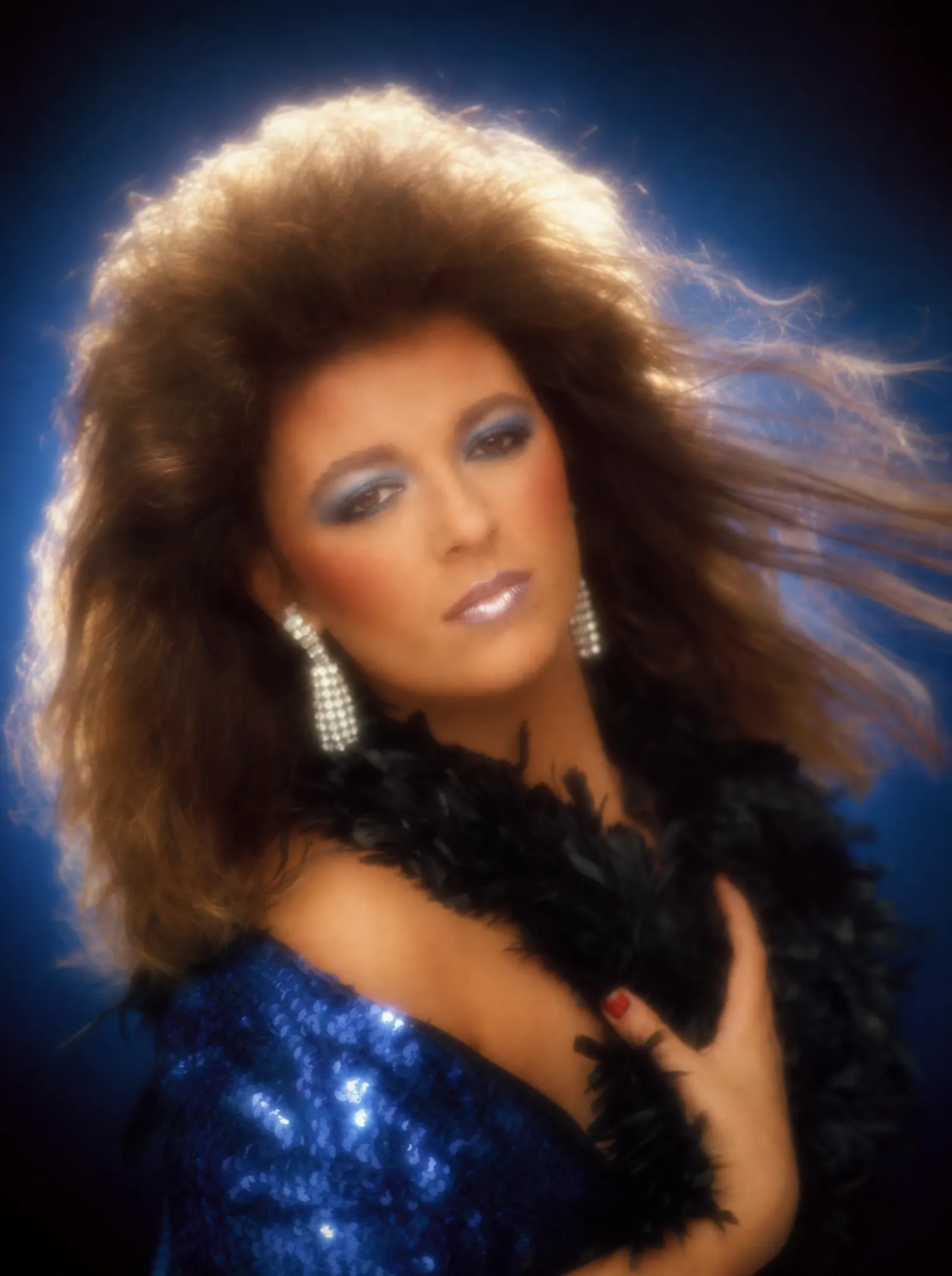
Prompt 36, unedited. Every element here is a named constraint rather than a mood: the blue gradient backdrop, the hair light, the fan, the diffusion filter.
37. Yearbook grid
A page from a high school yearbook, [1995]: a grid of small square
headshots, six across, each with a name in a small serif typeface
beneath it.

Every photo shot identically against a mottled grey backdrop with
the same flat flash, printed at low resolution on matte uncoated
paper with a coarse halftone screen.

Slight colour registration drift across the page, the paper faintly
yellowed and the gutter shadow visible.
38. Corporate headshot
A corporate headshot of [SUBJECT] for a [1989] annual report.

Grey seamless backdrop, conservative three-point lighting, subject
in a suit with strong shoulder structure, arms folded.

Shot on medium format with a slight soft-focus filter that was
considered flattering at the time.
Printed in the report on coated stock: slightly flat contrast, a
faint cyan cast in the neutrals.
Print, Packaging and Advertising (39–43)
These are the prompts most likely to end up in commercial work rather than personal projects, and the reproduction chain does the heavy lifting in every one. The same principles applied to a contemporary brief are in our walkthrough of generating brand creatives in ChatGPT.
39. Newspaper halftone
A photograph of [SUBJECT] as reproduced in a [1988] daily newspaper.

Coarse halftone dot screen at roughly 65 lines per inch, so the dots
are clearly visible. Heavy contrast loss, blacks gone muddy, midtones
flattened.

Printed on newsprint: slightly grey absorbent paper, ink spread at
the edges of every dot, slight show-through from the reverse page.
A small condensed caption beneath reading [CAPTION].
40. Magazine ad spread
A full-page magazine advertisement for [PRODUCT], [1986].

Glossy coated stock, rich saturated CMYK, a large hero product
photograph lit hard with a cyan rim light on a graduated backdrop.

A wide condensed headline in an outlined typeface reading [HEADLINE],
a three-column block of small body copy, and a logo at the bottom
right.
Faint halftone rosette pattern visible in the flat colour areas.
41. Photocopied zine
A page from a photocopied punk zine, [1993].

Third-generation photocopy: blacks blocked up, midtones gone
entirely, toner speckle across the page, a dark band along one edge
from the copier lid being open.

Cut-and-paste collage with visible tape edges and drop shadows from
the original paste-up, typed text from a manual typewriter, hand
lettering in marker reading [TEXT].
Slightly skewed on the page.
42. Risograph spot colour
A [1989] printed flyer for [AN EVENT], duplicated on a risograph in
two spot colours: fluorescent pink and blue.

Visible misregistration where the two passes do not align, ink
laid down unevenly with light patches, slight smudging.
Coarse halftone in the photographic element, flat solid areas in the
type.

Cheap uncoated paper with a slight tooth and a faint stock tint.
43. Consumer packaging
Product packaging for [PRODUCT], [1991].

A chunky geometric logo with a hard bevel, a burst graphic reading
[CLAIM], flat primary colours with a gradient panel, and a small
photographic product image with an airbrushed drop shadow.

Printed on a cardboard carton: slight sheen from the varnish,
visible board texture, a dot-matrix batch code stamped near the
bottom.
Photographed straight on in flat even light.
Anime and Animation Cels (44–47)
44. 80s OVA cel
A frame from a Japanese animated OVA, [1988].

Hand-painted cel over a painted background: the character rendered
in flat colour areas with hard-edged two-tone shading, the
background painted in soft gouache with far more detail than the
character.

Heavy cinematic lighting with dramatic coloured rim light, rain and
neon reflections.
Film grain over the whole frame from the optical printing process.
The cel and the background are visibly different media.
45. 90s TV anime
A frame from a Japanese television anime series, [1995].

Limited animation: simpler character art, fewer shading tones,
flatter backgrounds than film work, a restrained palette.
Large expressive eyes with hard highlight shapes, hair in solid
colour blocks with a single shadow tone.

Slight registration wobble between cel layers and visible dust
specks from the film transfer.
4:3 frame, slightly soft from broadcast.
46. Saturday morning cartoon
A frame from an American Saturday morning cartoon, [1986].

Thick uniform black outlines, flat bright primary colours, extremely
limited animation, a static painted background reused across shots.

Simple two-tone shading only where absolutely necessary, minimal
detail, a strong action pose held slightly too long.
Slight film grain and colour registration drift from the broadcast
print.
47. Animation cel as an object
A photograph of an original production animation cel from [1990]
resting on its painted background.

The acetate is slightly warped and catches a reflection at one edge.
Paint applied on the reverse side so the colours sit under the line
work. Registration peg holes along the top edge.
A production number handwritten in pencil in the corner.

Even flat copy-stand lighting, shot straight down.
Places and Interiors (48–50)
48. The arcade
The interior of a video arcade, [1985], photographed on fast colour
negative film.

Near-darkness punctuated by the glow of cabinet screens and marquee
lights, each throwing coloured light onto the faces of players.
Heavy grain from pushing the film, mixed colour temperatures
uncorrected so some areas go green and others magenta.

Patterned carpet, cigarette haze in the air catching the light,
cabinets in rows receding into the dark.
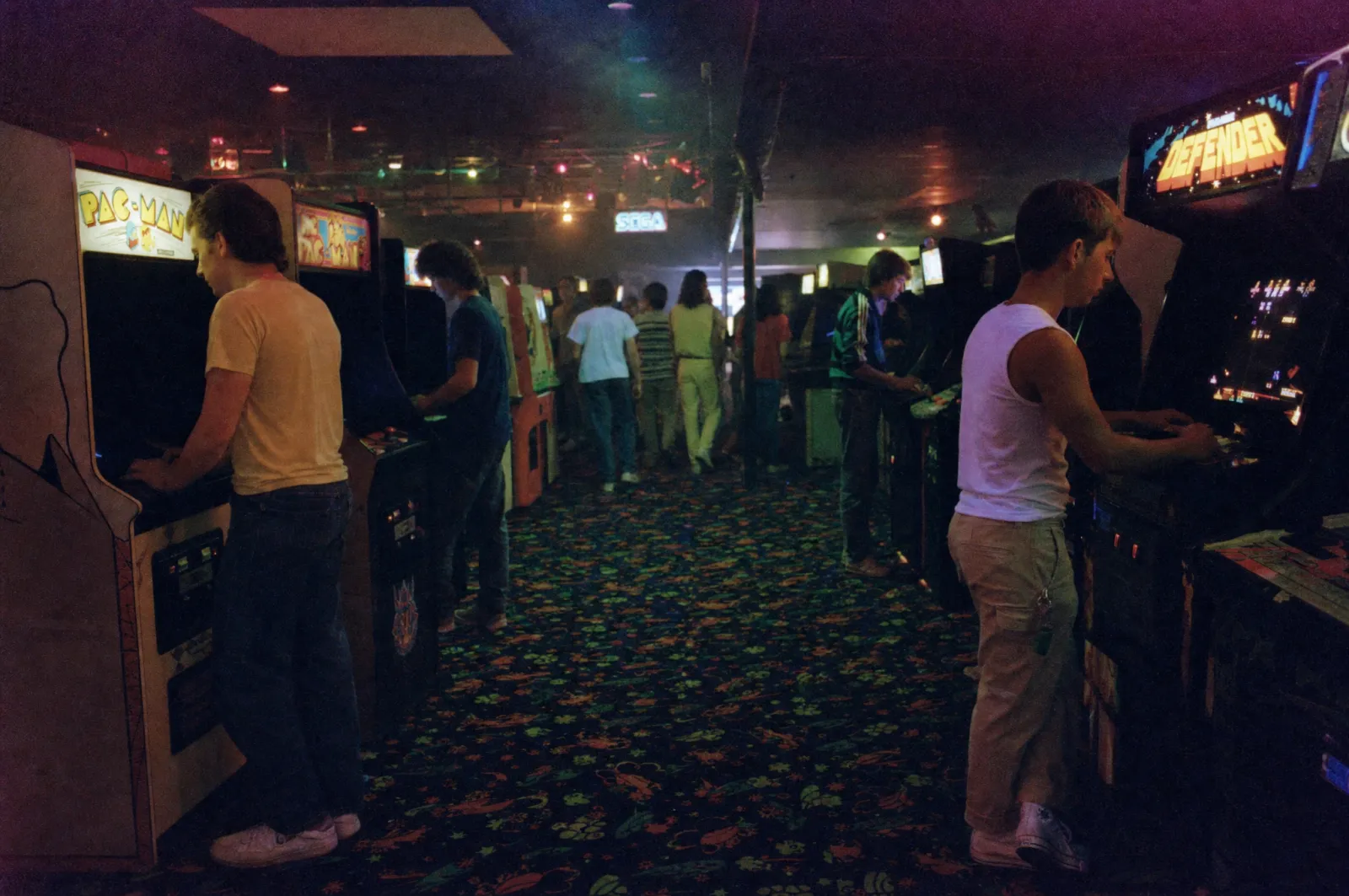
Prompt 48, unedited. The uncorrected mixed colour temperatures — some areas green, others magenta — are what make this read as pushed consumer film rather than a modern low-light photograph.
49. The shopping mall
The interior of an enclosed shopping mall, [1990], mid-afternoon.

Skylights throwing hard daylight onto a tiled floor, competing with
warm incandescent store lighting and green-cast fluorescents —
the colour temperatures deliberately unmatched.

A brass-railed balcony, large planters with real ferns, a fountain,
a directory sign in a chunky sans-serif.
Wide shot on a 28mm lens, everything in focus, slightly underexposed.
50. The bedroom
A teenager's bedroom, [1994], photographed in available light on
consumer film.

Posters taped edge to edge covering the wall, a CRT television on the
floor with a games console, a boombox, cassette tapes in a stack,
a beanbag chair, carpet.

Lit by a single window on an overcast day plus one warm lamp, so the
colour temperature is mixed and nothing is properly exposed.
Slightly wide, slightly crooked, taken from the doorway.
Chaining Prompts Into a Consistent Set
A single retro image is easy. A set of twelve that look like they came off the same roll of film is the actual job, and it needs a different approach.
Lock the technical clause first. Write your film stock, lighting, camera, year and ban list once, then treat it as fixed text you paste into every prompt while only the subject changes. The moment you start re-wording the technical half, your set stops matching.
Generate variations in one request. Current models hold character and object continuity across a batch far better than they match separate requests made minutes apart. Ask for the set in one go where you can. If you are producing volume, driving generation from the command line rather than the chat window makes batching and re-running a set far less tedious — we wrote up terminal-based image generation for exactly that workflow.
Edit rather than regenerate. Multi-turn editing got materially more reliable in the 2.5 release, so "same image, same lighting, change the jacket to denim" now holds the rest of the frame better than re-rolling the whole prompt — which would resample everything and break your set.
Use a reference image for the look. Better subject preservation from reference photos is one of the headline 2.5 improvements. One genuinely good output becomes the style anchor for the rest.
Upscaling Without Destroying the Grain
Retro images have a specific problem at upscale time: the artifacts are the aesthetic. Grain, chroma bleed, halation and dither are what make the image read as period, and most upscalers treat all four as noise to be removed. Run a 1990s disposable-camera shot through an aggressive enhancer and you get a clean, sharp, modern photograph of someone in 90s clothing — which is exactly the failure this entire article is trying to prevent.
Two rules. Keep any creativity or hallucination setting low, because at high values an upscaler invents detail that never existed at capture and the period illusion collapses — invented pore detail on a face shot on Kodacolor is an immediate tell. And upscale before you add any final grain pass, not after, so you are not magnifying the grain into blobs.
If you are preparing retro work for print or large-format display, a dedicated enhancer is worth it over a generic upscale — the credit maths on Magnific covers what a batch actually costs, which matters when a set of fifty images is the deliverable.
Eight Mistakes That Give the Game Away
- Modern teeth and eyebrows. The fastest tell in any retro portrait. Straight, uniformly white teeth and sharply defined modern brow shapes are contemporary. Ask for period-appropriate grooming explicitly.
- Clean bokeh. Shallow depth of field with smooth creamy background blur is a modern fast-lens look. Most consumer photography in both decades was shot at f/8 on a slow lens with everything in focus.
- A scanline overlay on a sharp image. VHS and CRT looks come from low resolution and signal degradation, not from stripes laid over a clean render. If the underlying image is sharp, the overlay reads as a filter.
- Mixing period and revival vocabulary. Kodachrome and synthwave in the same prompt cancel each other out. Pick one.
- Forgetting the aspect ratio. Anything from a television or early computer is 4:3. Polaroid is square. Widescreen retro is an immediate anachronism.
- Sepia as shorthand for old. Sepia is a darkroom toning process associated with pre-1940 photography. Applying it to the 80s or 90s skips both decades entirely.
- Immaculate environments. Real period rooms had visible cables, mismatched furniture, cigarette burns and clutter. Prompting a pristine set produces a museum recreation, not a photograph.
- Ageing damage on a photo that should be new. A picture taken in 1994 did not have creases and colour shift in 1994. Decide whether you are making a period photograph or a surviving artifact — they are different prompts.
The Verdict
Retro prompting rewards research more than it rewards creativity. The entire skill is knowing that Kodachrome renders red differently from Superia, that a disposable camera vignettes and a studio strobe does not, that 1984 and 1994 share almost nothing visually. That knowledge is what separates an image that looks like the past from an image that looks like a filter.
Start with the two decisions that govern everything: period or revival, and which year. Everything else in the prompt follows from those, and the fifty above are templates for the follow-through.
Keep Reading
OpenArt's credit and plan structure covers what a large prompt set actually costs to run, and ChatGPT prompts for ads and commercials applies the same specificity discipline to commercial work. Browse all prompts on PromptsRush.
Frequently Asked Questions
10 questions answered