Best AI Prompts for Logo Design
25 prompts covering the whole logo process — brand brief, concept exploration, mark construction, harsh critique, scalability testing and vector handoff. Built around what AI is genuinely good at, and honest about what it cannot do.
Advertisement
Here is the thing most articles about AI logo design will not tell you: image models cannot produce a usable logo file. They output raster pixels, not vectors. They garble typography. They cannot hold true geometric precision — a circle that is almost a circle, a curve that nearly matches its mirror. Every one of those is disqualifying for a mark that has to scale from a favicon to a building.
That is not a reason to skip AI. It is a reason to use it for the part it is genuinely excellent at: exploring a hundred directions in an hour, which is the part of logo design that normally takes a week and is where most projects go wrong. You explore with AI, decide with judgement, and execute in vector.
The 25 prompts below are organised around that reality. Some are for a language model — the brief, the critique, the naming of territories. Some are for an image model. None of them pretend the output is a finished logo.
What AI Actually Does Well Here
It is very good at: generating volume and variety fast, breaking you out of the first obvious idea, visualising abstract concepts, exploring one concept across many styles, producing mockups that make a mark feel real, and critiquing work when you ask it to be harsh.
It is bad at: typography, precise geometry, symmetry, consistent line weight, clean vector output, and anything requiring the mark to be identical across two generations. Recent models render text far better than they used to, but "far better" is not "reliable enough to ship."
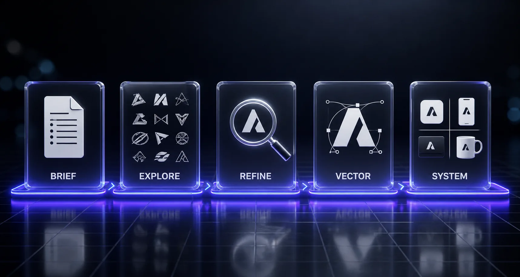
The workflow that works: brief in a language model, explore in an image model, choose with your own judgement, then rebuild the chosen direction properly in vector. The AI output is a reference for the vector artist — which may be you — not the deliverable.
Six Rules Before You Generate Anything
- Never name a real brand. Do not prompt for something in the style of an existing company's mark. It produces derivative work and creates trademark exposure. Describe the visual qualities instead.
- Generate the symbol and the wordmark separately. The symbol is where AI helps. Type should be set properly in a real typeface with real kerning — never generated.
- Ask for flat vector-style output. Photographic renders of logos look impressive and are useless. You want flat, high contrast, solid shapes on plain backgrounds.
- Test small before you fall in love. A mark that only works at 2000px is not a logo. If it fails at 16px, it fails.
- Trademark search before you commit. AI has seen every logo ever made and can reproduce something close to an existing mark without either of you noticing. A professional clearance search is not optional for a mark you intend to own.
- The output is a sketch. Treat every generation as a thumbnail an art director drew in thirty seconds. Useful, disposable, not final.
Strategy and Brief (Prompts 1–4)
Language model, not image model. Skipping this stage is why most logo projects produce something that looks fine and means nothing.
1. The Brand Discovery Interview
Act as a brand strategist running a discovery session with me. Interview me before designing anything.

BUSINESS: [WHAT IT IS AND WHAT IT SELLS]
CUSTOMERS: [WHO BUYS AND WHAT THEY CARE ABOUT]
CATEGORY: [WHAT MARKET THIS SITS IN]

Ask me questions in batches of three, one batch at a time, waiting for my answers before continuing. Cover:
- What the business actually does versus how it describes itself
- The single most important thing a customer should feel
- What the business is deliberately NOT
- Where it sits against competitors: challenger, incumbent, specialist, or alternative
- Longevity: is this a mark for five years or fifty
- Practical constraints: where the mark must work, what it must survive, who will apply it

After the interview, produce:
1. A positioning statement in one sentence
2. Three adjectives the mark must communicate, and three it must avoid
3. The single idea the logo should express, stated in plain language
4. Anything I said that contradicts something else I said, flagged for me to resolve

Push back where my answers are vague. "Premium" and "innovative" are not answers — make me be specific.
2. The Competitive Mark Audit
Audit the visual landscape of my category so I know what to avoid.

CATEGORY: [DESCRIBE]
COMPETITORS: [LIST THEM]
WHAT I KNOW ABOUT THEIR MARKS: [DESCRIBE EACH — form, colour, type, feel]

Analyse:
1. The visual conventions of this category — what almost every mark here does
2. Which conventions carry genuine meaning and which are just imitation
3. The colours that dominate, and what is conspicuously unused
4. The shape language patterns
5. Where the category is visually crowded, so I know which directions are already taken

Then tell me:
- Which convention I should keep, because breaking it would confuse customers about what the business does
- Which I should break, and what breaking it would signal
- The visual territory that is genuinely open in this category

Base your analysis only on the descriptions I gave you. Do not assert what a specific company's logo looks like from memory — if you need a description, ask me for it.
3. The Concept Territory Map
Diverge on meaning before diverging on form.
Generate distinct conceptual territories for this logo before any visual work.

BRIEF: [PASTE THE OUTPUT OF PROMPT 1]
CATEGORY CONVENTIONS TO AVOID: [PASTE FROM PROMPT 2]

Produce six genuinely different conceptual territories. For each:
1. The core idea in one sentence
2. Why it is true to this business specifically, not just appealing
3. Three visual metaphors that could express it
4. What it would signal to a customer
5. The risk of this direction

Rules:
- The six must be conceptually distinct, not six phrasings of one idea
- At least two should be non-obvious — the ones a competitor would not arrive at
- At least one should be abstract with no literal depiction
- Avoid the visual cliches of this category: [NAME ANY YOU ALREADY KNOW]
- No territory that requires explaining a pun

Then rank them by how well each would survive twenty years, and tell me which is most likely to be the safe boring choice.
4. The Design Brief
Write the design brief I will generate against.

STRATEGY: [PASTE FROM PROMPT 1]
CHOSEN TERRITORY: [PASTE THE ONE YOU SELECTED FROM PROMPT 3]
PRACTICAL REQUIREMENTS: [WHERE THE MARK MUST WORK — signage, app icon, embroidery, single colour print, vehicle livery, favicon]

Produce a brief covering:
1. The one idea the mark must express
2. Mark type and why: wordmark, lettermark, pictorial, abstract, emblem or combination
3. Formal direction: geometric or organic, sharp or soft, dense or open, symmetrical or dynamic
4. Weight and contrast requirements based on where it must reproduce
5. Colour direction and, critically, whether it must work in one colour
6. Minimum size it must remain legible at
7. What it must never look like
8. The test that would tell me the mark succeeds

Then produce a reusable generation block — under 80 words — capturing the formal direction, which I will paste into every image prompt.

Be specific enough that two different designers working from this brief would produce recognisably related work.
Concept Exploration (Prompts 5–9)
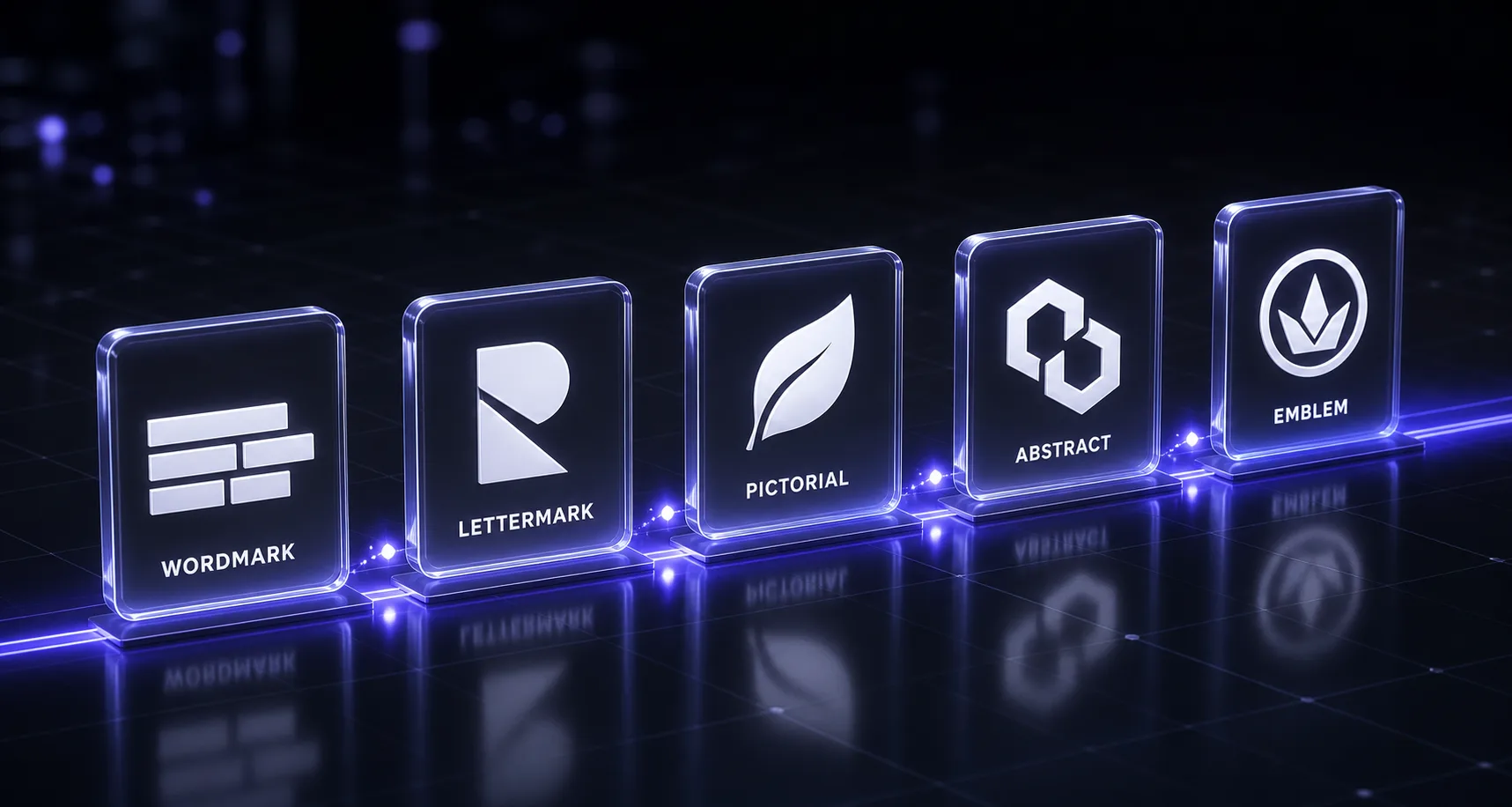
Image model. Volume stage. Generate far more than you need and discard ruthlessly.
5. The Divergent Concept Sheet
Generate a sheet of logo concept explorations.

CONCEPT: [THE IDEA THE MARK MUST EXPRESS]
FORMAL DIRECTION: [PASTE YOUR GENERATION BLOCK FROM PROMPT 4]

Produce a grid of 12 distinct logo mark concepts on a plain white background.

Output specification:
- Flat vector-style artwork: solid shapes, hard edges, no gradients, no shadows, no 3D rendering, no photographic effects
- Pure black on white, so form is judged without colour
- Each mark centred in its own cell at consistent scale
- Simple enough that each reads as a solid silhouette
- No text, no letters, no company name anywhere — symbols only

Variety requirements:
- Range from literal to fully abstract across the twelve
- Vary the construction: line-based, solid mass, negative space, modular, continuous stroke
- Vary the geometry: circular, angular, orthogonal, asymmetric
- No two should be minor variations of each other

CRITICAL: every mark must be an original invention and must not resemble the logo or symbol of any real company or organisation.
6. The Abstract Mark Exploration
Generate abstract logo marks — pure form, no literal depiction.

IDEA TO EXPRESS: [THE CONCEPT — expressed through form and movement only, not by depicting an object]
QUALITIES: [e.g. upward, connected, precise, expanding, balanced]
FORMAL DIRECTION: [PASTE GENERATION BLOCK]

Produce 9 abstract marks on a plain white background, arranged in a grid.

Construction approaches to spread across the nine:
- A single continuous stroke that never lifts
- Interlocking geometric primitives
- A modular system built from one repeated unit
- Rotational symmetry
- A form implied by negative space rather than drawn
- Deliberate asymmetry with visual balance
- Overlapping transparency creating a third shape
- Progressive repetition suggesting movement
- Pure geometric intersection

Output specification: flat vector-style, solid black on white, hard edges, no gradients or shadows, no text or letterforms, each mark centred at consistent scale.

Every mark must be entirely original and must not resemble any existing company logo.
7. The Pictorial Mark Exploration
Generate pictorial logo marks based on a recognisable subject.

SUBJECT: [WHAT THE MARK DEPICTS]
WHY THIS SUBJECT: [ITS CONNECTION TO THE BUSINESS]
FORMAL DIRECTION: [PASTE GENERATION BLOCK]

Produce 9 marks on a plain white background, spanning a spectrum of abstraction:
- Cells 1-3: the subject rendered with clear detail, still simplified for reproduction
- Cells 4-6: substantially reduced to essential shapes, recognisable but graphic
- Cells 7-9: reduced to the minimum that still reads as the subject

Craft requirements:
- Consistent stroke weight within each mark
- Each must read as a solid silhouette
- Avoid the obvious first depiction of this subject — find a less-used angle, gesture or fragment
- No fine detail that would disappear below 24px

Output specification: flat vector-style, solid black on white, hard edges, no gradients or shadows, no text, centred at consistent scale.

Every mark must be original and must not resemble any existing company logo or trademarked symbol.
8. The Monogram Exploration
Generate monogram and lettermark concepts.

LETTERS: [THE INITIALS — e.g. two or three characters]
FORMAL DIRECTION: [PASTE GENERATION BLOCK]

Produce 9 monogram concepts on a plain white background.

Construction approaches to spread across the nine:
- Letters sharing a common stroke
- One letter contained within another
- Letters interlocking or overlapping
- A letterform implied by negative space
- Geometric reconstruction of the letters from primitives
- Letters forming a single continuous path
- Stacked rather than side by side
- Rotational or mirrored arrangement
- Letters abstracted to near-unrecognisability while retaining their skeleton

Craft requirements:
- Consistent stroke weight and terminal treatment within each mark
- Counters — the enclosed spaces inside letters — must stay open enough to survive at small size
- Each must read as the intended letters, not as a shape that happens to contain them

Output specification: flat vector-style, solid black on white, hard edges, no gradients, no additional text beyond the letterforms themselves, centred at consistent scale.

IMPORTANT: I know AI renders letterforms imprecisely. Generate these as construction concepts to be rebuilt in vector — I am judging the idea, not the execution. Original work only, resembling no existing logo.
9. The Negative Space Concept
Generate logo marks built on negative space.

PRIMARY FORM: [WHAT IS DRAWN]
HIDDEN FORM: [WHAT APPEARS IN THE SPACE BETWEEN]
FORMAL DIRECTION: [PASTE GENERATION BLOCK]

Produce 6 marks on a plain white background where the counter-space creates a second readable form.

Requirements:
- The primary form must read instantly, before the hidden one is noticed
- The hidden form should be a genuine second reading, not a coincidental shape
- Both readings must survive at small size — negative space concepts fail first when scaled down
- Solid black on white only, since this technique depends entirely on figure-ground contrast
- Simple enough that the trick is elegant rather than laboured

Output specification: flat vector-style, hard edges, no gradients or shadows, no text, each mark centred at consistent scale.

Tell me honestly for each which reading dominates, and flag any where the hidden form is too subtle to be found. Original work only.
Mark Craft and Construction (Prompts 10–14)
10. The Geometric Construction Mark
Generate logo marks built on a strict geometric construction system.

CONCEPT: [THE IDEA]
CONSTRUCTION RULE: [e.g. built entirely from circles on a fixed grid / from a single square subdivided / from arcs of one radius only]
FORMAL DIRECTION: [PASTE GENERATION BLOCK]

Produce 6 marks on a plain white background, each obeying the construction rule strictly.

Requirements:
- Every curve is a true arc of a stated radius, not a freehand curve
- Every angle is a multiple of a stated increment
- Stroke weight is constant throughout each mark
- Proportional relationships are simple and repeated

Also produce, for the strongest one, a construction diagram showing the underlying grid and circles with the mark drawn over it.

Output specification: flat vector-style, solid black on white, hard edges, no gradients, no text, centred at consistent scale.

Note: I understand geometric precision is exactly what image models are worst at. These are construction concepts to be rebuilt accurately in vector — I am judging the system, not the execution. Original work only.
11. The Emblem or Badge
Generate emblem and badge logo concepts.

BUSINESS: [WHAT IT IS]
ELEMENTS TO INCLUDE: [SYMBOL, ANY DATE OR SHORT TEXT, ANY SUPPORTING ELEMENTS]
FORMAL DIRECTION: [PASTE GENERATION BLOCK]

Produce 6 emblem concepts on a plain white background.

Structural variety:
- Circular with the symbol centred and text following the curve
- Shield or crest structure
- Rectangular or banner-based
- Circular with a horizontal type band across the centre
- Minimal containment — an implied boundary rather than a drawn one
- Asymmetric containment

Requirements:
- Clear hierarchy: one element dominates, the rest support
- The interior symbol must be simple enough to survive the reduced space
- Consistent stroke weight between the container and its contents
- The whole must read as a single unit at small size

Output specification: flat vector-style, solid black on white, hard edges, no gradients.

Note: any lettering will be imprecise and is placeholder only — I am judging the structure. Original work resembling no existing badge, crest, seal, or institutional mark.
12. The Wordmark Direction
Read the caveat. This one is about direction, not output.
Help me define the typographic direction for a wordmark. Do not generate the wordmark itself.

COMPANY NAME: [NAME]
LETTER COUNT AND ANY AWKWARD CHARACTERS: [NOTE ASCENDERS, DESCENDERS, REPEATED LETTERS, UNUSUAL COMBINATIONS]
BRIEF: [PASTE FROM PROMPT 4]

Produce a written specification covering:
1. Typeface classification appropriate to the brief — grotesque, geometric sans, humanist sans, transitional serif, slab, or display — with the reasoning
2. Three to five specific typefaces worth testing, and what each would signal
3. Weight and width recommendation
4. Case treatment and the argument for it
5. Letterspacing direction and where it needs manual adjustment
6. Which specific letter pairs in THIS name will need kerning attention
7. Which letters offer an opportunity for a custom modification, and what that modification could be
8. What to avoid given the specific letters in this name

Then describe two or three custom letterform ideas — a modified terminal, a ligature, an altered counter — in enough detail that a designer could execute them.

Do not generate an image. AI-rendered typography is not accurate enough to judge, and a wordmark must be set in a real typeface and kerned by hand.
13. The Combination Lockup
Generate lockup arrangements combining a symbol and a wordmark.

SYMBOL: [ATTACH OR DESCRIBE YOUR CHOSEN MARK]
NAME: [COMPANY NAME AND ITS APPROXIMATE PROPORTIONS AS SET TYPE]

Produce 8 lockup arrangements showing the spatial relationship between symbol and type:
- Symbol left, type right, optically centred
- Symbol above, type below, centred
- Symbol above, type below, left aligned
- Symbol left, type right on two stacked lines
- Symbol integrated into the type
- Symbol enclosed with the type
- Wide horizontal arrangement for constrained spaces
- Compact stacked arrangement for square spaces

For each, indicate the clear space around the lockup and the proportional relationship between symbol height and cap height.

Output specification: flat, solid black on white, no gradients. Type may be rendered as approximate placeholder blocks or simplified letterforms — I am judging spatial relationships and proportion, not the typography.

Then tell me which arrangement is most flexible across applications, and which will break first in a constrained space.
14. The Responsive Mark Family
Design a responsive family of the mark that works from billboard to favicon.

MARK: [ATTACH OR DESCRIBE]
NAME: [COMPANY NAME]
APPLICATIONS: [WHERE EACH VERSION WILL BE USED]

Produce four versions in a single row, each shown at its intended relative scale:
1. FULL — symbol plus complete wordmark, for primary applications
2. COMPACT — reduced lockup with tighter spacing, for constrained horizontal spaces
3. SYMBOL — the mark alone, simplified if necessary, for app icons and social avatars
4. MINIMAL — the most reduced form that remains identifiable, for favicons and small stamps

For each simplification, remove detail rather than scaling it down — thin strokes thicken, small counters open up, fine detail disappears entirely.

Then show all four rendered at 16 pixels wide in a row, so I can see which survive.

Output specification: flat, solid black on white, hard edges, no gradients.

Tell me at which point the identity stops being recognisable, and what detail I would have to sacrifice to push it further.
Style Direction (Prompts 15–18)
15. The Minimal Line Mark
Generate logo marks in a minimal line style.

CONCEPT: [THE IDEA]

Produce 9 marks on a plain white background built entirely from strokes rather than filled shapes.

Style specification:
- Uniform stroke weight throughout, [THIN / MEDIUM / BOLD]
- [ROUNDED / FLAT] stroke terminals, consistent across every mark
- Generous open space inside the form
- The fewest strokes that express the idea — if a stroke can be removed without losing meaning, remove it
- Consistent corner radius where strokes meet

Vary across the nine: number of strokes, whether the path is continuous or broken, whether the form closes or stays open, and the degree of abstraction.

Output specification: flat vector-style, solid black on white, hard edges, no gradients, no fills, no text, centred at consistent scale.

Warning to account for: thin line marks fail at small sizes and in embroidery or engraving. Tell me which of these would not survive a 16px render or a single-colour stamp. Original work only.
16. The Bold Geometric Mark
Generate logo marks in a bold geometric style.

CONCEPT: [THE IDEA]

Produce 9 marks on a plain white background built from solid geometric mass.

Style specification:
- Heavy solid forms rather than strokes
- Constructed from geometric primitives: circles, squares, triangles, arcs
- High contrast between form and ground
- Simple, confident silhouettes readable at any size
- Where negative space appears, it is deliberate and generous
- Sharp precise intersections between shapes

Vary across the nine: the primitives used, symmetry versus asymmetry, density, and how many elements combine.

Output specification: flat vector-style, solid black on white, hard edges, no gradients, no outlines, no text, centred at consistent scale.

These should feel inevitable rather than decorative — the strongest geometric marks look like the only possible solution. Original work only.
17. The Organic Mark
Generate logo marks with an organic, hand-crafted quality.

CONCEPT: [THE IDEA]

Produce 9 marks on a plain white background with a deliberately non-mechanical character.

Style specification:
- Curves that vary in weight along their length, as a brush or nib would
- Slight asymmetry and irregularity — the hand is visible
- Natural growth-like forms rather than constructed geometry
- Terminals that taper or swell rather than cutting flat
- Warmth and imperfection, while remaining controlled and intentional

Vary across the nine: brush-like versus carved versus drawn, degree of irregularity, and openness of form.

Output specification: flat vector-style, solid black on white, no gradients, no texture overlays, no text, centred at consistent scale. Irregular but crisp-edged — this is hand-drawn character reproduced as clean vector, not a scanned texture.

Original work only. Tell me which of these would lose their character when reduced, since irregularity is the first thing to disappear at small size.
18. The Style Matrix
One concept, many treatments — the fastest way to find the right register.
Take one concept and render it across many stylistic treatments.

CONCEPT: [THE SINGLE IDEA — describe the form precisely so it stays recognisable across all versions]

Produce a grid of 12 versions of the SAME underlying concept, each in a different treatment:
1. Minimal thin line
2. Bold solid geometric
3. Rounded and soft
4. Sharp and angular
5. Built from a modular grid
6. Organic and hand-drawn
7. Defined by negative space
8. Constructed from repeated units
9. Monoline with rounded terminals
10. High-contrast with varying stroke weight
11. Fragmented or deconstructed
12. Reduced to the absolute minimum

Critical: the underlying idea must remain recognisable across all twelve. This is one concept in twelve registers, not twelve concepts.

Output specification: flat vector-style, solid black on white, hard edges, no gradients, no text, consistent scale and cell size throughout.

Then tell me which treatment best matches this brief: [PASTE BRIEF SUMMARY]. Original work only.
Refinement and Testing (Prompts 19–22)
19. The Harsh Critique
Ask for approval and you get approval. Ask for demolition and you get something useful.
Critique this logo as a senior design director would in a review. Do not be encouraging.

MARK: [ATTACH]
BRIEF: [PASTE FROM PROMPT 4]
CATEGORY: [WHAT MARKET THIS COMPETES IN]

Assess honestly:
1. Does it express the intended idea, or does it merely look acceptable
2. Silhouette strength — does it read as a solid black shape
3. Whether it would still be legible at 16 pixels, and what fails first
4. Whether it works in a single colour, and in reverse on dark
5. Balance, optical weight, and any awkward spacing or tangent
6. Craft problems: inconsistent stroke weight, imprecise curves, broken symmetry, uneven counters
7. Whether it looks like other marks in this category
8. Whether it will look dated in five years, and which element will age worst
9. What a competitor would say about it

Then:
- Name the single biggest problem
- Give the three changes that would most improve it, ranked by impact
- State plainly whether this is worth refining or worth abandoning

Do not list strengths unless I ask. I want the problems.
20. The Scalability Test
Test this mark across sizes and reproduction conditions.

MARK: [ATTACH]

Produce a test sheet showing the mark rendered at: 512px, 128px, 64px, 32px, and 16px, in a single row on a plain background, each at actual relative size.

Then produce a second sheet showing it:
- In solid black on white
- Reversed in white on black
- As an outline only
- With a single flat colour fill
- At low contrast, simulating poor reproduction

Then assess:
1. The smallest size at which it remains identifiable
2. Which detail disappears first as size decreases
3. Whether counters and negative space close up
4. Whether stroke weights merge
5. Whether it survives reversal without losing form
6. What would need to change for a small-size variant

Be specific about the pixel size at which each failure occurs, and tell me whether this mark needs a simplified small-size version or whether one drawing can serve every application.
21. The Colour System
Build a colour system for this mark.

MARK: [ATTACH — designed in black and white]
BRAND POSITIONING: [PASTE FROM PROMPT 1]
CATEGORY COLOUR CONVENTIONS: [PASTE FROM PROMPT 2]
APPLICATIONS: [DIGITAL, PRINT, SIGNAGE, MERCHANDISE — list what applies]

Produce:
1. A primary colour recommendation with the reasoning, including what it signals and how it sits against the category
2. Two alternative primary directions with different strategic arguments
3. A supporting palette: secondary, neutral range, and one accent
4. Specifications in HEX, RGB and CMYK, plus a note on which need a Pantone match for print
5. Contrast ratios against white and black backgrounds, with WCAG pass or fail for text use
6. How the mark behaves in single colour, in reverse, and on photography
7. The colour combinations to prohibit in the guidelines

Rules:
- The mark must work in pure black and pure white before colour is applied
- Check that the primary is distinguishable from competitors as described
- Flag any colour choice that will be problematic in print or on screen
- Note any colour with strong cultural associations that could misread in other markets
22. The Similarity Sanity Check
Not a legal search. A first filter before you spend money on one.
Review this mark for similarity risk before I take it to a professional trademark search.

MARK: [ATTACH AND DESCRIBE IT IN WORDS]
CATEGORY AND MARKETS: [WHERE IT WILL BE USED]

Assess:
1. Whether the underlying visual concept is a common or generic device in this category
2. Which elements are distinctive and which are conventional
3. Whether the form resembles any widely-used symbol type — and describe the category of similarity rather than asserting specific company matches
4. Whether the concept is likely to be crowded in trademark registers for this class
5. What descriptive terms an examiner or searcher would use to classify this mark

Then:
- Rate how distinctive this mark is, and therefore how defensible
- Suggest modifications that would increase distinctiveness without losing the idea
- List the specific search terms and visual classifications to give a trademark professional

CRITICAL LIMITATIONS you must state in your answer: you cannot search trademark registers, you cannot reliably recall specific existing logos, and nothing here is legal advice or a clearance opinion. This is a preparation step. A registered trademark attorney must run an actual clearance search before I adopt this mark. Do not tell me a mark is available.
System, Application and Handoff (Prompts 23–25)
23. The Application Mockups
Show this mark in realistic application contexts.

MARK: [ATTACH]
BUSINESS TYPE: [WHAT IT IS]
KEY TOUCHPOINTS: [WHERE THE MARK ACTUALLY APPEARS MOST]

Produce photorealistic mockups showing the mark applied to:
[SELECT THE ONES THAT MATTER — business card, storefront signage, app icon on a phone home screen, website header, packaging, vehicle, apparel, email signature, social profile]

Requirements:
- The mark reproduced exactly as supplied — correct proportions, correct colour, no distortion, no added effects
- Realistic scale and placement for each context
- Clean, neutral presentation — the mockup should not flatter the mark with dramatic lighting
- Appropriate clear space around the mark in every application

Then assess: in which of these contexts does the mark work least well, and why? I want to know where it struggles, not to see it flattered.

Note that these mockups are for evaluation, not for use as marketing material implying the business already operates at this scale.
24. The Brand Guidelines Skeleton
Write the logo guidelines document for this mark.

MARK AND VARIANTS: [ATTACH ALL VERSIONS]
COLOUR SYSTEM: [PASTE FROM PROMPT 21]
APPLICATIONS: [WHERE IT WILL BE USED AND BY WHOM]

Produce a guidelines document covering:
1. The mark and what it means, briefly
2. The variant set and the specific rule for when each is used
3. Clear space, defined as a proportion of a mark element rather than a fixed measurement
4. Minimum sizes for print and screen, stated separately
5. Colour specifications and approved colour combinations
6. Backgrounds it may be placed on, including rules for photography
7. Misuse: the specific things people will do wrong — stretching, recolouring, rotating, adding effects, altering spacing, placing on busy imagery, recreating it in the wrong typeface
8. Co-branding rules if relevant
9. File formats provided and which to use where

Write the rules so a non-designer can follow them without judgement calls. Where a rule needs a visual example, describe exactly what that example should show.
25. The Vector Handoff Spec
The bridge from AI exploration to a real logo file.
Write the specification for rebuilding this mark properly in vector.

MARK: [ATTACH THE AI-GENERATED REFERENCE]
INTENDED APPLICATIONS: [LIST]

Analyse the reference and produce a build specification:
1. The underlying geometric structure — what grid, what circles, what proportional system the form implies
2. Exact construction: radii, angles, and proportional relationships stated as ratios
3. Stroke weight as a proportion of the overall mark height
4. Corner radii and terminal treatments
5. Where the reference is imprecise and needs correcting — asymmetry that should be symmetric, curves that should be true arcs, weights that should match
6. Optical adjustments needed beyond mathematical accuracy — where geometric correctness will look wrong to the eye and must be compensated
7. Path and anchor point strategy for a clean, minimal vector build
8. Required export formats and sizes

Be explicit that the AI reference is a concept sketch, not a template to trace. Auto-tracing produces bloated paths and preserves every imprecision. This mark should be redrawn from the construction logic above.

Flag anything in the reference that cannot be resolved into clean geometry and would need a design decision from me.
The Workflow, End to End
- Strategy first — prompts 1 to 4, in a language model. Do not skip to generating.
- Diverge widely — prompts 5 to 9. Generate hundreds. Print them small. Discard 95%.
- Develop the survivors — prompts 10 to 14 on the three or four directions worth pursuing.
- Find the register — prompt 18 on your leading concept.
- Attack it — prompt 19, honestly, before you get attached.
- Test it — prompt 20. Small sizes kill more marks than bad concepts do.
- Rebuild in vector — prompt 25. This is where the actual logo gets made.
- Clear it — prompt 22 to prepare, then a real trademark search with a real attorney.
- Systematise — prompts 21, 23 and 24.
Mistakes That Waste the Whole Process
- Generating before briefing. You will produce a thousand attractive marks that mean nothing, then pick the prettiest. That is how brands end up with a logo that could belong to anyone.
- Treating the output as final. It is raster, imprecise and unsymmetrical. It is a sketch.
- Auto-tracing the AI output. Tracing preserves every wobble and produces hundreds of unnecessary anchor points. Redraw from the construction logic instead.
- Generating typography. Set the wordmark in a real typeface and kern it by hand. Always.
- Judging at large size. View everything at 32px before you fall in love with it.
- Naming brands in prompts. Produces derivative work and creates legal exposure.
- Skipping the trademark search. The single most expensive mistake available in this process, and AI makes it more likely rather than less.
- Falling for the mockup. Anything looks credible on a storefront render. Judge the mark on white first.
- Asking AI whether it is good. It will say yes. Prompt 19 exists because you have to explicitly ask for the opposite.
Where to Run These
Strategy, critique and specification prompts work in any capable language model. For generation, you want a model that handles flat graphic output well — our image MCP guide covers connecting one directly to Claude so you can iterate in conversation, and the OpenArt review covers a platform with broad model access. If you already pay for a plan with image generation, generating from the terminal is the cheapest route to high volume, which matters when the exploration stage wants hundreds of thumbnails.
For adjacent work: Midjourney prompts for creators, luxury brand creative workflows, and Claude Design prompts if the logo is heading into a product interface.
Keep Reading
More design and image work: image MCPs for Claude, the OpenArt review, Midjourney prompts for creators, luxury brand creatives with ChatGPT, Claude Design prompts, and Claude Design vs Figma. Or browse all guides and prompts on PromptsRush.
Frequently Asked Questions
10 questions answered