Loading model...
Best Nano Banana Pro prompts
153 prompts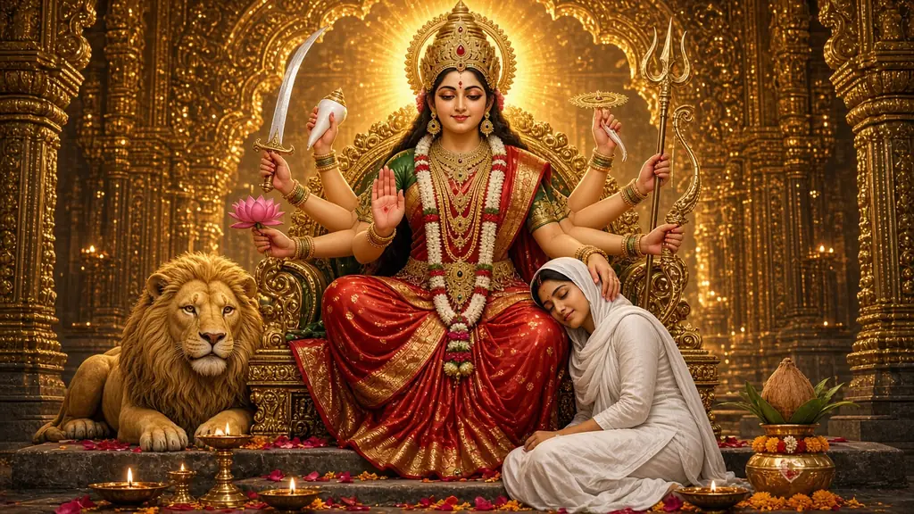
Image
Portrait & Character
Maa Durga Blessing AI Image Prompt
A Maa Durga AI image prompt that generates the Divine Mother on her temple throne blessing a devotee at her feet, with control over form, pose and style. This template creates a vertical 9:16 divine mother's blessing scene: a giant, serene goddess on a golden throne rests one hand on the head of a small devotee at her feet. The contrast in scale feels safe, tender and deeply emotional, and every form carries her full traditional iconography. What you can customize Goddess Form: Maa Durga, all nine Navadurga forms, Maa Parvati or a gentle, motherly Maa Kali, each with her own weapons, mudras and vahana. Devotee: anyone of any age or gender in modest traditional clothes; the default wears a white salwar suit. Devotee's Pose: head in her lap, asleep at her feet, folded hands, touching her feet, offering a diya or holding her hand. Temple Setting: golden temple arches, a Durga Puja pandal, a Himalayan shrine, a rock cave shrine, a lotus-pond garden, a cosmic throne or a home mandir. Festival / Occasion: Navratri, Durga Puja, Diwali, Vijayadashami or a quiet everyday prayer. Light & Mood: a warm temple glow, dawn rays, diya flame-light, moonlit silver, a divine aura burst or monsoon and lamps. Colour Palette: red & green, red & gold, saffron & marigold, ivory & gold, royal blue & silver or pastel lotus. Art Style: photoreal cinematic, Raja Ravi Varma oil, Pichwai, 3D animated, watercolour, Tanjore gold-leaf or Indian miniature. Extra Details: optional touches such as petals on the steps, lit diyas or a glow where her hand rests. Reference Photo (optional upload): add your own photo to become the devotee in her lap. Best for Navratri and Durga Puja stories, reel covers and WhatsApp status images, mobile wallpapers, a devotional post for each of the nine days, and framed gifts for family. Tips for the best results Choose the goddess form first; the vahana and weapons come with it, so keep extra details free of other animals. Keep the devotee description to age, clothing and hair; the pose field handles the body. For the Reference Photo, use a clear front-facing photo and a model that accepts image input. Head in Her Lap and Asleep at Her Feet give the most emotional result. Add greetings later in an editor, not in the prompt.
24 ViewsTemplate
Image
Portrait & Character
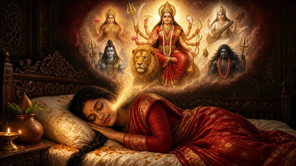
Navratri Goddess Dream AI Image Prompt
A Navratri AI image prompt that generates a devotee peacefully dreaming of Maa Durga or a Navadurga goddess, with full control over form, scene and style. This template creates a two-tier devotional dream scene: a devotee sleeps peacefully in a lamp-lit room while a glowing cloud above reveals the goddess they are dreaming of, surrounded by other deities. Every goddess option carries her complete traditional iconography, so the arms, weapons, mudras and vahana come out right. What you can customize Goddess in the Dream: Maa Durga, all nine Navadurga forms from Shailaputri to Siddhidatri, Maa Lakshmi or Maa Saraswati. Sleeping Devotee: describe anyone, of any age or gender, in modest traditional attire; the default is a young woman in a red-and-gold saree. Deities Around Her: a divine pantheon, the Navadurga circle, the Tridevi, Shiva's family, rishis and devas, or a simple lotus halo. Setting: a carved wooden bedroom, a village home, a modern apartment, beside the home altar, a rooftop under the stars or a palace chamber. Festival / Occasion: Navratri, Durga Puja, Diwali, Vijayadashami dawn or everyday devotion, each with its own ritual props. Dream Mood & Light: a warm golden aura, moonlit calm, pre-dawn brahma muhurta, a cosmic starfield, a petal shower or diya glow. Colour Palette: red & gold, saffron & marigold, ivory & pearl, emerald & gold, royal blue & silver or pastel lotus. Art Style: photoreal cinematic, Raja Ravi Varma oil, Pichwai, 3D animated, watercolour, Tanjore gold-leaf or Indian miniature. Extra Details: optional touches such as a bedside diya, petals on the pillow or light rising into the dream. Reference Photo (optional upload): add your own photo to appear as the sleeping devotee. Best for Navratri and Durga Puja greetings, WhatsApp status and Instagram stories, devotional phone wallpapers, a new post for each of the nine nights, and prints for the home mandir. Tips for the best results For a nine-night series, change only the goddess and keep every other field the same so the posts match. Keep the devotee description short and concrete: age, attire, hair and sleeping pose. For the Reference Photo, use a clear front-facing photo and a model that accepts image input. If a companion repeats the main goddess, switch to the lotus halo or the rishis instead. Add greetings later in an editor, not in the prompt.
Image
Portrait & Character
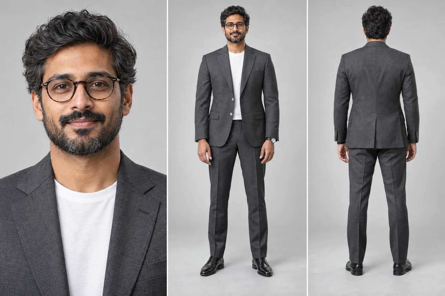
Character Reference Sheet Prompt
A character reference sheet prompt that builds a multi-panel studio sheet of one person — close-up, full-body front and back, perfectly consistent. It produces the sheet artists, studios and brand teams actually use: equal side-by-side panels on one seamless backdrop, the same face, wardrobe and proportions in every view, and the rear panel showing real back tailoring rather than a mirrored copy of the front. Why every panel shows the same person Multi-view sheets usually fail by producing three similar-looking strangers. The prompt names consistency as its most important requirement — identity, age, hair, glasses, proportions, fabric and accessories locked across panels, all views on one baseline at matching scale — and bans the specific drift modes that ruin a sheet. What you can customize The Subject — who the sheet is of, in your own words: age, hair, facial hair, glasses and expression Panel Layout — close-up with front and back, front and back only, a four-view turnaround, a portrait trio, close-up plus turnaround, or a hero portrait beside a full-body pair Wardrobe — charcoal suit with a white tee, navy suit and tie, black tuxedo, smart casual blazer, bandhgala, streetwear, shirt and trousers, or a fantasy adventurer outfit Studio Backdrop — light grey seamless, white cyclorama, warm beige, deep charcoal, blue gradient, or a technical grid board Lighting — soft even studio, high-key, Rembrandt key, dramatic low-key, window daylight, or beauty ring light Render Style — ultra-photorealistic, cinematic film still, 3D character render, stylized illustration, anime model sheet, or comic ink Extra Details — watches, shoes, props or anything else to carry across panels Best for Character design and concept art, game and animation asset references, brand and founder photo kits, actor and model comp cards, tailoring and lookbook mockups, and keeping one character consistent across a series. Tips for the best results Describe the subject precisely and give one age, since conflicting ages are the fastest way to get different faces per panel. Attach a photo when you need a real likeness; skip it to invent a character from the description alone. Fewer panels hold identity better, so use two or three views when the face matters most and reserve four-view layouts for full-body wardrobe checks. Match the render style to the use: photoreal for people, 3D or anime for production assets. The sheet renders deliberately text-free, so add panel labels or annotations in any editor afterward.
Image
Portrait & Character
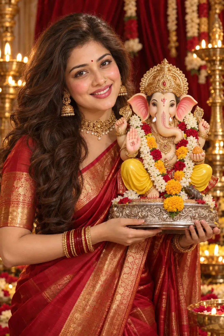
Festive Portrait Holding Ganpati Idol
A festive portrait prompt that shows you in a silk saree holding a garlanded Ganpati idol, with your real face and seven festival looks. Upload one photo and it creates a studio-lit devotional portrait: you in rich silk and temple jewellery, holding a beautifully decorated idol close, framed by velvet drapes and glowing brass lamps. What you can customize Sacred Idol — Ganpati for Ganesh Chaturthi, Lakshmi for Diwali, Laddu Gopal for Janmashtami, Maa Durga for Navratri, plus Krishna, Saraswati and Radha Krishna. Subject — used only when no photo is attached; your upload carries your real face. Expression — a warm smile by default, or any mood from the shared expression list. How You Hold It — beside the shoulder, cradled at the chest, raised in offering or placing it on the altar. Saree — red-gold Kanjivaram, yellow Paithani, green Banarasi, white-red Bengali, royal purple silk, pink Chanderi or maroon bridal. Jewellery — temple gold, kundan polki, Maharashtrian pearl nath, oxidized silver or minimal gold. Makeup Look — soft festive glow, natural dewy, bold bridal red lip or classic kohl eyes. Backdrop — velvet with brass lamps, marigold toran decor, home mandir, rangoli with diyas, Durga pandal lights or evening fairy lights. Best for Festival wishes and WhatsApp status for Ganesh Chaturthi, Diwali, Janmashtami and Navratri, family festive photos, and saree or jewellery brand posts with a devotional theme. Tips for the best results Upload a clear, front-facing photo of just you with visible hair so the likeness carries over. Match the idol, saree and backdrop to one festival, such as Lakshmi with a rangoli and diyas for Diwali. Pick the Maharashtrian pearl nath with the yellow Paithani for a classic Ganeshotsav look. Avoid tightly cropped selfies; the idol needs room beside you in the frame.
Image
Social Media
Road Trip with Hindu Gods Photo
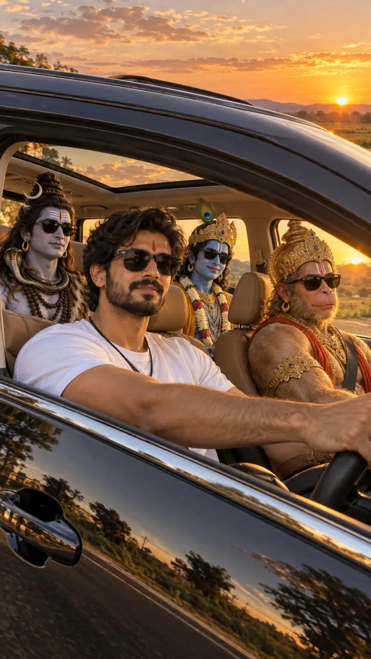
A road trip with Hindu gods AI photo prompt that seats Hanuman, Shiva and Krishna in your car, with your real face at the wheel. Upload one photo and it renders the viral devotional road-trip photo: you driving a car at golden hour while your favorite deities ride along in full traditional iconography, wearing matching sunglasses. What you can customize Divine Passengers — eight groups, including Hanuman, Shiva and Krishna, Ram Darbar, the Shiva family, Radha Krishna, Lakshmi-Ganesha-Saraswati, Maa Durga, Krishna and Arjuna, and the Trimurti. Driver — used only when no photo is attached; your upload carries your real face. Driver Outfit — type any look, from a white tee to a kurta or a festive sherwani. Sunglasses — everyone in shades, only the driver, or the deities in their traditional form. Vehicle — luxury SUV with sunroof, open-top jeep, classic white Ambassador, red convertible or a garlanded sedan. Setting — golden-hour road, Himalayan highway, coastal road, desert dunes, monsoon drive, city lights or a temple town. Camera View — through the driver window, through the windshield, a dashboard selfie or a drone shot through the sunroof. Extra Details — small touches like a marigold garland on the mirror or diyas on the dashboard. Best for Festival wishes for Janmashtami, Mahashivratri, Hanuman Jayanti and Diwali, WhatsApp and Instagram status posts, and devotional reels that stand out from ordinary god wallpapers. Tips for the best results Upload a clear, front-facing photo of just you in good light so your likeness carries into the driver seat. Match the setting to the occasion — a temple town for pilgrimages, a monsoon drive for Shravan, city lights for Diwali. Keep the passenger group to the one you pick; adding extra deities in Extra Details crowds the car. Choose the no-sunglasses option for a more traditional, reverent version of the same scene.
Image
Social Media
Motu Patlu AI Photo Prompt
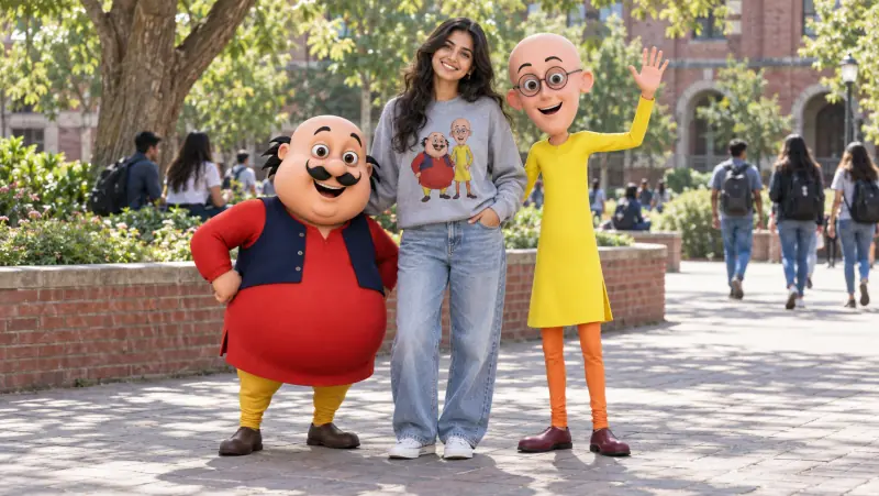
A Motu Patlu AI photo prompt that puts you in a real photo with the famous cartoon duo — your exact face, eight fun poses, and six render styles. Upload one photo and it builds the viral fan picture: you standing, laughing or snacking with Motu and Patlu, rendered as real characters sharing the scene with you. It matches the lighting, color and soft contact shadows so the cartoons look like they are actually standing next to you. Why Motu and Patlu stay on-model Both characters are written into the prompt as a fixed lock that no field can change: Motu short and round with his curled mustache, red kurta and navy vest, and Patlu tall and thin with round glasses, a yellow kurta and orange leggings. Every field changes the scene around them, so the duo stays recognizable whatever you pick. What you can customize The Pose — standing between them, group selfie, arms around shoulders, samosa party, bench, high-five jump, walking together, or a candid laugh Motu & Patlu Reaction — cheerful wave, big laughter, surprised wow, thumbs up, dance moves, or proud best friends Your Outfit — a character print sweatshirt, the same sweatshirt with the name printed, streetwear hoodie, summer tee, casual kurta, festive ethnic, or keep your own outfit Location — campus plaza, cartoon hometown street, samosa stall, city park, mall atrium, beach promenade, amusement park, or railway platform Character Render — 3D animated in a real photo, soft feature-film 3D, life-size mascot costumes, hyperreal live-action, clay stop-motion, or a 2D cartoon overlay Photo Look — bright daylight, golden hour, phone candid, cinematic grade, evening lights, or vivid pop color Extra Details — anything else to add to the scene Best for Instagram posts and reels covers, WhatsApp status and display pictures, nostalgic fan posts, birthday surprises for a Motu Patlu fan, and fun profile pictures. Tips for the best results Use a clear, well-lit, front-facing solo photo without sunglasses, hats or heavy filters. The printed-name sweatshirt adds real lettering, so use a model with strong text rendering and regenerate if a letter garbles. If a character drifts off-model, such as Patlu growing hair or Motu gaining glasses, regenerate rather than editing. Pick Keep My Outfit to wear exactly what you have on in the photo. Motu and Patlu are trademarked characters, so keep results to personal fan posts rather than ads or merchandise.
Image
Social Media
Life-Size Cartoon Mascot Photo
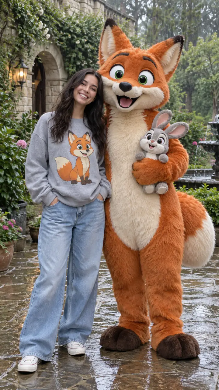
A cartoon character photo prompt that puts you beside a life-size version of your favorite character, wearing a matching graphic sweatshirt. Upload one photo and it renders a joyful meet-and-greet snapshot: you in an outfit printed with the character, standing next to that same character brought to life at human height in a real setting. What you can customize Cartoon Character — describe any character by look, or name your favorite, including a sidekick to hold. Person — used only when no photo is attached; your upload carries your real face. Character Look — realistic plush costume, 3D animated character, soft felt toy or claymation figure. Matching Outfit — graphic sweatshirt with baggy jeans, graphic tee, graphic hoodie or tee dress. Pose — side by side, arm around the shoulder, high five, big hug or both waving. Setting — rainy garden courtyard, theme park street, city sidewalk, sunny park or studio backdrop. Best for Fans who want a share-worthy photo with a beloved character, brand and event teams creating mascot meet-and-greet visuals, and creators making playful Instagram and WhatsApp posts. Tips for the best results Upload a clear full-length photo of one person on a simple background so your likeness and proportions carry over. Describe the character by species, colors, eyes and signature features rather than by name alone. Keep the matching-outfit option on; the printed graphic is what makes the photo read instantly. Avoid group photos and busy backgrounds as the reference image. Famous characters belong to their studios, so keep those images for personal fun, not posters or merchandise.
Image
Portrait & Character
Ganesh Chaturthi Murti AI Image Prompt
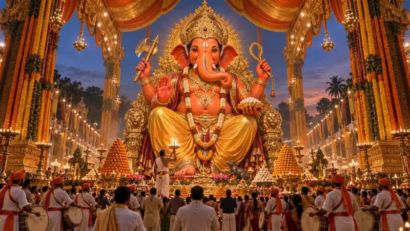
A Ganesh Chaturthi AI image prompt that generates a colossal Lord Ganesha murti in a grand public pandal, with eight divine forms and soaring scale. It recreates the spectacle of the biggest public pandals: a towering murti as the undisputed focal point, devotees and dhol-tasha drummers small at its base, and open, spacious composition that makes the scale feel immense rather than cluttered. Why the murti comes out right Deity art fails most often on iconography, so each Murti Form option carries a complete, self-contained description — crown, ornaments, what each hand holds, the vahana. The fixed tail then guards the details models usually get wrong: a single correctly curved trunk and the right number of arms for the chosen form. What you can customize Murti Form — royal seated king, gold ornament splendor, eco shadu clay, dancing Nritya Ganapati, Panchmukhi on a lion, standing protector, Bal Ganesha, or white marble Pandal Setting — a grand street pandal, temple replica, royal palace durbar, floral mandap, eco bamboo and jute, seaside visarjan float, or village chowk Scene — who and what surrounds the murti, in your own words Festive Moment — evening aarti, night light spectacle, morning sthapana, gulal celebration, monsoon night, golden hour, or visarjan farewell Camera & Scale — low-angle heroic, symmetrical aisle, aerial drone view, close divine portrait, wide street panorama, or three-quarter side Decor Palette — saffron and gold, royal red, pastel floral, emerald, royal blue and silver, or ivory and gold Art Style — photorealistic, cinematic film still, 3D render, classical oil painting, watercolor, or traditional miniature Extra Details — offerings, flowers, an aura, or anything else to add Best for WhatsApp status and display pictures, Instagram festival posts, Ganesh Chaturthi greeting cards, pandal committee posters, phone and desktop wallpapers, and thumbnails for festival videos. Tips for the best results Choose the form first and leave arms and hand objects out of the Scene field — the form already defines them, and repeating them causes conflicts. For the most spacious feel, pair Low-Angle Heroic or Symmetrical Aisle with a grand pandal; use Aerial Drone View to show crowd scale. Keep the Scene to three or four elements, since a crowded foreground shrinks the murti. If the trunk or arm count comes out wrong, regenerate rather than editing. The image is deliberately text-free, so add greetings such as Ganpati Bappa Morya in any editor afterward.
Image
Social Media
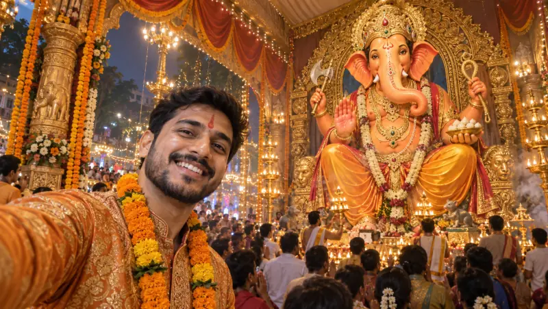
Selfie with Ganpati Bappa AI Prompt
A Ganpati selfie AI prompt that places you in front of a colossal Lord Ganesha murti at a public pandal, with your exact face and festive glow. Upload one photo and it builds the selfie everyone wants from pandal visits: you large and smiling in the foreground, a towering Bappa rising behind, and the lights, drums and marigolds of the celebration all around. It works just as well for anyone who could not make it to the pandal this year. Why you and Bappa both stay recognizable Your photo is treated as a strict identity source, so your face, skin tone and hair are preserved while the outfit and scene are rebuilt. The fixed framing puts you in the left foreground and the murti on the right with open space between you, so neither covers the other, and the phone is never shown. What you can customize Selfie Moment — joyful arm-out selfie, one-hand namaste, pointing up at Bappa, gulal celebration, dhol dance, modak moment, or serene tilak portrait Festive Outfit — saffron and gold festive wear, nauvari saree, kurta with pheta, dhol-tasha troupe uniform, pastel ethnic, or keep your own outfit Murti Behind You — royal seated king, gold ornament splendor, eco shadu clay, dancing Ganesha, standing protector, or white marble Pandal Setting — grand street pandal, temple replica, floral mandap, visarjan procession, housing-society pandal, or village chowk Festive Moment — evening aarti, night lights, gulal celebration, morning sunlight, monsoon drizzle, or golden hour Photo Look — modern phone selfie, portrait-mode bokeh, night flash, cinematic warm grade, vivid HDR, or soft film Extra Details — a tilak, a garland, fairy lights, or anything else to add Best for Instagram posts and stories, WhatsApp status and display pictures, festival wishes to family and friends, and sharing a pandal moment with relatives who live far away. Tips for the best results Use a clear, well-lit, front-facing solo photo without sunglasses, hats or heavy filters. Pick Keep My Outfit to wear what you have on in the photo. With Portrait Mode Bokeh the murti softens but stays recognizable; choose Modern Phone Selfie for a fully sharp background. Only upload photos of people who are happy to be featured. The image is text-free, so add a Ganpati Bappa Morya greeting in any editor afterward.

Image
Fashion & Beauty
Hairstyle Analysis Grid Prompt
A hairstyle AI prompt that builds a side-by-side comparison grid from one portrait, so you can see which cut actually suits your face. Every panel shows the same person with a different haircut, labelled underneath in short clean type, on a minimal neutral background. It is visual-first by design — short labels only, no paragraphs — so the whole comparison reads at a glance on a phone. Why the comparison stays fair The prompt locks identical framing, lighting, expression and clothing across every panel and holds the natural hair color constant, so only the cut changes. A comparison stops being a comparison the moment the pose or the light shifts between tiles. What you can customize Hairstyles to Compare — a free text field: list the cuts you want in panel order, from fades and buzz cuts to bobs, layers, curtain bangs or braids Layout — a four-up grid, a side-by-side pair, a row of three, or a six-up sheet Verdict Style — a BEST MATCH badge on the strongest panel, ranked numbers, a suits-versus-avoid split, or no ranking at all Background — warm ivory, studio grey, soft beige, or charcoal with the labels reversed out in light type Best for Deciding before a salon appointment, stylist and barber consultations, client decks for hair and image consultants, personal-shopping services, and salon social content. Tips for the best results Upload a clear, front-facing photo with the whole face visible and hair pulled away from the cheeks — the model has to rebuild the hairline in every panel. Keep each style name short; long names are where the rendered labels start to garble. Run it in a model with strong text handling and regenerate if a word comes out wrong. Compare four styles at a time — a six-up sheet packs the faces smaller and makes fine differences harder to judge.

Image
Education
Cross-Section Cutaway Diagram
A cutaway diagram prompt that turns any photo into a clean, textbook-style cross-section revealing a believable labeled interior. Upload a picture of almost anything — a fruit, a camera, an engine, a building, an animal — and the template rebuilds it as an educational science graphic: the subject's distinctive features preserved, a plausible layered interior exposed, and thin leader lines pointing to short callouts. Clarity is the whole point, so the style favors accuracy and flat even lighting over dramatic art direction. What you can customize Cutaway Type — half cross-section, quarter wedge cut, peeled layers, exploded view, or transparent ghosted Detail Level — simple (4-6 callouts), standard (7-9), or detailed (10-14), matched to your audience Label Style — clean sans leader lines, serif textbook, a numbered key, or handwritten field notes Diagram Style — textbook science, museum exhibit, technical blueprint, vintage encyclopedia, or modern 3D render Color Style — full natural color, muted scientific, monochrome line art, or blueprint cyan Background — clean white, soft grey, blueprint blue, or aged paper Subject — a written description used when no image is attached Best for Lesson visuals and worksheets, science communication and course content, museum and exhibit panels, explainer articles, and product or engineering teams needing an internal view without commissioning an illustrator. Tips for the best results Upload a clear photo of a single subject against a simple background so its silhouette reads cleanly. Match the detail level to the audience — fewer callouts for younger learners, more for technical readers. Keep every label to a few words so the type stays crisp. Avoid cluttered photos with several competing objects. Treat the interior as a plausible illustration, not a verified reference: the model reconstructs internals from general knowledge, so check labels and structures against a real source before teaching or publishing.

Image
Fashion & Beauty
Personal Color Analysis Graphic
A personal color analysis prompt that turns one portrait into a graphic showing which clothing colors flatter you and which wash you out. The template builds the whole comparison from a single photo: the same face repeated across tiles in different colored tops, split into labelled BEST and AVOID groups, with swatch chips, short color names and a seasonal palette strip. It is visual-first by design — short labels only, no paragraphs — so it reads instantly on a phone. What you can customize Color Season — warm autumn, cool winter, soft summer, bright spring, deep winter, or light spring Best Colors — three or four short color names that make up the flattering group Avoid Colors — three or four short names for the washing-out group Layout — best-versus-avoid row, 2x2 quadrant grid, color drape fan, portrait with a palette ring, or a two-row grid Design Style — clean minimal editorial, soft pastel, bold modern, or magazine spread Background — soft off-white, clean white, warm cream, or light grey Subject — a written description used when no photo is attached Best for Stylists and color consultants delivering client palettes, personal-shopping and wardrobe services, salon and image-consulting content, and anyone mapping their own best colors before shopping. Tips for the best results Upload a clear, well-lit, front-facing photo on a neutral background with minimal makeup — accurate skin, hair and eye tone is what the whole analysis rests on. Avoid filtered photos or colored lighting; they distort the very tones being compared. Keep color names to one or two words so the labels stay crisp. Pick a season that matches the undertone rather than a favorite palette. Treat the result as a styling guide, not a professional draping diagnosis.